Beyond Translation: Designing for Mindsets, Not Just Languages
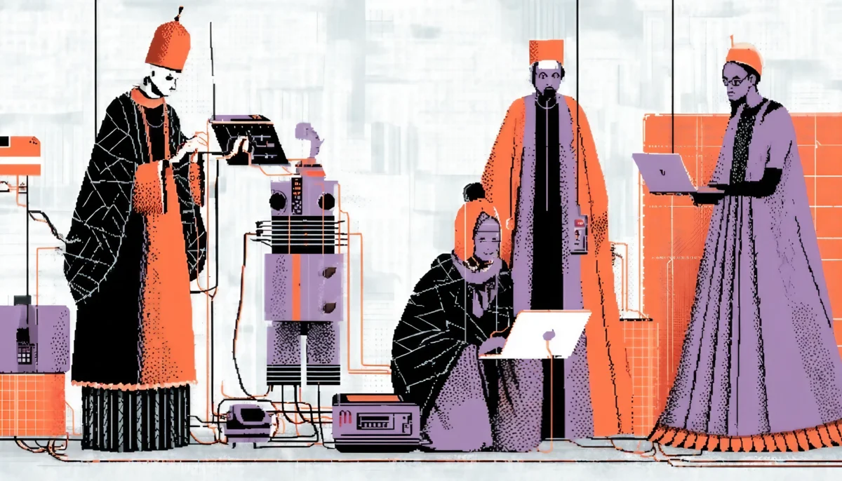
Think about the last time you visited a foreign supermarket. The aisles were familiar, yet every label, color, and shelf felt slightly — sometimes wildly — different. Digital products are no different. Interfaces carry subtle cultural cues — color meanings, reading directions, humor, and even button copy—that can make an app feel like a friendly corner store or a bewildering maze. If you disregard these cues, you run the risk of alienating millions of potential customers. Honor them, and you create instant rapport. After all, culture is the operating system running quietly in every user’s head.
So, why does this invisible OS matter so much? The scarcity of attention makes trust even more elusive. Users will abandon a product that “smells foreign” before they can appreciate its features. Worse, they may never convert. Translation alone won’t save you. Culture shapes behavior: how people pay, how they search, how they scroll, and how soon they judge credibility. A Japanese shopper may expect honorific politeness; a German visitor might crave precision and data; a Brazilian user may lean on social proof. When we design with these patterns instead of against them, we swap friction for flow.
Want a shortcut? Pretend every culture is a different dance floor. You can bring the same music, but it’s important to learn the local steps to avoid dancing off-beat.
Layout, Color, Imagery & Symbolism: The Four-Corner Check
Layout Logic
Left-to-right feels natural in New York. Not so in Riyadh. Arabic interfaces mirror Western grids; menus slide in from the right; progress bars fill right-to-left. Flip the direction, and the entire product feels broken.
Color Semantics
Red screams “sale” in the U.S. but signals luck in China and mourning in parts of South Africa. Airbnb famously swaps its pinkish Bélo for a calming blue in some Middle Eastern promos to respect local modesty norms.
Imagery & Icons
A mailbox icon with a flag means “new mail” in the States. In regions without that hardware, the symbol flops. Similarly, Netflix’s new TV UI conceals violent thumbnails in markets that discourage graphic imagery, presenting lighter visuals instead.
Tone & Copy
Formality levels vary wildly. McDonald’s app copy in Japan uses polite verb endings, while its U.S. counterpart cracks jokes. Small changes have a significant influence.
When vetting a design, run the Four-Corner Check: layout, color, imagery, and tone. If all four corners feel native, chances are the whole canvas does too.

Getting Under the Skin of Users Worldwide
How do you uncover these cultural landmines before launch? Start with mixed-methods research:
- Desk research — Tap Hofstede’s cultural dimensions, government usability standards, and ethnographic papers.
- Remote diary studies — Ask users to screen-record a day’s digital routine. Patterns pop fast.
- Pseudo-localization — Inflate strings or swap scripts to stress-test layouts long before translators step in. Netflix uses this trick to reveal spacing bugs and bidirectionality issues early.
- Figma string integrations—automate the extraction of strings, allowing translators to view the copy in context and immediately identify cultural mismatches.
- A/B Testing by Locale—Run simultaneous experiments. What wins in Seoul might flop in Stockholm.
Remember, research is not a one-time event but a continuous process. Cultures evolve; so should your insights.
Turning Insight into Interfaces
- Design for expansion
German and Finnish text balloons are like life rafts. Build generous auto-layout rules so your UI stretches without breaking. - Leverage modular content
Separate what you say from how you display it. A componentized CMS lets you rearrange modules per market without code rewrites. - Use neutral defaults, local overrides
Set a culturally agnostic baseline — think grayscale icons, metric-imperial toggles, and generic success GIFs. Then layer cultural polish: colors, idioms, and holiday themes. - Mind the payment funnel
Cash on delivery still dominates in parts of MENA. Digital wallets rule Indonesia. Offer the wrong method and watch abandonment soar. - Respect legal & ethical norms
Cookie banners require explicit opt-in in the EU but not everywhere. Age-gating varies too. Compliance lapses erode trust instantly. - Embed local voices
Hire country specialists or “culture councils.” IKEA’s Life at Home reports on local family rituals to inspire new features and store layouts.
Small tweaks, massive returns. One extra device test in Arabic can prevent thousands of support tickets.

How Top Brands Nail Localization
- Netflix’s Responsive Recommendations
The 2025 TV revamp personalizes rails not just by taste but by cultural relevance — even thumbnail tags adapt to regional awards like “César Winner” in France. - McDonald’s “Glocal” Menu & App
Users can switch regions in the app, instantly updating menu images, nutritional data, and promotions — proof that content and backend logic must travel together. - Airbnb’s Contextual Listings
Listings highlight tatami rooms in Japan, riads in Morocco, and treehouses in Costa Rica. Each listing’s microcopy mirrors local hospitality norms, driving trust. - IKEA’s Home-Need Framework
Research uncovered eight universal “home needs,” yet the site surfaces them differently per country — emphasizing privacy in Germany and togetherness in India. - Regional Color Swaps in Food Delivery Apps
A Latin American delivery startup flipped its green CTA to bright yellow for Brazil after A/B tests showed a 12% lift — green was linked to rival brands.
These examples prove localization isn’t lipstick on a UI. It’s architecture, workflow, and data science intertwining to serve humans respectfully.
Designing for diverse cultures is not merely a desirable feature. It is a growth engine that is often overlooked. When your product feels customized for each user, it fosters positive word-of-mouth, reduces churn, and significantly increases your total addressable market (TAM). Ignore culture, and you burn money translating error messages no one reads. Therefore, conduct the research, refine the visuals, and continue learning. The world’s dance floors are calling — let your product move gracefully on each one.


