

Let’s be honest—most digital experiences are forgettable. You swipe, click, scroll, and bounce. But once in a while, an interface feels just right. You find yourself smiling at a micro-interaction. You instinctively trust the navigation. You feel… understood.
That’s not luck. That’s neurological UX at play.
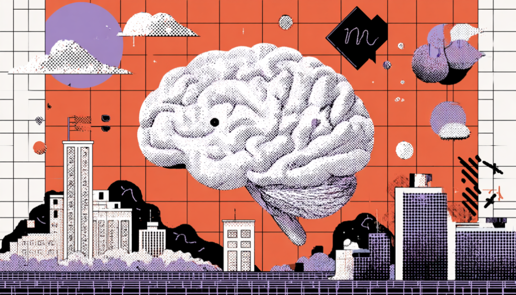
Neurological UX isn’t just about accessibility or clean design—it’s about syncing your product with how the human brain naturally works. It’s rooted in cognitive psychology, emotional behavior, and user neuroscience. In other words, it’s about designing for the brain rather than fighting against it.
Let’s take a deep dive into this lesser-talked-about world of UX, where pixels meet psychology—and magic happens.
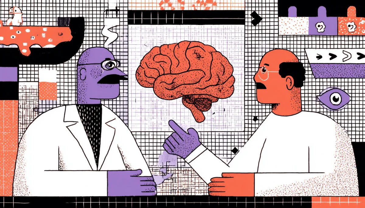
Understanding the Brain-UX Connection
Why Your Brain is the Real End-User
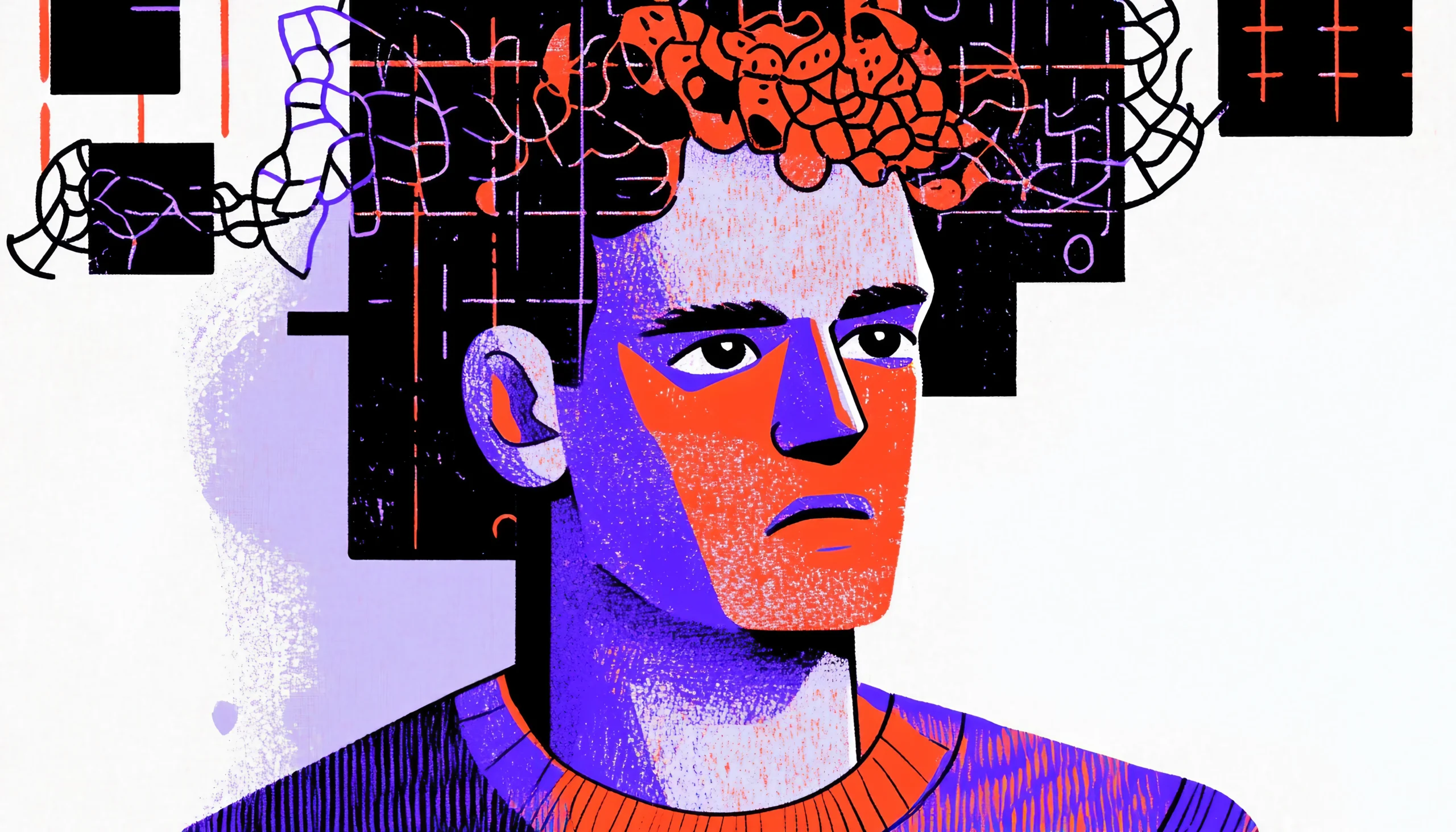
Imagine your brain as the world’s most powerful processor—but it has limitations. It’s energy-efficient (read: lazy), craves simplicity, and despises overwhelm. And guess what? That shows up in every single user interaction.
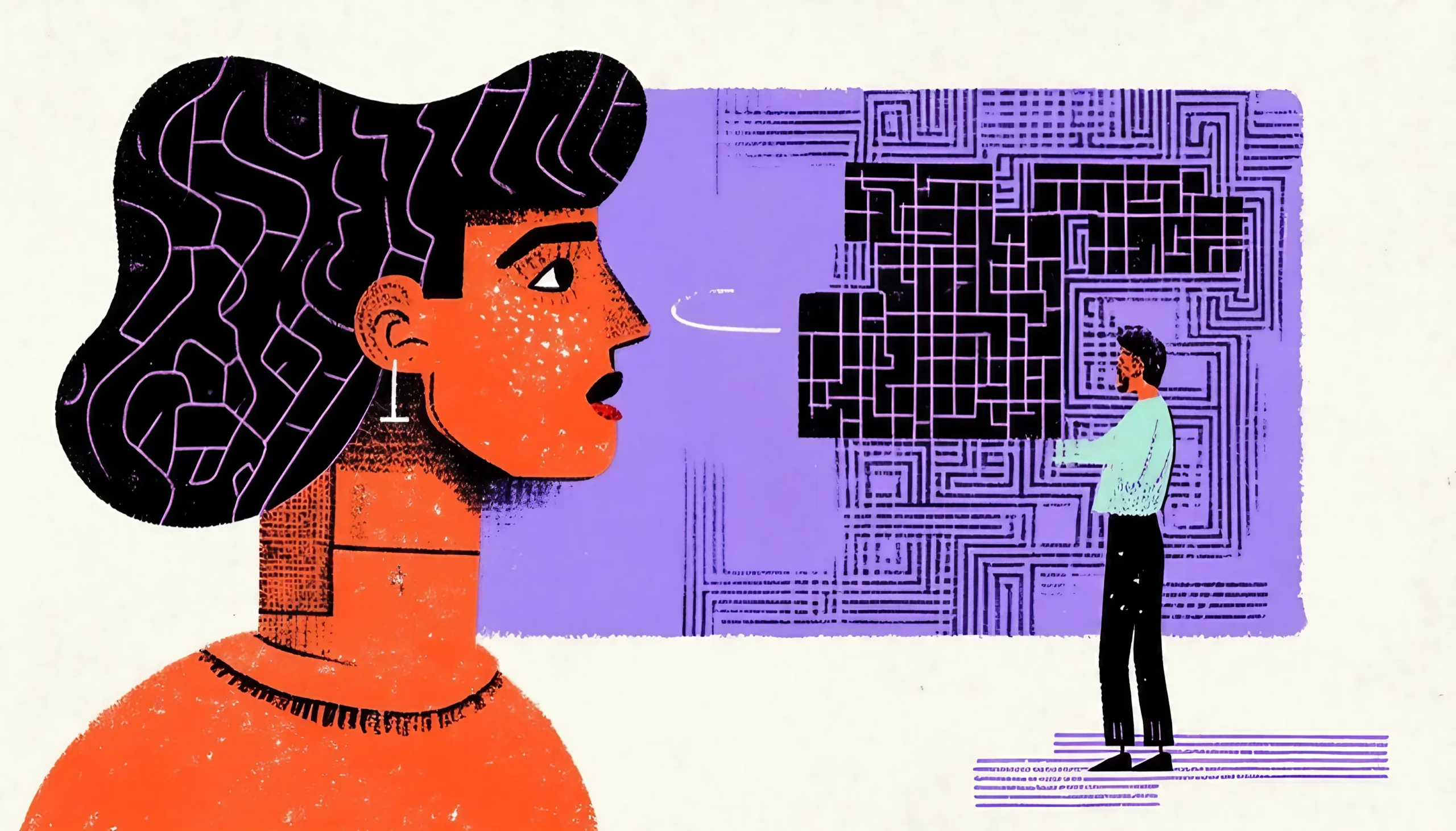
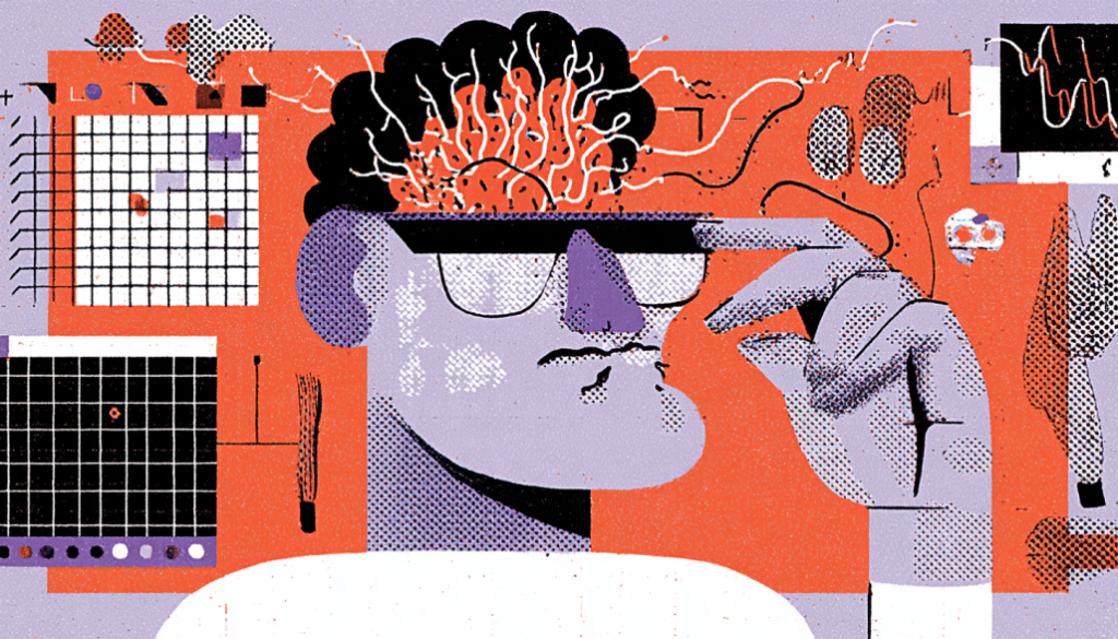
Cognitive Load: The Mental Bandwidth Problem
Your users only have so much brainpower to spare. Every decision—whether to click a button or decipher a layout—adds to cognitive load. Think of it like a browser with too many tabs open. Eventually, it crashes.
Design takeaway? Reduce friction. Strip away the noise. Give the brain a breather.
- Use progressive disclosure (show info as needed)
- Avoid walls of text
- Group related items with visual hierarchy
The Power of Patterns and Mental Models
Ever notice how people intuitively know where the “menu” icon is? That’s because the brain relies on mental models—its internal map of how things “should” work.
Break the model, and users get confused. Respect it, and they feel smart.
Design wisely.
- Stick to familiar iconography and layouts
- Match your flow to user expectations
- Surprise sparingly—and delightfully
Working Memory is Short—Design for It
The average working memory can only juggle about 3–5 things at once. So when we overload users with options, popups, and flashing banners, we’re asking them to juggle flaming swords while riding a unicycle.
Instead:
Let the interface do the remembering
Prioritize clarity over cleverness
Use chunking and bullet points
Designing for Emotional Resonance
Your Interface Has a Mood—Whether You Know It or Not
Here’s the secret sauce of neurological UX: Emotion drives behavior. A product that feels good will perform better. Period.
Think about it—when was the last time you kept using an app that made you feel frustrated or overwhelmed? Exactly.
The Brain Loves Feedback
Every time we tap a button and see something move, we get a little hit of dopamine. It’s our brain’s way of saying, “Hey, good job!”
Use microinteractions to:
- Confirm actions
- Guide the journey
- Celebrate user progress (even small wins!)
Designers often underestimate these tiny nudges—but the brain craves them.
Color, Shape, and Motion—The Silent Communicators
- Colors evoke emotion: Blue = calm, red = urgency, green = go
- Rounded edges feel safer than sharp corners (yes, really)
- Smooth transitions signal control; abrupt ones create tension
The trick is not just making it pretty but making it emotionally appropriate.
Emotional Triggers and Trust Signals
When users feel safe, they explore. When they feel anxious, they bounce.
You can build emotional trust through:
- Humanized language (“Let’s get started” vs. “Submit form”)
- Faces and photos (we connect with eyes!)
- Social proof (testimonials, reviews, community badges)
Good design doesn’t just work—it feels like it cares.
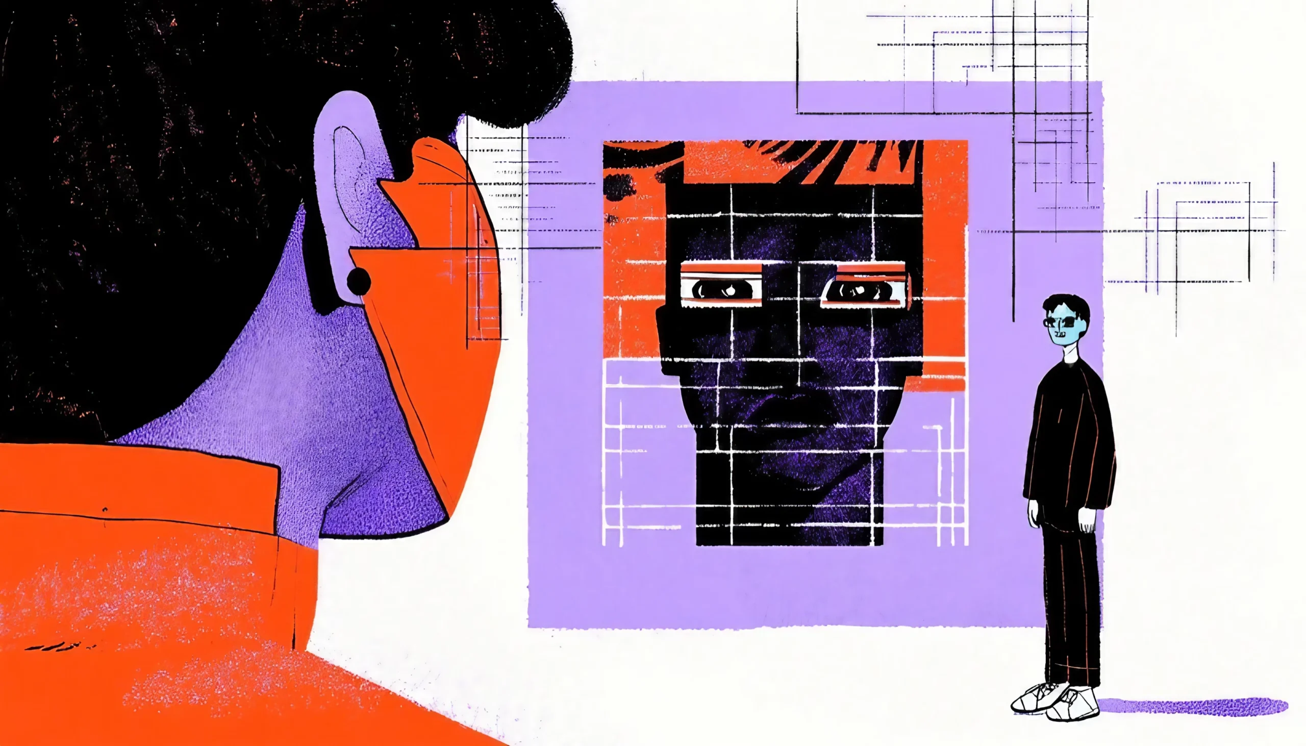
Neurodiversity and Inclusive UX
Brains Come in All Kinds—Design for Them All
Let’s bust a myth: designing for “average” users leaves most people out. In reality, cognitive differences are the norm, not the exception.
Neurological UX shines brightest when it embraces neurodiversity—designing for people with ADHD, autism, dyslexia, anxiety, and more.
Simplicity Helps Everyone—Especially the Overwhelmed
For users with ADHD or cognitive impairments, clutter can be paralyzing. Too many choices = no choice at all.
Try:
- Minimal interfaces
- Clear pathways (no dead-ends)
- Visual cues and step-by-step guidance
Sensory-Friendly Design
Autistic users may struggle with sensory overload. Flashing animations, loud sounds, or color flickers can make a digital space unbearable.
Instead:
- Give control over motion or sound
- Avoid autoplaying anything
- Offer “quiet” modes or reduced-sensory versions
Dyslexia-Friendly Typography
Did you know fonts can literally change readability?
- Use sans-serif fonts like Open Dyslexic or Lexend
- Avoid full caps and italics
- Keep line spacing generous
These aren’t “extras”—they’re design fundamentals for real, paying users.
Practical Tips for Brain-Friendly Design
Your UX Checklist for Neurological Goodness
Let’s bring it all home. Whether you’re designing a landing page or a mental health app, these brain-loving principles will elevate your UX from usable to unforgettable.
Keep It Simple, But Not Boring
Don’t sacrifice personality for clarity. You can have both. Use delightful microcopy, playful animations, or a mascot if it fits—just don’t overwhelm.
Quick win: Hide complexity behind toggles. Let advanced users dig deeper.
Guide the Journey (Don’t Just Show the Map)
The brain prefers guided experiences. Think GPS, not just a roadmap.
How?
- Use visual affordances (arrows, cues)
- Provide progress bars
- Offer undo and back options—safety nets boost confidence
Let Curiosity Flow, But Limit Friction
People love to explore when it feels safe. Design with breadcrumbs, tooltips, and gentle nudges—not aggressive popups.
Think of your interface like a museum: clear signage, friendly staff (aka UI helpers), and space to wander.
Humanize Every Touchpoint
Replace robotic interactions with emotionally intelligent ones.
Before:
“Error 404: Page not found.”
After:
“Oops! It appears that the page has gone missing. Want to head back home?”
Your words should resonate deeply
Design That Thinks Like a Brain, Feels Like a Hug
Neurological UX isn’t a buzzword—it’s a shift in mindset. It’s recognizing that behind every click is a human brain, navigating complex thoughts and emotions, with limited energy and infinite distractions.
By designing with how people think and how they feel in mind, we build products that aren’t just usable—but unforgettable.
We create digital experiences that don’t just serve a function—they serve humans.
So the next time you sketch a wireframe, ask yourself:
Is this brain-friendly? Does it feel emotionally safe?
Am I designing for the mind—or fighting against it?
Your users’ neurons—and hearts—will thank you.