
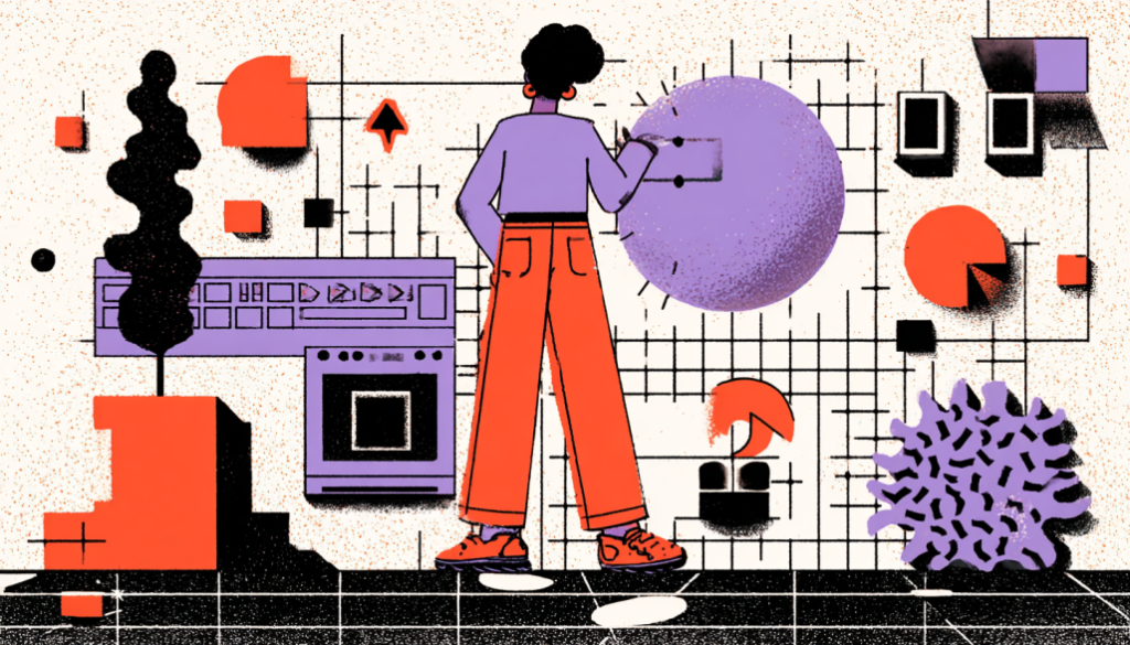
Why the Design Chaos Had to Stop
Let’s face it—design can get messy.
You start a new project with a clear vision. But fast-forward a few months, and things begin to unravel. Buttons start looking slightly different on each page. Headings shift in size depending on the designer’s mood. And the devs? They’re scrambling to piece everything together while muttering, “Is this the final version or…?”
Sound familiar?
If you’ve ever worked on a growing product, you understand how quickly things can go awry. This is where design systems become invaluable. They bring consistency, scalability, and peace of mind—without killing creativity.
In this guide, we’re going to unpack what a design system is (and isn’t), why it matters, and how it’s revolutionizing the way we build user experiences. Even if you’re just starting out in the UX world, this guide will provide you with the clarity and excitement necessary to either build or contribute to a design system.
What Exactly Is a Design System? (And What It’s Not)
Breaking Down the Buzzword with Plain English
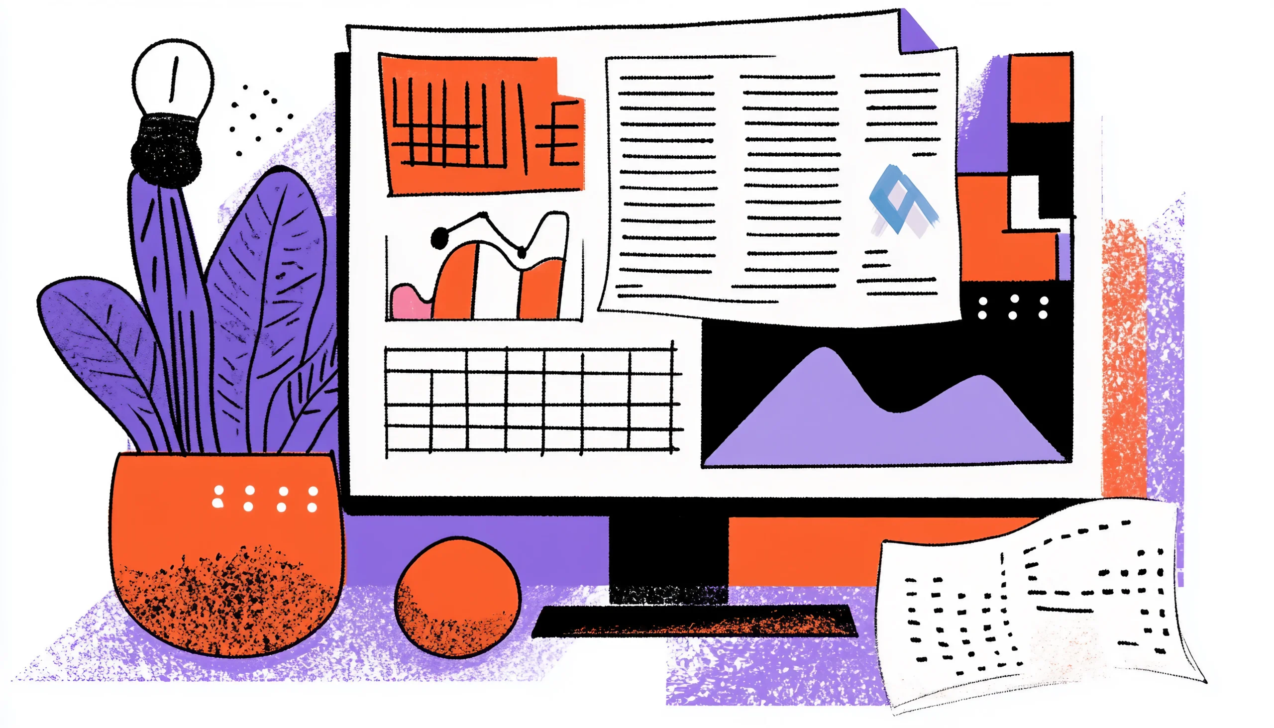
At its core, a design system is a collection of reusable components, guidelines, and standards that helps teams design and build consistent, high-quality products—faster.
Think of it like a LEGO set. The bricks (components) come in different shapes and colors, but they’re made to fit together. You can build a spaceship or a castle—it’s up to you. The magic lies in the interchangeability and reliability of those bricks.
A full design system usually includes:
- Design Tokens: The smallest building blocks—colors, spacing, and typography rules.
- UI Components: Buttons, forms, modals, sliders, and tooltips—all reusable and standardized.
- Usage Guidelines: When and how to use each component properly (and when not to).
- Code Implementations: Front-end code, usually in React, Vue, or other frameworks.
- Philosophy & Principles: A shared mindset. Why we design things the way we do.
Here’s an example: Google’s Material Design. It’s not just a button template—it’s a philosophy wrapped in UI elements, design logic, and developer code. It teaches you not only how things look, but how they should behave.

Why Design Systems Matter (and Why Your Team Is Probably Craving One)
The Real-World Pain Points That Systems Solve
Let’s say you’re working on a product with five designers, ten engineers, and three product managers.
Without a design system? Chaos.
One designer uses #E74C3C for the primary button. Another team member picks the color #FF5733 because they believe it looks more modern. Meanwhile, the dev team is building both versions… until someone asks during QA, “Could we clarify which version we are actually using?”
This kind of disjointed workflow is more common than you think. And it’s expensive. Here’s why design systems are the unsung heroes behind seamless UX:
Consistency at Scale
When you have multiple teams working across products or platforms, a design system ensures everything feels like it belongs to the same brand. You’re no longer reinventing the wheel with every page.
Faster Design & Development
With pre-built, approved components, designers don’t waste time pixel-pushing. Developers don’t have to guess how a component should behave. Everyone moves faster, with fewer surprises.
Better User Experience
Users don’t care how many people worked on your app—they just want it to feel intuitive. Familiar patterns reduce cognitive load. Predictability creates trust.
Cost Efficiency
Time saved is money saved. A design system reduces duplication, cuts down on QA errors, and minimizes rework.
Improved Collaboration
Design systems serve as a bridge between the design and development phases. Everyone speaks a common language, which reduces friction and finger-pointing.
Bottom line? If you’re scaling a product or team, not having a design system is like trying to build IKEA furniture without the instructions… or the screws.

What Makes a Good Design System? (It’s More Than Pretty Buttons)
Must-Have Ingredients for Something That Actually Works
Not all design systems are equal. Some are too rigid. Others are glorified style guides dressed up in fancy Figma files.
So, what separates a solid, scalable design system from a pretty-but-useless one?
Modularity
Every component should be reusable and adaptable. Is your button capable of adapting from mobile to desktop without any issues? That’s the test.
Accessibility
Inclusive design isn’t optional anymore. A reliable system bakes in WCAG standards—contrast ratios, keyboard navigation, and screen reader compatibility—so you don’t have to retrofit it later.
Documentation
It’s not just about having a dropdown component—it’s about knowing how and when to use it. Documentation should include dos, don’ts, edge cases, and rationale.
Version Control
Design systems evolve. Without proper versioning, teams can break things unintentionally. A great system offers changelogs and updates in real time.
Cross-Functional Input
A design system isn’t owned by just designers or developers. It is a dynamic product that thrives on the contributions of cross-disciplinary teams.
Governance Model
Who decides when a component gets added, changed, or deprecated? A successful system has rules for contribution and review—so it doesn’t turn into a Frankenstein.
Imagine your system as a garden. You can’t just plant seeds and walk away. You have to prune it, water it, and occasionally pull out the weeds.
How to Build a Design System (Without Losing Your Mind)
A Beginner-Friendly Roadmap to Get You Started
Are you starting from scratch? Deep breath. You don’t need to build an entire atomic-design-powered design system in one weekend. It’s okay to start small and grow over time.
Here’s a simple roadmap:
Step 1: Audit What You Already Have
Inventory your UI. Gather screenshots of buttons, inputs, modals, and other components across your product. Look for inconsistencies. You’ll be shocked at how many versions of “primary button” exist.
Step 2: Define Your Foundations
Pick your design tokens: colors, spacing scale, typography, grid system, and iconography. These are the DNA of your product’s visual identity.
Step 3: Build Core Components
Start with the essentials—buttons, forms, modals, and alerts. Create them using Figma and your front-end framework. Make sure they’re accessible.
Step 4: Document Everything
Use tools like Zeroheight, Notion, or Storybook to document your system. Don’t assume people will use components correctly without guidance.
Step 5: Get Buy-In and Feedback
A design system only works if people use it. Present it to your team. Run workshops. Collect input. Ensure it is collaborative rather than top-down.
Step 6: Evolve Gradually
Don’t approach it as a one-time project. Your product changes. Your system should too. Revisit, refine, and refactor regularly.
Keep in mind: This is a journey, not a quick fix.

Real-World Examples: Design Systems in Action
What the Pros Are Doing (And What You Can Learn)
Let’s take a closer look at some industry-leading systems.
Material Design (Google)
Probably the most well-known system is Material Design (Google). It combines philosophy, components, and code. It provides comprehensive guidance on motion, interaction, and brand expression.
Polaris (Shopify)
A shining example of a system made for cross-functional teams. Their documentation balances design logic with implementation details.
Lightning Design System (Salesforce)
The Lightning Design System (Salesforce) is designed to accommodate a vast array of enterprise tools. The system places a strong emphasis on accessibility and scalability. This platform serves as an excellent tool for managing large teams effectively.
Carbon (IBM)
Carbon (IBM) is an open-source platform that is built with accessibility as a core pillar. The guidelines for spacing, hierarchy, and content structure are extremely detailed.
Spectrum (Adobe)
Spectrum (Adobe) prioritizes flexibility and a user interface that is responsive. Their system empowers teams to work across creative and technical landscapes seamlessly.
What do they all have in common? Structure + flexibility. They respect brand consistency but don’t kill creativity. They evolve with the product—not against it.
Here’s the thing: design systems might seem intimidating at first. All those tokens, components, and guidelines? It’s a lot.
However, once you master it, it becomes as effortless as transitioning from a bicycle to a race car. Everything gets smoother, faster, and way more fun.
Whether you’re a solo designer trying to create order or a growing team seeking consistency, a design system is your compass in the chaos. It helps you scale design without sacrificing soul.
So start small. Build smart. Remember, those who care about not just pixels but also the people using them create the best design systems.