


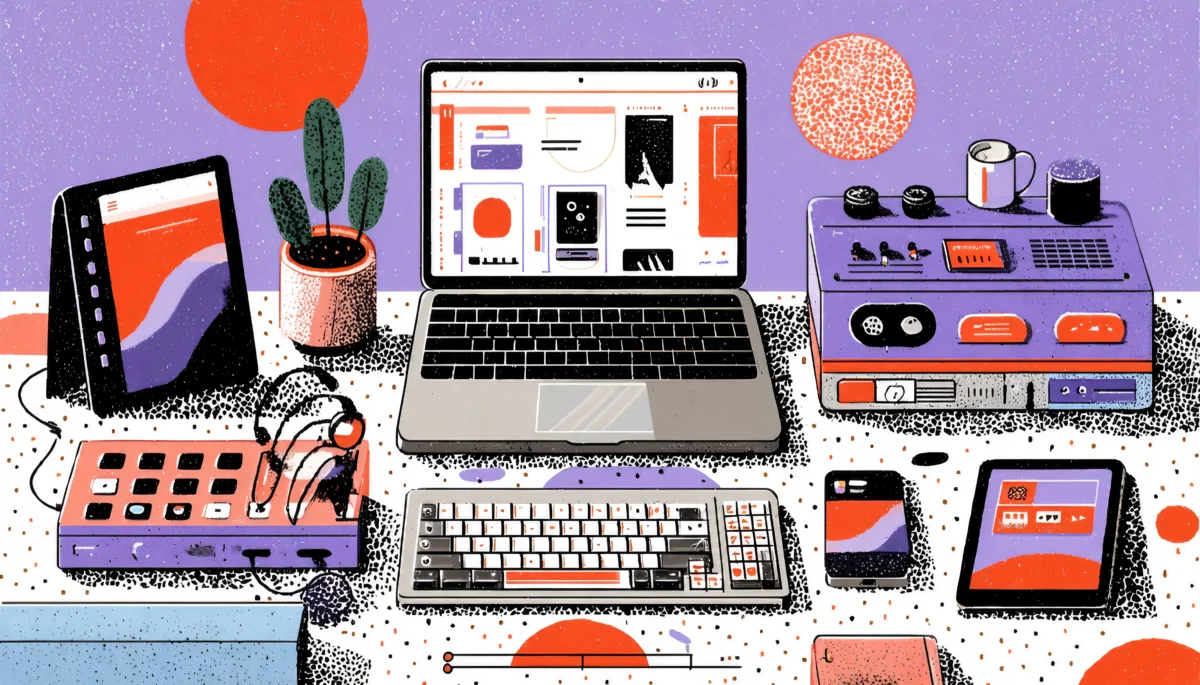
Have you ever started a task on your smartwatch, switched to your phone, and finished on your TV? That fluid switch is now the norm, not the exception. As a designer, you’re no longer designing purely for mobile or desktop—you’re designing for an ecosystem. This ecosystem could start on a watch, continue on a phone, and conclude on a large-screen TV.
In this moment, you must ask: what does “consistent brand experience” really mean when the canvas spans from a 1.5-inch wearable to a 65-inch smart screen?
When we talk about device-agnostic design, we’re talking about allowing users to engage with the brand in the same way, feel the same identity, and complete tasks seamlessly, regardless of the gadget. A strong omnichannel UX strategy says: The channel doesn’t matter. The experience does.
Why is this so critical? Users think not in terms of devices, but rather in terms of goals. They want to start and finish something in a familiar place while feeling like they’re in the same brand world.
Your brand is like a scenic trail that winds through mountains, forests, and beaches. The path may shift in environment, elevation, and even mood, but the markers, the signage, and the feel of the journey stay consistent. The user should feel as if they are still on the same brand trail, even though the scenery has changed.
As a strategic guide, we’ll walk through the major sections to help you assimilate the key thinking, the process, and the tactics required to succeed across platforms (from watch to TV) while keeping that unified brand voice and behavior.

Foundations—User Journey Mapping + Device Context
Map the journey before you pick the screen
You can’t simply treat each device independently and hope for coherence. The first step for you as a designer is a robust user journey map that spans devices. Ask yourself: Where does the user start, where do they go next, and where could they end up?
When the journey might begin on a wearable, continue on mobile, and finish on TV, then you must consider:
- What triggers the user to pick up the watch? Maybe a notification or glanceable content.
- What happens next on mobile or tablet? Perhaps the next step involves a more detailed interaction.
- Then, how does that transition to TV? Perhaps it involves a more extended form of content consumption or a shared viewing experience
Understanding context is vital. Each device offers different affordances and constraints. The watch provides glanceability and minimal input. The mobile device provides touch, mobility, and a moderate screen size. The TV provides a large screen, shared viewing, and possibly remote control as input. A clearly defined device-agnostic principle says: design to context, not just screen size.
As highlighted in research on omnichannel user experience: you must make it plausible for a user to switch devices mid-flow without friction. For your design system and brand experience, you’ll want to answer questions like: - Are core tasks available on all relevant devices?
- Does the experience feel consistent across devices? (Visual language, tone, functionality)
- Does data continuity exist (so the user doesn’t lose progress)?
When mapping the journey, you also tie it back to your design system (more on that in Section 3). You’ll identify where the user crosses device boundaries, where the brand needs to maintain cues, and where unique device capabilities (watch glance, TV full immersion) require special design treatment.

Building the Design System for Device-Agnostic Consistency
One system, many canvases—make your design system your brand’s anchor
Think of your design system as the ship’s anchor in a stormy sea of devices. The anchor (your brand identity, rules, and tokens) holds firm, no matter how high the waves from devices like watches, phones, tablets, TVs, or even voice assistants rise.
Why is your design system vital? Because in an omnichannel world, you can’t redesign everything from scratch for each device. You need a unified source of truth. Here are key parts you should include:
- Design tokens: colors, typography, spacing, and icons that adapt responsively across screen size and device type.
- Interaction patterns: How a user navigates and how they input or trigger an action. The core behavior should feel familiar.
- Adaptive layout rules: For the watch you might use ultra-simplified flows; for TV you might use richer visuals and possibly remote control navigation. But your layouts should belong to the same system, have the same logic, and have the same brand feeling.
- Voice & tone guidelines: The wording on the watch should match the tone on the TV. The brand voice doesn’t waver.
- Accessibility & input variation rules: On TV you may rely on remote or voice; on a watch you must consider glance time and minimal text; on mobile you must support touch and maybe one-hand use.
From a practical standpoint, when your teams (mobile, web, TV, and wearable) pull from the same design system, you reduce the risk of context shifts or brand fractures. In omni-channel UX research, one major problem flagged is siloed teams leading to inconsistent experiences.
Some key tactical moves: - Run a design audit: Check each platform against tokens, patterns, and voice.
- Build device-specific extensions: Recognize that watches and TVs will need extra rules (e.g., for glance vs. full immersion) but will still be housed within the system.
- Define hand-off rules: E.g., “If a user moves from mobile to TV, maintain state, keep their last action, and present the same visual cues.”
- Test across device transitions, not just single screens.
Device-Specific Considerations—From Wrist to Large Screen
Each device is a character in your story—know how they behave
Now, let’s dive into the specifics. While maintaining consistency in your overall brand and system is important, each type of device requires a unique approach. Let’s explore typical device classes you’ll be managing: watch, mobile/tablet, and TV (large screen).
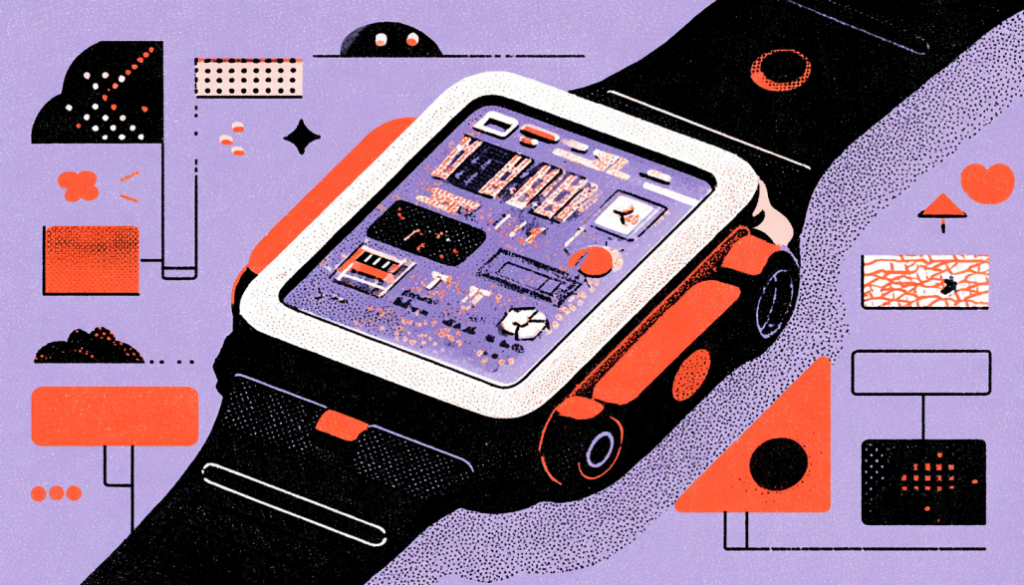
Watches (Wearables)
- Constraint: tiny screen, minimal input, quick interactions.
- Opportunity: glanceable insights, notifications, simple actions.
- Design tactic: Keep tasks ultra-focused. Think micro-flows: “one tap to open,” “two taps to confirm.”
- Brand cue: Use your visual accent (color, icon) prominently so that even at a glance, the brand’s presence is unmistakable.
Mobile / Tablet
- Constraint: There are many contexts, varying screen sizes, and different types of input.
- Opportunity: Rich interaction, mobility, and context awareness (location, sensors).
- Design tactic: Use vertical/horizontal layouts as appropriate, support user input comfortably, and allow users freedom to dig deeper.
- Example: If the user started something on the watch (e.g., “Start a timer”), the mobile version might let them customise settings, view history, set reminders, etc.
TV / Large Screen / Living Room
- Constraint: Remote control or limited input; the user is often further away from the screen, perhaps shared viewing.
- Opportunity: Big canvas, immersive visuals, shared experience, media-rich content.
- Design tactic: Think large typography, fewer navigational items per screen, remote-friendly actions, and maybe voice input.
- Brand cue: The brand visuals must scale elegantly to this large context. The feel is bigger and cinematic but still unmistakably your brand.
Transitioning between devices
One of the most critical moments is the hand-off: the user moves from one device to another. This is the crucial point at which many brands fail to provide adequate support. You must design the transitions:
- Ensuring state continuity (where did the user leave off?)
- Offering clear cues (e.g., “Continue on your TV”)
- Avoiding repetition (the user shouldn’t feel like they’re doing the same work twice)
- Keeping brand identity intact across devices
This is exactly what omnichannel UX best practices emphasize: seamless hand-offs. Think of your brand experience as a train journey. The user boards at Station A (watch), transfers smoothly at Station B (mobile), and disembarks at Station C (TV). If the train changes color mid-journey, or the tracks feel different, the experience fractures. Your job is to ensure it’s the same train all the way.
As a product manager or design lead, this means that when you define features, you should consider not only “How will this work on mobile?” but also “How will this flow across watch, mobile, and TV?” What’s the next device? How do we support that?”
Also: don’t treat TV as an afterthought. The living room context is increasingly important (streaming, shared experiences). If your brand neglects it, you cede space to competitors.
Implementation Strategy—From Roadmap to Metrics
Align teams, set up workflows, measure impact
You’ve defined the journey, you’ve built the system, and you’ve considered each device. Now you implement. Here’s how to approach it strategically.
1. Cross-functional alignment
You’ll need buy-in from design, product, engineering, marketing, and maybe operations. Why? Because delivering consistent brand experience across devices is organizational, not just UI.
Set shared OKRs like “User completes core task across devices with no repetition” or “Time from watch to TV hand-off under X seconds.”
2. Roadmap planning
Break your roadmap into waves:
- Phase 1: Core task flows on mobile + tablet (foundation)
- Phase 2: Wearable support (minimal viable glance/interaction)
- Phase 3: TV/large-screen version + hand-off features
- Phase 4: Advanced smoothing (notifications, voice, remote, multi-device continuity)
Each phase should reference the design system and the journey map.
3. Tech and design mechanism
Use component libraries, tokens, and shared codebases where possible (for example, one UI logic across devices). Many platforms have cross-platform UX builders or frameworks that help. Consider data-sync mechanisms: user state, progress, and preferences must follow the user across devices.
4. Testing strategy
Don’t just test screens in isolation—test flows across devices. For example: “Start on the watch, pick up on the phone, and continue on TV.” Identify dropped states, brand inconsistencies, and friction points.
5. Metrics and feedback
Define what success looks like:
- Reduction in drop-off when users switch devices
- Improved time-to-completion of the same task across devices
- Higher user satisfaction/brand perception scores related to cross-device experience
- More frequent and longer engagement on large-screen device (if that’s a strategic goal)
Gather qualitative feedback: user interviews and usability tests on multi-device flows.
6. Continuous iteration
Even after launch, keep iterating. Device landscape changes. Wearables evolve. TVs get new smart features. Your design system must evolve. Omnichannel UX is an ongoing journey.
Implementation is like planting a garden that spans the front yard, backyard, and patio. You’ve planted the trees (design system), and you’ve built pathways (journeys); now you must tend the garden, water it, prune it, and keep it in shape as seasons pass.

Common Pitfalls and How to Avoid Them
What tends to derail cross-platform brand experiences
Alright—we’ve covered what should be done. Let’s now explore the common mistakes that often occur. Knowing the traps helps you avoid them.
Pitfall 1: Device silos
Teams build the mobile version, the watch version, and the TV version separately, without a shared system or shared mindset. The result: brand fragmentation, inconsistent interaction logic, and reduced trust.
Pitfall 2: Ignoring hand-off transitions
You may optimize each device individually, but if the user tries to switch gadgets and everything resets, you lose them. The baton drops.
Pitfall 3: Over-designing for one device only
Many brands optimize heavily for mobile and treat TV or wearables as “nice to have.” That undermines your brand reach and consistency across devices.
Pitfall 4: Underestimating input/context differences
Don’t assume what works on mobile (touch, on-screen keyboard) works on TV (remote, big screen) or wearable (glance, small input). Without context adaptation, you’ll frustrate users.
Pitfall 5: Neglecting the design system as living asset
You might create a design system once and then never update it. That means as devices evolve the system falls behind, inconsistencies creep in.
How to avoid these
- Foster a cross-device mindset from Day 1.
- Build and maintain a single design system.
- Prioritize state continuity and data sync across devices.
- Allocate test flows that span devices.
- Make design system maintenance part of your roadmap.
By proactively recognizing these pitfalls, you keep your project resilient and future-ready.

Real-World Example and Takeaways
A quick illustrative scenario
Imagine you’re the product manager of a fitness-wellness brand. Your service spans a watch (for quick check-in or starting a workout), a mobile app (for routine details and planning), and a TV (for guided video workouts in the living room).
Here’s how you apply the guide:
- Journey Map:
- Wake up, glance at watch: “Today’s workout: 20 min HIIT”
- On mobile: review routine, customise, start tracking
- After workout: on TV, join family in living room doing cool-down video
- Later: on mobile or watch check progress, log feelings, decide on the next workout
- Design System:
- Tokens: brand red for alerts, green for success; typography scales across watch-mobile-TV.
- Patterns: The “Start” button is always bottom right on mobile and bottom left on TV (due to the remote). But the icon and label are the same, so it feels recognizable.
- The voice should be friendly and energetic, maintaining the same tone as the phrase “Let’s crush today’s session!” appears on the watch and mobile and matches the TV voice-over.
- Adaptive layouts: The watch shows the summary only. Mobile shows full routines. TV shows provide a fully immersive, full-screen video experience along with side-panel statistics.
- Device-Specific Execution:
- Watch: a glance widget shows “20 min HIIT” with a big red “Start ”Now”—no complex list.
- Mobile: full list of routines, ability to pick time, set audio cues, and customize equipment.
- TV: Full-screen video, minimal nav, large text, remote-friendly exit/back options, visual sync with mobile (e.g., counts live tracked by watch).
- Hand-Off Logic:
- If a user taps “Start on TV” from mobile, mobile sends a link or QR code or casts automatically.
- Progress updates sync: watch → mobile → TV. If paused on TV, resume on mobile.
- State persistence: the user’s selected workout carries across devices.
- Implementation:
- Roadmap: Phase 1: mobile; Phase 2: watch glance; Phase 3: TV version; Phase 4: cast and sync features.
- Metrics: Drop-off rate when switching devices, completion rate of workouts, and user satisfaction with “device hand-off.”
- Iteration: Collect feedback from users who start on a watch and move to TV. Where do they stumble? Fix it.
Key takeaways for you
- Think ecosystem, not just screen.
- Device context matters. Wearable ≠ mobile ≠ TV.
- The transition between devices is as critical as the experiences on each one.
- A strong design system is your anchor.
- Cross-functional collaboration and continuous iteration are non-negotiable.
- Measure real-world flows, not just task success in siloed apps.
By following this method, you’ll create not just a product, but a brand experience that resonates regardless of device. And your users will feel, “Yes—this brand knows me, meets me, and supports me whether I’m sitting on the couch, walking in the park, or standing in the living room.”

Why This Is a Competitive Advantage
Because devices will only keep multiplying
As a design lead or product manager, you’re steering into a future where users will expect your brand to follow them—on wearables, in-car screens, voice assistants, AR glasses, TVs—and still feel coherent. If you get cross-platform UX right today, you set the stage for tomorrow’s devices.
This type of experience isn’t just nice to have. It’s increasingly a differentiator. Brands that offer seamless transitions, recognizable identity, and effortless workflows across devices will earn higher trust and loyalty. The ones that don’t will frustrate users and lose ground.
Analogous to bricks-and-mortar retail: If you walk into one store branch and the brand looks different and the staff service is different, you wonder if you’re still dealing with the same company. In the digital world, if you switch from your watch to your TV and things look different and behave differently, you may think you’re dealing with an app from a different company (even if you’re not). That erodes brand value.
In sum: Cross-platform UX from watch to TV isn’t just a technical execution—it’s a brand commitment. It’s saying to your users, “Wherever you are, whatever device you use, we’re with you—and our brand stands for something consistent, reliable, and recognizable.” That’s the promise you deliver when you embrace device-agnostic principles, strong design systems, thoughtful user journey mapping, and omnichannel design strategy. And that promise is one that your users will remember.