


There’s a moment every design team eventually hits. You’re three products deep, two years into building, and someone asks a simple question: “Can we just reuse that button component from the last project?” And then the silence. The uncomfortable shuffling. The realization that your design system, if you can even call it that, is less a system and more a pile of one-off decisions held together by hope and a shared Figma file named “Final_v3_ACTUAL_FINAL.” Atomic design is the methodology that finally puts an end to this chaos.
Sound familiar? You’re not alone. According to a 2023 survey by Knapsack, over 60% of product teams reported that inconsistency across their digital products was their number one design and development pain point. Not lack of talent. Not budget. Inconsistency. The kind that creeps in when components are created in silos, when design decisions live in someone’s head rather than a shared system, and when scaling feels like rebuilding from scratch every single time.
That’s exactly the problem Brad Frost set out to solve when he introduced Atomic Design back in 2013. Borrowing from chemistry, where atoms combine to form molecules, which form organisms, which form the complex matter of the world around us, Frost gave designers and developers a mental model for thinking about UI components hierarchically. Build small. Build intentionally. Build in a way that scales without chaos.
But here’s the thing: most teams who say they’re “doing Atomic Design” are only halfway there. They’ve got the atoms, buttons, inputs, and icons, but what about the connective tissue that links those atoms to a full, flexible, living design system? That part gets murky fast. This article explains how to structure your design system using Atomic Design principles for flexibility, reusability, and sanity.
Understanding the Atomic Hierarchy—And Why Most Teams Get It Wrong
From Chemistry Class to Component Libraries: The Five Levels Explained
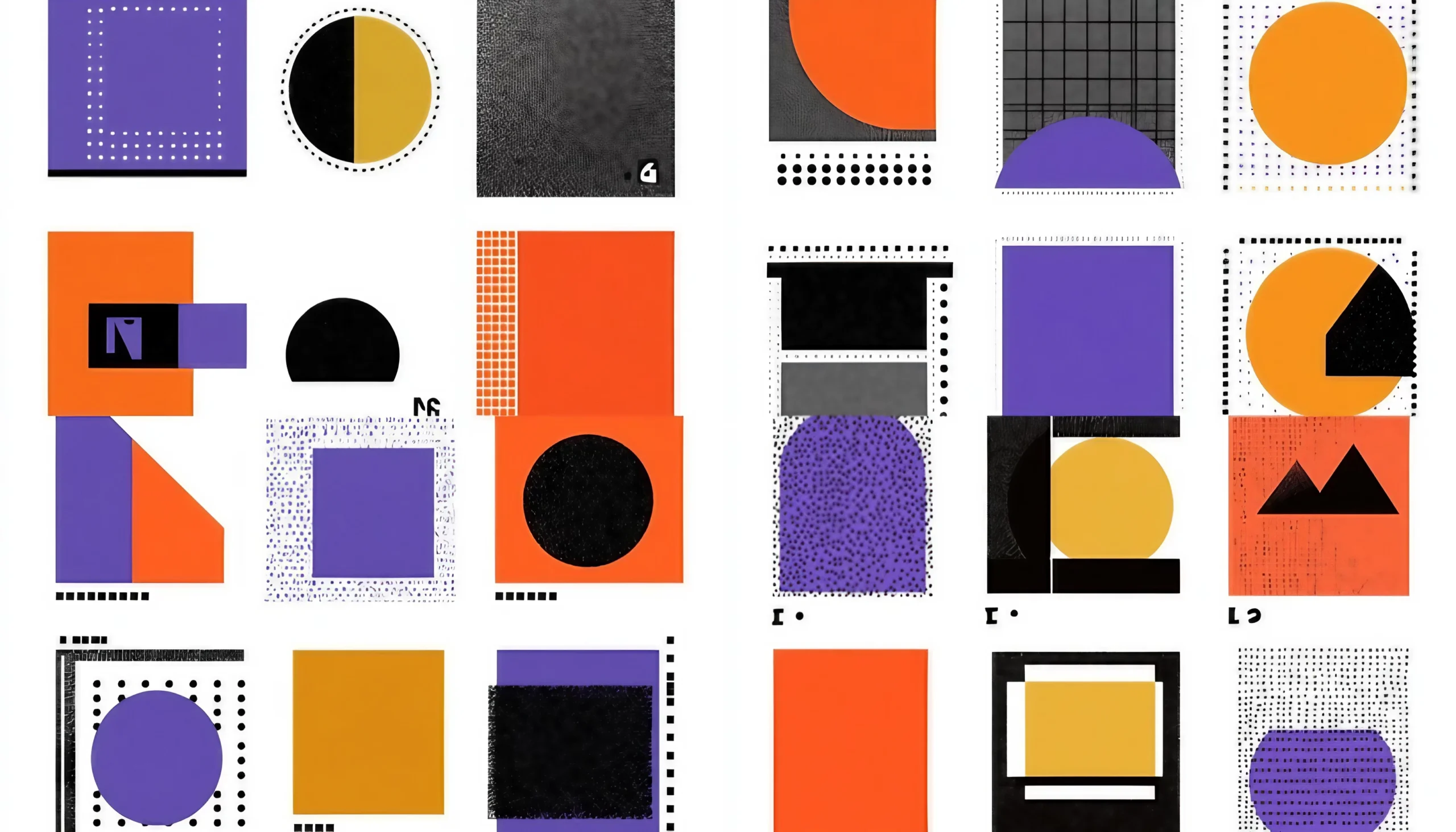
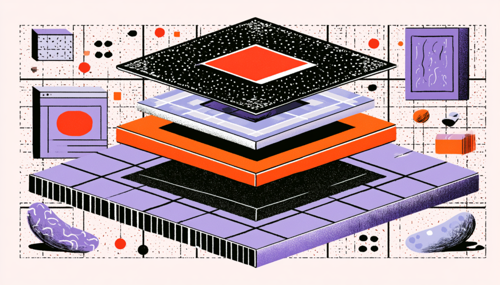
Brad Frost’s Atomic Design methodology breaks UI architecture into five distinct levels: atoms, molecules, organisms, templates, and pages. Each level builds on the previous one, and the beauty of the system is that it forces you to see components not as standalone design decisions but as building blocks in a larger, interconnected system. Think of it like LEGO, except the bricks were engineered to click together in infinite configurations without the whole structure collapsing.
Atoms are your most basic, indivisible UI elements. A button. A text input. A color swatch. A typography style. Individually, they have limited impact, much like a single hydrogen atom is not water. But their real power comes from the constraints you build into them. When you define an atom, you’re setting the rules of engagement for everything that comes after. The font size on that label, the border-radius on that button, the exact hex code of that primary color—these aren’t just aesthetic choices. They’re foundational decisions that ripple through your entire system.
Molecules are where things start getting interesting. Combine a label, an input field, and an error message atom, and suddenly you have a form field molecule. Combine an icon atom with a text atom and a background container, and you’ve got a notification badge. Molecules serve a single purpose and do so well. Here’s where many teams go wrong: they start building molecules that are too complex, essentially trying to skip straight from atoms to full UI sections. Keep your molecules focused and single-purpose. If you find a molecule trying to do three things at once, you’re probably looking at an organism in disguise.
Organisms, templates, and pages round out the hierarchy: organisms are complex UI sections, like navigation bars or product cards; templates are the skeletal layout structures that hold organisms together; and pages are real content poured into templates. Most design teams are reasonably adept at building atoms. The breakdown usually happens somewhere between molecules and organisms, where the boundaries get blurry and components start accumulating responsibilities like a middle manager who can’t say no.
Building Atoms That Actually Scale

Design Tokens Are the DNA of Your Atoms
Here’s a question: what happens to your design system when the brand team decides to change the primary color from cobalt blue to teal? If you’ve hardcoded color values directly into every component, you’re looking at a multi-day find-and-replace nightmare. If you’ve built your atoms on top of design tokens, abstracted named values that represent design decisions, you can change one thing and watch the ripple effect propagate correctly across your entire system. Magic? No. Just smart architecture.
Design tokens are, in essence, the DNA layer beneath your atoms. They’re called variables, which store your raw design decisions in a format that both designers and developers can reference. Tools like Figma’s Variables feature, Style Dictionary, and Tokens Studio have made design token management genuinely accessible in the last few years. Companies like Salesforce (with their Lightning Design System) and Shopify (with Polaris) have published extensively about how tokens form the backbone of their scalable design systems, and both systems serve hundreds of product teams simultaneously.
When you build your atoms on top of tokens, you’re doing something incredibly powerful: you’re separating the what from the how. A button isn’t “that blue thing with white text.” It’s an element that references color.interactive.background and color.interactive.text, which happen to be blue and white right now but could be anything tomorrow. This separation is what makes your system genuinely flexible rather than just organized-looking. And there’s a practical bonus: when you eventually need to support dark mode, brand themes, or accessibility-adjusted contrast ratios, you’ll be glad you made this investment.
Composing Molecules and Organisms Without Creating a Component Junkyard
The Single Responsibility Principle Is Your Best Friend Here
Every senior developer you’ve ever worked with has probably muttered something about the “single responsibility principle” at some point. They weren’t being pedantic; they were protecting the system’s long-term sanity. In the context of atomic design, this principle translates directly: every molecule and organism should do one thing and do it well. A search bar molecule handles search input. A product card organism displays product information. Neither of these components should be making decisions about page layout, fetching data, or managing authentication state.
The component junkyard problem is real, and it’s ugly. It happens when teams build a new component every time they hit a design edge case instead of asking whether an existing component can be extended or configured. Airbnb famously dealt with the issue early in their design system journey; their team documented that they had accumulated hundreds of loosely related button variants before they consolidated them into a single, highly configurable button component with a clear set of props and variants. The lesson? Proliferation is the enemy of flexibility.
Organisms are where you’ll spend most of your time wrestling with scope creep. A navigation bar organism, for example, might legitimately need to contain molecules for the logo, nav links, a search bar, and a user avatar dropdown. That’s complex, but it’s all navigationally purposeful. The moment you start adding promotional banners or feature announcements to that same organism, you’ve crossed a line. Keep organisms tied to a specific functional role in the interface. Use composition, which refers to an organism built from molecules that are built from atoms, to achieve complexity rather than mere accumulation.
One underused technique worth adopting: slot-based composition. Instead of hardcoding child components inside organisms, design them to accept configurable “slots” where different molecules can plug in. Think of how React’s children prop or Vue’s <slot> tag works; the same header organism can accommodate a search bar in one context and breadcrumb navigation in another, simply by swapping what’s inserted into the designated slot. This approach dramatically increases the reuse potential of your organisms without bloating them with conditional logic.
Templates, Pages, and the Real-World Test of Your System

Where Theory Meets Reality—and Where Systems Prove Themselves
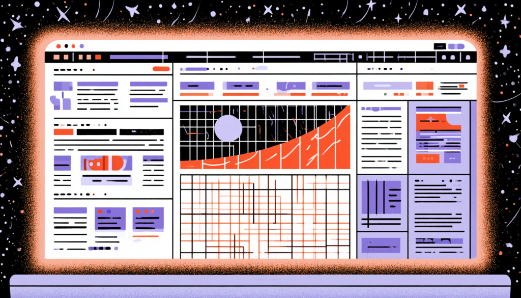
Templates and pages are the levels of atomic design that most design system documentation glosses over, as if once you’ve sorted out your atoms and molecules, the rest takes care of itself. It doesn’t. Templates are the skeletal layouts, the grid structures, spacing rules, and responsive breakpoints that govern how organisms are arranged on a page. Pages are what happens when you pour real, messy, variable-length content into those templates. And real content is absolutely ruthless at exposing the weaknesses in your system.
Think about a blog post template. In theory, it’s clean: a headline organism at the top, a body content area in the middle, and a sidebar on the right. Easy. But then editorial drops in a headline that’s 87 characters long. Or it could be an article with no sidebar content. Or it could be a featured image that’s portrait-oriented instead of landscape. Real content behaves in ways you didn’t anticipate during the design phase, and your templates need to be resilient enough to handle it gracefully. This is why prototyping with realistic content, what the legendary content strategist Karen McGrane calls “content-out design,” is so critical during the template phase.
This stage is also the phase where your responsive strategy gets tested. Are your organisms genuinely fluid, collapsing and recomposing intelligently at different breakpoints? Or are you maintaining separate mobile and desktop component variants, which is essentially doubling your maintenance burden? Systems like Google’s Material Design 3 and IBM’s Carbon Design System publish explicit “responsive behavior” documentation for their organisms precisely because the page level is where cross-platform flexibility either holds up or falls apart.
The page level, the final step, is really less about design and more about validation. Pages let you see what the system looks like in context, with real content, real constraints, and real user journeys at play. They’re also your most powerful tool for stakeholder communication. Showing a stakeholder an atoms-and-molecules breakdown of your design system is about as compelling as showing someone a pile of LEGO bricks. Showing them a fully assembled page built entirely from system components? That’s when eyes light up and budget conversations go differently.
Governance, Documentation, and Keeping Your System Alive
A Design System Without Governance Is Just a Fancy Folder
Here’s an uncomfortable truth: a design system is a product. It needs ownership, roadmapping, versioning, and maintenance just like any other product your team ships. The most technically elegant atomic design system in the world will decay into chaos within 18 months if no one is overseeing it. Components get forked. Tokens get ignored. New team members don’t know the system exists and start building from scratch. Sound dramatic? Ask anyone who’s joined a team mid-growth and inherited a “design system” that was last updated 14 months ago.
Governance doesn’t have to mean bureaucracy. It means having clear answers to a handful of critical questions: Who can contribute new components? What’s the process for deprecating old ones? How do version updates get communicated to consuming teams? What’s the criterion for something to graduate from a one-off design decision to a documented system component? Shopify’s Polaris team uses a clear three-tier contribution model to manage updates: “designed” components (fully spec’d and approved), “in progress” components, and “experimental” components under validation, minimizing bottlenecks.
Documentation is the lifeblood of a living system. Not documentation as an afterthought, but documentation as a first-class design deliverable. Every component should ship with usage guidelines, do/don’t examples, accessibility notes, and the reasoning behind key design decisions. That last part, the why, is more important than most teams realize. When a new designer joins six months from now and wonders why the button component uses a 4px border-radius instead of 8px, the documentation should have the answer. Otherwise, that decision gets revisited, debated, and potentially inconsistently overridden across the system. Tools like Storybook, Zeroheight, and Supernova have made component documentation dramatically more accessible, integrating directly with your code or Figma files to keep docs and reality in sync.
Atomic design isn’t a silver bullet, and no methodology ever is. But as a mental model for building UI systems that scale with your product, your team, and your ambitions, it remains one of the most practically powerful frameworks the design world has produced. The teams that get the most out of it aren’t the ones who follow Frost’s five levels with religious rigor; they’re the ones who understand the intent behind the hierarchy: build small, build intentionally, build with relationships in mind, and never stop asking, “How does this component serve the system rather than contradict it?” Start with your atoms. Get your tokens right. Be ruthless about scope at every level. And treat your design system like the product it is, because the flexibility you build into it today is the velocity you’ll unlock tomorrow.