


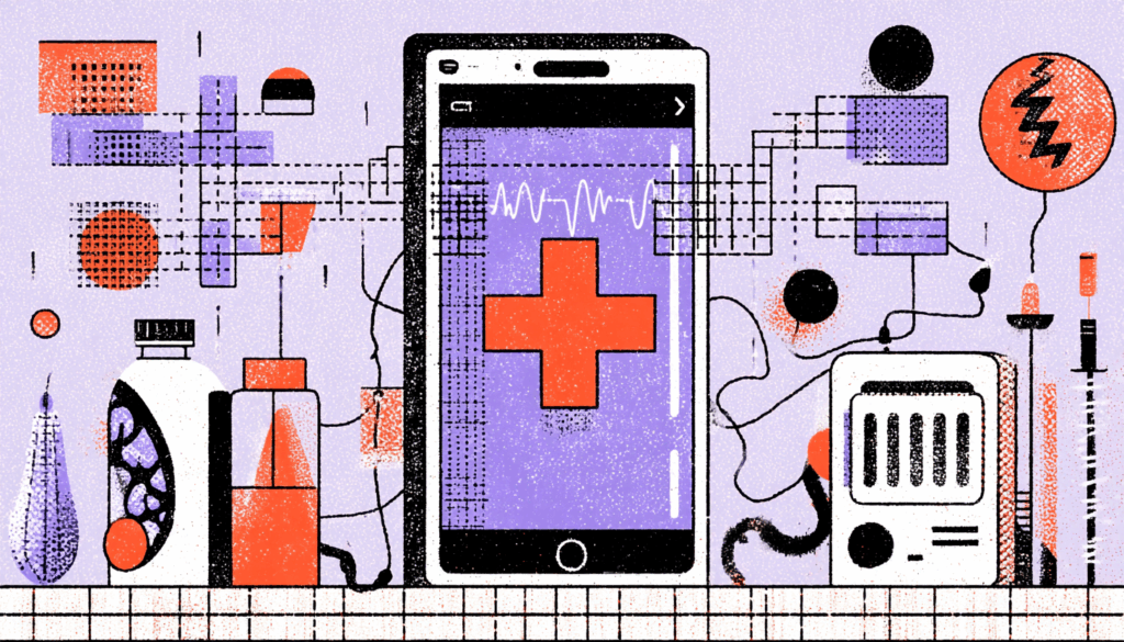
Why Accessibility in Healthcare Apps Matters More Than Ever
Imagine this: you’ve just downloaded a healthcare app to refill your prescription, yet the buttons are not labeled for your screen reader. Or imagine trying to schedule a telehealth appointment when you can’t hear the audio instructions and there are no captions. What should be a seamless experience suddenly turns into a digital brick wall.
For patients with disabilities, such an incident isn’t just a small inconvenience—it can be a matter of health and safety. Accessibility in healthcare apps is no longer optional. It’s the digital equivalent of building wheelchair ramps into hospitals. Only now, those ramps have features like text-to-speech, clear navigation, and captioned video calls.
The stakes? Immense. Healthcare is not a shopping app where frustration means abandoned carts. Here, inaccessibility could mean missed medication, delayed treatment, or even life-threatening consequences. That’s why inclusive design in healthcare is more than UX best practice—it’s a moral obligation.
So, how do we get it right? Let’s dive into the design principles, tactics, and real-world examples that can help us build accessible healthcare apps for patients with diverse needs.
Understanding Patient Needs in Accessible Healthcare App Design
Types of Disabilities That Impact Digital Health Access
When designers think about accessibility, it’s tempting to picture a single “type” of disabled user. But reality is far richer and more complex. Disabilities come in many forms:
- Visual impairments: blindness, low vision, and color blindness.
- Hearing impairments: partial or total hearing loss.
- Motor disabilities: tremors, paralysis, limited dexterity.
- Cognitive challenges: dyslexia, ADHD, autism, and memory issues.
Each group interacts with digital tools differently. Someone with motor impairments may rely on voice commands. A patient with low vision might need scalable text and high-contrast interfaces. And those with cognitive challenges often benefit from simplified layouts and plain language.
The key takeaway? Accessibility isn’t about designing for “them.” It’s about designing for all of us—because disabilities may be permanent, temporary (like a broken arm), or situational (like trying to use an app under bright sunlight).
Why Accessibility Matters More in Healthcare Apps Than Other Apps
In healthcare, the stakes are higher than in almost any other industry. If you can’t order a meal in a food delivery app, you’ll find another option. But if you can’t access your medical records, test results, or emergency care instructions, your health could be at risk.
Accessibility in healthcare apps is like oxygen—unnoticed when available but catastrophic when absent.

Core Principles of Designing Accessible Healthcare Apps
1. Keep Healthcare App Interfaces Clean and Simple
Complexity is the enemy of accessibility. Overly cluttered screens, hidden menus, and confusing pathways create unnecessary barriers. We must minimize cognitive load for patients who may already feel stressed about their health.
Keep navigation predictable and consistent. Group related tasks (appointments, prescriptions, lab results) logically. Whenever feasible, simplify the process—if scheduling an appointment requires more than three taps, it may be overly complex.
Think of the interface as a hospital corridor: clean, uncluttered, and guiding patients directly to where they need to go.
2. Improve Readability with Adjustable Fonts and High Contrast
Accessibility starts with something simple: text readability. Use legible fonts and base sizes of at least 16 pixels and allow resizing without breaking layouts.
Contrast matters, too. Ever tried reading gray text on a slightly lighter gray background? Patients with visual impairments don’t just find it annoying—it’s impossible. Use tools like the WCAG contrast checker to ensure readability.
And don’t rely solely on color to convey meaning. A “red alert” needs an icon or label too. Otherwise, it’s invisible to color-blind users.
3. Support Screen Readers and Voice Navigation in Health Apps
Many patients rely on assistive technologies. That means your app must be screen reader-friendly.
- Label buttons descriptively (“Book Appointment” instead of “button1”).
- Structure content with headings so screen readers follow a logical flow.
- Write alt text for images describing their purpose.
The crucial step is to incorporate voice command support. For patients with motor disabilities, being able to say, “Book a doctor’s appointment for Monday” can mean independence instead of dependence.
4. Offer Multiple Input Options for Patients with Disabilities
Flexibility is inclusivity. Some patients prefer touch, others need keyboards, and others rely on voice. Offering multiple ways to complete the same task ensures no one is locked out.
Imagine a diabetic patient logging glucose levels: they should be able to type, dictate, or even select from preset options. The task remains the same, but the path adapts to the user.
5. Write in Plain, Patient-Friendly Language
Healthcare is filled with jargon: “hypertension,” “myocardial infarction,” and “contraindication.” Patients don’t need a dictionary—they need clarity.
Use plain language. Instead of “hypertension,” say “high blood pressure.” Say “Take your medicine on time” rather than “initiate medication adherence.”
The goal? Patients should understand their care instructions on the first read, without needing a medical degree.

Practical Accessibility Tactics for Healthcare App Developers
Using WCAG Guidelines for Healthcare App Compliance
The Web Content Accessibility Guidelines (WCAG) are your foundation. They outline four pillars: perceivable, operable, understandable, and robust. In simple terms:
- Can users see or hear the content?
- Can they operate the app easily?
- Is it understandable without confusion?
- Is it robust enough to work across assistive technologies?
Think of WCAG as the skeleton of accessibility. Your design decisions are the muscles that bring it to life.
Usability Testing with Patients with Disabilities
Design teams often fall into a trap: testing apps with colleagues instead of real users. But accessibility can’t be confirmed in a vacuum. Patients with disabilities are the true experts in using accessibility features.
Run usability tests with patients who rely on screen readers, captions, or voice commands. Watch where they struggle. Then iterate. Accessibility is less about guessing and more about listening and observing.
Going Beyond ADA and WCAG Compliance
Meeting WCAG is the floor, not the ceiling. What is the true objective? Empower patients with features that make healthcare simpler and more humane.
Some ideas:
- Text-to-speech summaries of lab results.
- Color-blind-friendly palettes for charts.
- Simplified mode for patients who want less clutter.
- Captioned telehealth calls with transcript exports.
Compliance keeps you legal. Empathy makes you memorable.
Telemedicine Platforms: Accessibility in Virtual Care
Take video consultations. For patients with hearing impairments, real-time captions aren’t optional—they’re vital. For patients with vision loss, the platform should integrate seamlessly with screen readers.
Want to go further? Allow patients to pin the doctor’s feed, enlarge visuals, or export notes after the session. That way, accessibility isn’t just reactive—it’s proactive.

Designing Healthcare Apps with Empathy and Emotional Accessibility
The Human Side of Digital Accessibility
Accessibility is not just technical checklists—it’s emotional design. Patients who feel excluded may lose trust in their providers. On the flip side, when they feel supported, they’re more likely to engage.
Imagine opening a health app that immediately asks:
“Would you like larger text, voice navigation, or captions enabled?”
That small touch shows empathy. It tells patients, “We thought of you before you had to ask.”
Designing Accessible Apps That Preserve Patient Dignity
Accessibility isn’t about charity; it’s about dignity. Patients don’t want reminders of their limitations. They want digital tools that treat them like capable, respected individuals.
The difference? An inaccessible app reminds them of what they can’t do. An accessible one empowers them to take control of their health.

Common Accessibility Pitfalls in Healthcare App Design
- Overusing Medical Jargon—Confuses more than it clarifies.
- Poor Color Choices—Stop relying on red vs. green.
- Ignoring Older Adults—Many accessibility needs overlap with aging.
- Assuming One-Size-Fits-All—Blindness ≠ dyslexia ≠ hearing loss.
- Treating Accessibility as a Checkbox—It’s an ongoing journey, not a deadline.
Accessibility is not something you “finish.” It’s something you maintain and evolve with your app.
Real-World Examples of Accessible Healthcare Apps
- Be My Eyes: Connects blind users with volunteers for real-time assistance. Imagine this model applied to patient portals.
- Microsoft’s Seeing AI: Translates the visual world into audio descriptions—what if lab results or prescriptions did the same?
- Epic’s MyChart: Patient portals with growing accessibility features like voice commands and improved screen reader support.
These apps prove accessibility is not only achievable but also scalable.
The Business Benefits of Accessible Healthcare Apps
Accessibility isn’t just ethical—it’s profitable. Here’s why:
- Wider patient base: More patients can use your platform.
- Legal protection: Avoid lawsuits under ADA or similar laws.
- Brand trust: Patients remember inclusive experiences.
- Better outcomes: Accessibility improves adherence, engagement, and satisfaction.
Think of accessibility as a long-term investment: it pays dividends in patient loyalty, reputation, and ROI.
The Future of Inclusive Healthcare App Design
Designing accessible healthcare apps for patients with disabilities isn’t just about ticking compliance boxes. It’s about building digital ramps that ensure no patient is left behind.
Every font choice, every input method, and every navigation pathway is a decision: Will this empower or exclude?
The future of healthcare is digital, but digital without accessibility isn’t progress—it’s just another barrier. By embedding empathy into design, we don’t just make apps usable. We make healthcare human.
So ask yourself: Am I building an app that empowers everyone, or am I leaving someone behind? In healthcare, that choice could make all the difference.