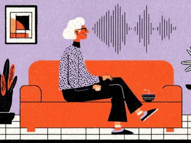


Imagine you’re a nurse on a 12-hour night shift. It’s 3 AM, the ward is understaffed, and you’re squinting at a medication management dashboard, trying to confirm whether that alert banner says “500 mg” or “5000 mg.” The font is small, the color is a dusty gray on a slightly less dusty white background, and your eyes have been working for nine hours straight. This isn’t a UX thought experiment. This is Tuesday in hospitals around the world.
Color contrast in healthcare UI isn’t just a design preference. It’s a patient safety issue. The World Health Organization estimates that medication errors harm 1.3 million people annually in the United States alone, and while bad UI design isn’t the sole culprit, it’s a documented contributing factor. When clinicians can’t quickly and accurately parse information on a screen, the margin for error widens dangerously.
What makes this especially frustrating is that the solutions are well-established. WCAG 2.1 guidelines, accessible color palettes, and contrast ratio tools have existed for years. Despite the availability of well-established solutions, healthcare software, including EHR systems, patient portals, and telehealth apps, continues to be released with contrast ratios that would leave an accessibility auditor in tears. The disparity between our knowledge and the actual construction is astonishing.
So let’s close that gap. This article is for the UX designers, product managers, and digital health teams who want to understand why readability and color contrast matter so profoundly in healthcare contexts and exactly what to do about it.
The Human Cost of Poor Contrast—More Than Just Aesthetics

When “Ugly” Becomes “Dangerous”
Most conversations about bad UI design end with someone saying “it’s just ugly” or “it’s not ideal.” In healthcare, that conversation needs to end differently. Poor color contrast creates genuine cognitive friction, and cognitive friction in clinical environments doesn’t just slow people down, it creates the conditions for error.
Consider the research. A 2020 study published in the Journal of the American Medical Informatics Association found that poor EHR usability was directly linked to clinician burnout and a measurable increase in documentation errors. Participants specifically cited visual fatigue from low-contrast interfaces as a compounding stressor. When you make a clinician work harder to read something, you’re spending their cognitive budget, and that budget is finite, especially during long shifts.
Consider it like RAM on a computer. Every time a user has to pause and squint, re-read, or second-guess what they’re seeing on screen, you’re using up working memory that should be reserved for critical clinical thinking. A nurse who spends three seconds reconfirming a drug dosage because the text is unclear is not only slower but also more mentally depleted for every decision that follows. Multiply that across hundreds of interactions per shift and you have a systemic fatigue problem baked directly into your design choices.
It gets worse when you factor in the user population. Healthcare workers are not a monolithic group of 25-year-old developers with perfect eyesight. They include doctors in their 50s and 60s with presbyopia, nurses who wear tinted safety glasses in certain wards, and pharmacists working under fluorescent lights that shift color perception. Your interface needs to work for all of them. Low contrast doesn’t discriminate, but it punishes the most vulnerable users hardest.
Understanding WCAG — The Baseline That Healthcare UI Keeps Ignoring
The Rules Exist. The Problem Is Following Them.
WCAG stands for Web Content Accessibility Guidelines, and it’s the international standard for making digital content accessible. For contrast specifically, WCAG 2.1 sets minimum requirements at a 4.5:1 contrast ratio for normal text and 3:1 for large text. WCAG AAA, the enhanced standard, pushes that to 7:1 for normal text. These aren’t arbitrary numbers. They’re derived from decades of vision science research.
Here’s what’s remarkable and somewhat damning: healthcare platforms are among the most egregious violators of these standards. A 2021 audit of the top 20 U.S. hospital patient portal interfaces found that 14 of them failed WCAG AA compliance on their primary navigation and critical alert components. These are the parts of the interface patients and clinicians interact with most. It would be almost funny if the stakes weren’t so high.
Why does this keep happening? Partly it’s a priority problem. Many healthcare software projects are driven by clinical requirements, regulatory compliance, and data architecture concerns, with UX and accessibility treated as a layer applied at the end rather than a foundation built in from the start. Partly it’s a procurement problem; hospital systems often buy enterprise software based on features and pricing, not accessibility scores. And partly it’s a knowledge gap. Developers and project managers who haven’t had accessibility training simply don’t know what 4.5:1 contrast looks like in practice or why it matters.
You can check contrast ratios in seconds with tools like WebAIM’s Contrast Checker, Stark (a Figma plugin), or Adobe XD’s built-in accessibility features. There is genuinely no technical reason to ship a healthcare interface that fails basic contrast requirements. It’s a process and culture problem, not a capability problem. And that should make us all a little uncomfortable.
Applying WCAG in Clinical Contexts: Beyond the Bare Minimum
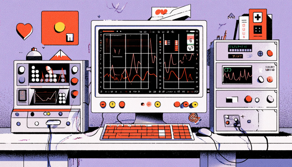
Meeting WCAG AA isn’t the finish line — it’s the starting line. In healthcare specifically, you should be designing toward WCAG AAA wherever possible, especially for high-stakes UI elements like medication dosages, allergy alerts, vital sign readings, and error messages. These aren’t decorative elements. They are the information that clinicians and patients make life-affecting decisions with.
Large text rules are also worth revisiting in clinical contexts. WCAG defines “large text” as 18pt regular or 14pt bold. But on a medical tablet mounted at the foot of a hospital bed, viewed from 1.5 meters away by a physician with reading glasses, “large text” might need to mean something completely different. Designing purely to the letter of WCAG without understanding the physical environment of your users is still a failure mode.
Color as Communication: How Healthcare UI Uses (and Abuses) Color Coding
Red Doesn’t Mean the Same Thing to Everyone
Healthcare interfaces love color coding. Red for critical alerts. Yellow for warnings. Green for normal ranges. It’s intuitive, it’s fast, and it maps neatly onto the mental models most people already carry. The problem? Roughly 8% of men and 0.5% of women have some form of color vision deficiency. In a hospital with 500 clinical staff, that could easily mean 30 to 40 people who cannot reliably distinguish your red warning from your green all-clear.
This isn’t a niche edge case. It’s a predictable characteristic of your user base. Epic Systems, one of the dominant EHR platforms in the US, has faced repeated criticism from clinicians with color blindness who struggle to differentiate alert severity levels that are communicated by color alone. The fix isn’t complicated: pair color with iconography, text labels, or pattern differentiation. But it requires someone in the design process to ask the question: “What happens when a user can’t see the color?”
Color also behaves differently across screens and environments. A red that pops vividly on an OLED design monitor in a studio looks entirely different on a washed-out LCD screen in a brightly lit ICU with sunlight glare. Healthcare UI designers need to test their work under real conditions, not just in Figma with a calibrated display. Grab a tablet, go to an actual clinical environment, and look at your interface. You’ll be humbled. And probably horrified.
Building Redundancy into Color Systems
The principle to internalize here is: never let color be the only signal. This concept has a name in accessibility: avoiding sole reliance on color for meaning. The practical application is building redundancy into every status-communicating element of your UI. Critical alerts should be red AND bold AND accompanied by a clear text label AND an icon. Normal readings should be green AND marked with a checkmark AND labeled as “within normal range.”
Think of it like aviation. Airplane cockpits use multiple overlapping signal systems, audio, visual, and haptic, precisely because no single channel is reliable in all conditions. Your healthcare UI is also a high-stakes control environment. Design it accordingly.
This also helps in other edge cases beyond color blindness. Nurses reviewing charts in low-light conditions, physicians glancing at a screen while also speaking to a patient, or patients accessing a health portal on a cheap Android phone with a dim screen—all of these users benefit from redundant communication systems built into your color choices.
Designing for the Full Spectrum: Patients, Not Just Clinicians

Your Patient Users Have Different Needs Than Your Clinical Users
Clinicians are trained to interpret clinical interfaces. They can decode abbreviations, navigate dense information architecture, and work with complex workflows. Patients cannot. And when patients are accessing healthcare platforms, booking appointments, reviewing test results, or managing chronic conditions, they’re often doing so while anxious, medicated, or unwell. Their cognitive load is already high. Your interface needs to be dramatically more readable than what you might design for clinical users.
Consider the demographics. According to the CDC, adults over 65 are the heaviest users of healthcare services, and they are also the population most likely to have age-related vision changes, reduced contrast sensitivity, yellowing of the lens, and reduced ability to distinguish blue from green. Patient portals designed without this population in mind are effectively excluding the people who need them most. MyChart, one of the most widely used patient portals in the US, has improved significantly in recent years, but early versions were notorious for small fonts and low-contrast help text that left elderly users completely stranded.
This isn’t just a moral argument, although it is absolutely that. It’s also a business and regulatory argument. The ADA (Americans with Disabilities Act) and Section 508 of the Rehabilitation Act create legal obligations around accessibility for healthcare providers receiving federal funding. That covers nearly every major healthcare system in the US. Non-compliance isn’t just an ethical failure—it’s a liability.
Practical Design Decisions That Transform Patient Readability
Let’s get concrete. For patient-facing healthcare interfaces, you should be targeting a minimum 4.5:1 contrast ratio everywhere and pushing toward 7:1 for body text. Font size should be a minimum of 16px for body content, not the 12px or 14px that still haunts too many patient portals. Line height is crucial for readability; aim for at least 1.5 times the font size. And please, stop using light gray text on white backgrounds for secondary information. If it’s in your interface, it deserves to be read.
Buttons and interactive elements deserve special attention. A “Confirm Appointment” button that’s a pale blue on a white background isn’t just low contrast; it’s also not communicating affordance effectively. Patients need buttons that look obviously clickable, with text that’s immediately legible, in colors that have been tested for both contrast compliance and colorblind-accessible visibility.
Typography choices compound these issues. Thin-weight typefaces like certain light variants of system fonts look elegant on design mockups and become nearly invisible to users with vision impairments viewing them on consumer-grade screens. Stick to medium or regular weight at minimum for any content that matters, and in healthcare, all content matters.
Designing healthcare UI with strong color contrast and readability isn’t an optional enhancement or a box-checking exercise. It is, at its core, an act of care for the people who use your product. Every clinician who can instantly read a drug dosage without squinting is a clinician with more cognitive capacity for the patient in front of them. Every elderly patient who can navigate their test results without calling the helpdesk is a patient who feels more empowered and less anxious. Every accessibility decision you make ripples outward into real human outcomes.
The tools are there. The guidelines are clear. What’s needed now is the will to prioritize this work, to make contrast audits a non-negotiable part of every design review, to include color blindness simulation as a standard QA step, to test in real clinical environments, and to treat accessibility as a first-class feature rather than a last-minute polish. Healthcare deserves better than what we’re currently building. And your users, every single one of them, deserve to be able to read your interface without having to fight for it.