


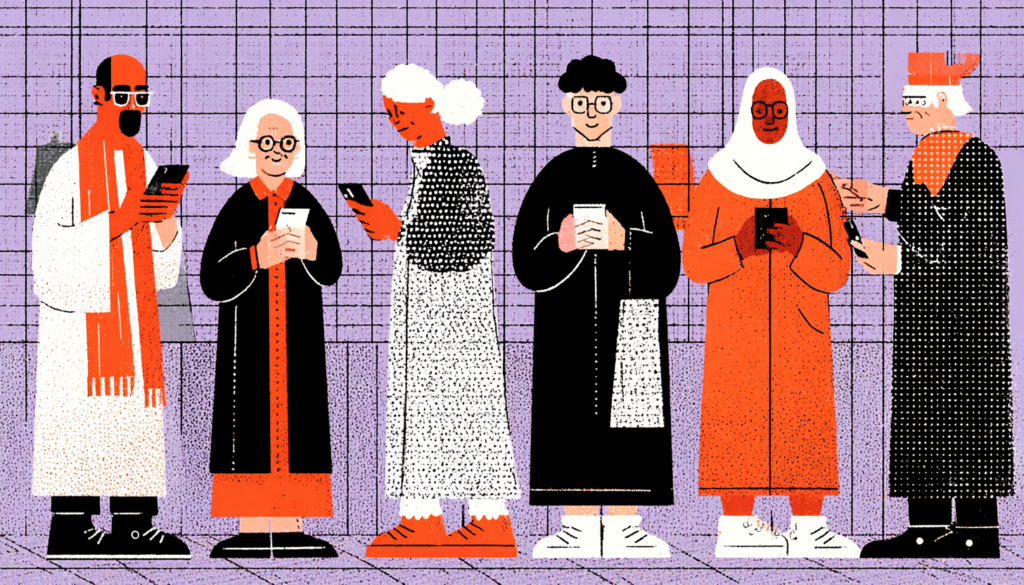
There’s a quiet crisis happening in digital health right now. Millions of people—elderly patients, users with disabilities, those with limited English proficiency, and people with low digital literacy—are logging into patient portals, telehealth apps, and health management platforms every day and walking away confused, frustrated, or completely shut out. We’ve built these magnificent digital cathedrals of healthcare technology and then forgotten to put in a ramp.
Consider this: according to the World Health Organization, over one billion people worldwide live with some form of disability. The CDC reports that 27% of American adults have a disability that impacts major life activities. Now layer on the fact that healthcare is typically the *most* high-stakes, high-stress digital experience a person will ever have. You’re not just trying to book a dinner reservation—you’re navigating a medication refill at 2am, trying to understand a diagnosis, or coordinating care for an aging parent from across the country. The margin for UX error here isn’t just bad business. It’s a genuine public health issue.
And yet, most healthcare UX teams are still designing for a mythical “average user”—typically imagined as a reasonably healthy, tech-savvy adult in their 30s or 40s, with perfect vision, reliable internet, and English as a first language. That person exists, sure. But they’re a minority of the actual population that uses these products. The rest of the users—your grandmother, your neighbor who recently immigrated, your colleague managing chronic fatigue—are left to fend for themselves in interfaces that weren’t built with them in mind.
This article is about changing that. We’re going to dig into what inclusive UX actually means in a digital healthcare context, why it’s harder (and more important) than in almost any other domain, and what you can do—practically, right now—to make your product work for everyone who needs it. Not just the easy users. All of them.
Understanding the Full Spectrum of Healthcare Users
Why “Edge Cases” Are Actually the Core Use Case
Here’s a mental model shift that changes everything: in digital healthcare, the people we typically call “edge cases” are actually central to the entire mission. The 70-year-old man managing five chronic conditions isn’t an outlier; he’s one of the most frequent users of healthcare systems, both digital and physical. The parent with postpartum depression trying to schedule a therapy session at midnight isn’t a corner case—she’s exactly who these platforms exist to serve.
The concept of the “curb cut effect” is worth understanding deeply here. When cities started adding curb cuts to sidewalks for wheelchair users in the 1970s, something unexpected happened: everyone started using them. Parents with strollers, delivery workers with carts, cyclists—they all benefited. Designing for accessibility didn’t narrow the product’s usefulness. It expanded it. The same principle applies in digital health. When you design a medication tracker that works for someone with early-stage Parkinson’s—with larger tap targets, voice input, and reduced cognitive load—you’ve also built a better experience for every other user on the platform.
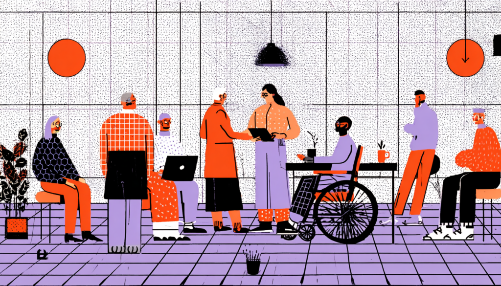
Let’s be precise about who we’re actually designing for. We’re talking about users with visual impairments (roughly 246 million people globally have moderate to severe vision loss, per WHO). Users with cognitive disabilities, including ADHD, dementia, and traumatic brain injury. Users with motor impairments who can’t easily tap small buttons or scroll through long pages. Users experiencing acute distress—anxiety, grief, chronic pain—which temporarily degrades anyone’s cognitive performance. And users navigating all of this on a 5-year-old Android device with a cracked screen and spotty LTE. That’s your real user base.
The Cognitive Load Problem in Health Interfaces

How Complexity Becomes a Health Hazard
Cognitive load, the mental effort required to process information, is the silent killer of healthcare UX. And it’s especially pernicious in health contexts because the people who most need clear, simple interfaces are often experiencing exactly the conditions that reduce cognitive capacity. Pain clouds thinking. Anxiety narrows attention. Grief makes even familiar tasks feel impossible. When you’re designing a discharge instruction portal for post-surgery patients, you’re designing for someone who just spent three days in a hospital, is on pain medication, and is terrified about their recovery. That’s your cognitive baseline. Design for that.
MyChart, one of the most widely used patient portal platforms in the US, has made notable improvements over the years — but it still regularly presents users with dense medical terminology, multi-step workflows, and interface patterns that require significant prior knowledge to navigate. Imagine trying to interpret an after-visit summary full of ICD-10 codes and clinical shorthand when you’re still processing an unexpected diagnosis. Studies published in the Journal of the American Medical Informatics Association have found that low health literacy, which affects nearly 36% of American adults, is directly correlated with worse health outcomes, and confusing digital interfaces dramatically compound that problem.
The solution isn’t dumbing things down. It’s being strategic about information hierarchy. Progressive disclosure is your best friend here. Lead with what the user needs to do right now—take this medication, attend this appointment, or call this number. Tuck the detailed clinical context behind a “Learn more” expansion. Use plain language standards: the CDC recommends writing health content at a 6th-grade reading level. Break complex processes into clearly numbered steps. And ruthlessly audit your interfaces for jargon. “Referral authorization pending” means nothing to most patients. “We’re waiting for your insurance to approve your specialist visit” means everything.
Accessibility Is Not Optional — It’s the Infrastructure

Building WCAG Compliance Into Your Design DNA
Let’s talk about the Web Content Accessibility Guidelines—WCAG—because understanding them as a floor rather than a ceiling changes how you approach the whole problem. Most teams treat WCAG 2.1 AA compliance like a checklist they run through before launch. Pass the contrast ratio test. Add alt text to images. Done. But real accessibility isn’t a pre-launch audit. It’s a design philosophy baked into every decision from the very first wireframe.
What does that look like in practice? It means your color system is designed with color blindness in mind from day one — not retrofitted with a “color blind mode” as an afterthought. Approximately 8% of men and 0.5% of women have some form of color vision deficiency, which means using red/green alone to indicate critical health status changes, like a medication warning or an abnormal lab result, is a real accessibility failure with real health consequences. It means every interactive element has a focus state that’s visible without a mouse. It means your forms—notoriously brutal in healthcare, with their endless intake questionnaires—support autofill, have clear error messages that explain how to fix the problem, and don’t time out on users who type slowly.
Screen reader compatibility deserves its own paragraph because it’s where so many healthcare platforms catastrophically fail. ARIA labels, semantic HTML, logical tab order, descriptive link text that works out of context (“Click here” tells a screen reader user nothing; “Download your lab results from March 12” tells them everything)—these aren’t advanced accessibility features. They’re table stakes. Tools like Axe, NVDA, and Apple’s built-in Voice Over should be part of your regular QA cycle, not a specialized accessibility review that happens twice a year. And critically: test with actual users who use assistive technology. Nothing replaces watching a real person navigate your interface with a screen reader to reveal gaps that automated tools will never catch.
Language, Culture, and the Invisible Barriers in Health Tech
Designing for Cultural Safety, Not Just Translation
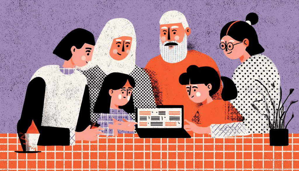
Here’s something that gets overlooked constantly in digital health design: translation is not localization, and localization is not cultural safety. You can translate every word in your app into Spanish and still completely fail your Spanish-speaking users if the underlying mental models, interaction patterns, and health concepts are built entirely around Western, individualistic healthcare assumptions. Healthcare is deeply cultural. How people relate to authority figures like doctors, how they make healthcare decisions (often as a family unit, not as an individual), how they conceptualize illness and treatment—all of this varies enormously across cultures, and your interface either accounts for that or it doesn’t.
The US has over 67 million people who speak a language other than English at home. The UK, Canada, and Australia have similarly multilingual populations. And yet the vast majority of digital health platforms default to English-only, with machine-translated alternatives that range from adequate to medically dangerous. Consider this: a medication instruction that reads naturally in English can, when poorly translated, describe the exact opposite of the intended dosing schedule. These aren’t hypothetical risks. Research published in JAMA has documented medication errors linked to language barriers in healthcare settings, and digital interfaces are increasingly part of that chain.
What does genuinely inclusive multilingual design look like? It starts with involving bilingual and bicultural research participants in your user research—not as translators, but as primary participants who shape the research questions. It means hiring professional medical translators, not relying on Google Translate or bilingual staff members who happen to be available. It means testing your translated interfaces with native speakers across literacy levels, because translating complex English health content into equally complex Spanish doesn’t solve the problem. And it means thinking about the cultural framing of your content—for example, some cultures have significant stigma around mental health that affects how users engage with behavioral health features. Surfacing a “mental health check-in” prominently on a dashboard might feel supportive to some users and deeply alarming to others. Cultural safety means designing for that nuance.
Inclusive Design in Practice: Testing, Iteration, and the Real Work
Building Research Practices That Actually Include Everyone
You cannot design inclusively for people you’ve never talked to. This sounds obvious, but the research pipelines at most digital health companies are quietly, systematically excluding exactly the populations they’re supposed to serve. Recruiting through social media skews young and digitally comfortable. Running sessions only in English excludes non-native speakers. Holding interviews via video call excludes people with unreliable internet or low comfort with video technology. Paying participants through digital gift cards excludes people without bank accounts. Every one of these decisions filters out a category of users you need to hear from.
Building inclusive research practices requires deliberate effort. Partner with community health clinics, senior centers, disability advocacy organizations, and refugee resettlement agencies to recruit participants who reflect the actual user population. Offer multiple participation formats in-person, by phone, or asynchronously so that people with mobility limitations, limited technology access, or demanding schedules can participate. Pay participants fairly in formats they can actually use. Provide interpreters or conduct research in participants’ preferred languages. And crucially, don’t just recruit diverse participants and then run the same research script you’d use with anyone else. Adapt your methods. Use think-aloud protocols with simpler prompts. Allow longer session times. Design tasks that reflect the real health contexts these users navigate.
Then there’s the question of what you do with what you learn. Inclusive research insights have a way of getting deprioritized in product roadmaps when they conflict with engagement metrics or business goals. An elderly user who needs a fundamentally simplified interface isn’t going to be captured in your standard funnel analytics; they’ve already dropped off before you started measuring. Building advocacy for inclusive design within your organization means making the business case clearly: in the US, the disability market alone represents $490 billion in annual disposable income, per the American Institutes for Research. Healthcare organizations that serve diverse populations more effectively see measurably better health outcomes, lower readmission rates, and stronger patient loyalty. Inclusive design isn’t charity. It’s strategy.
Inclusive UX in digital healthcare isn’t a feature; it’s the foundation. When we design products that work only for the most privileged, most able, most digitally fluent slice of the population, we aren’t just failing users. We’re actively widening health disparities that already cost lives. The good news is that the design tools, research methodologies, and technical standards to do this well already exist. What’s missing in most organizations is the will to treat every person who needs healthcare—which is eventually all of us—as a user worth designing for. The curb cut is waiting to be built. The question is whether your team will pick up the chisel.