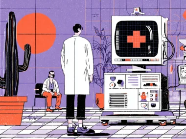


There’s a moment every patient knows. You’re sitting in a waiting room, trying to pull up your lab results on your hospital’s patient portal, and the app either crashes, asks you to reset your password for the fourth time this year, or buries the information you need under six different menus. You give up. You wait for the doctor to just tell you. The portal—the tool that was supposed to make healthcare more accessible—has made you feel more helpless than before.
This isn’t a fringe experience. A 2021 study published in the Journal of the American Medical Informatics Association found that nearly 40% of patients who were given access to a patient portal never used it after their first login. And among those who did use it, satisfaction scores were consistently among the lowest of any digital product category. We’re talking about software that manages some of the most important information in a person’s life — and it routinely fails basic usability tests that a mid-tier e-commerce app would never get away with.
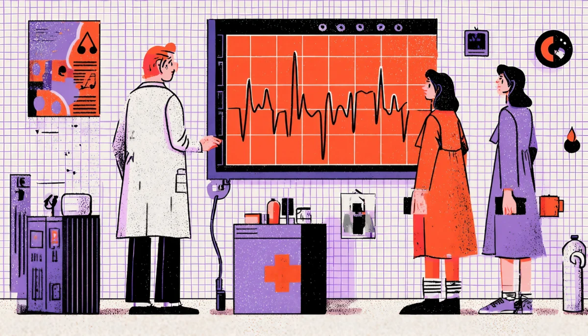
The tragedy here is that the stakes couldn’t be higher. When patients can’t navigate their health records, they miss follow-up appointments, misunderstand medication instructions, delay care, and disengage from their health management. For clinicians stuck with clunky EHR interfaces, the consequences are even more severe. Physician burnout is now directly linked to poor EHR design. A landmark 2019 Mayo Clinic study found that every hour physicians spend with patients, they spend nearly two hours on EHR documentation. Bad UX isn’t just an inconvenience in healthcare—it’s a patient safety issue.
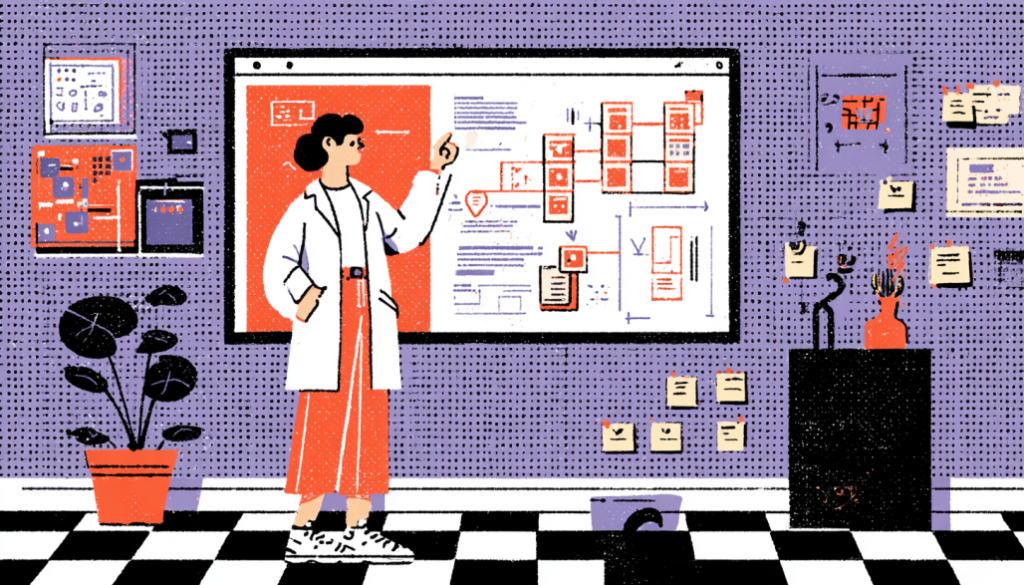
So what does good UX actually look like in this space? How do we design patient portals and EHRs that people genuinely want to use and that make healthcare safer, clearer, and more human?
Understand Who You’re Actually Designing For: It’s Not One Person
The Myth of the “Average Patient”
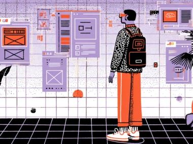
Here’s something that trips up almost every healthcare product team: they design for an imaginary average user. Maybe it’s a tech-savvy 35-year-old who owns a smartphone and has decent health literacy. But the real users of patient portals span an enormous range. You have elderly patients managing multiple chronic conditions who may have never owned a smartphone. You have parents managing health records for several children simultaneously. You have people with low health literacy who don’t know what “creatinine levels” means or why their “eGFR” should concern them. You have non-native English speakers, people with visual impairments, and patients in acute emotional distress trying to understand a scary diagnosis.
Designing for the “average” in healthcare is a bit like designing a single pair of shoes for everyone in a marathon and expecting them all to finish. It doesn’t work. Deep, segmented user research, including actual interviews with elderly patients, people managing chronic illness, caregivers, and clinicians, uncovers the real friction points for each group. When Epic Systems conducted usability research with real clinician users in redesigning parts of their EHR interface, they found that nurses and physicians had almost completely different mental models of the same workflow. What felt intuitive to one group was a maze to the other.
The actionable takeaway? Build distinct personas—not marketing personas with names and stock photos, but research-grounded behavioral archetypes. A “first-time portal user post-surgery” has entirely different needs than a “chronic disease patient checking weekly lab trends.” Design for the edges, not the middle. When you solve for your most challenged users, you almost always improve the experience for everyone else too. This is the curb-cut effect applied to digital health: ramps built for wheelchair users also help parents with strollers, cyclists, and delivery workers.
Simplify Information Architecture So Patients Can Actually Find Things
The Navigation Problem Is Deeper Than You Think
Ask yourself: when was the last time you saw a patient portal with navigation that made sense on the first try? Most portals bury critical information—test results, upcoming appointments, medication lists, and billing—in category systems that reflect how the hospital is organized internally, not how patients think about their health. This is a classic case of organizational thinking bleeding into product design. The lab department owns the lab results, so they go in the “Labs” section. Imaging is in “Imaging.” And the patient, who just wants to know, “what did my doctor find out about me this week,” has to become an amateur healthcare administrator to piece it together.
The fix starts with card sorting and tree testing—foundational IA research techniques that are criminally underused in healthcare UX. When you hand patients a set of cards representing different portal features and ask them to group them the way they naturally would, you almost always see the same pattern: patients organize around questions and life events, not clinical categories. “What’s wrong with me?” “What do I need to do next?” “What medications am I taking?” “What did my doctor say?” These are the mental models your navigation should mirror. MyChart, for all its shortcomings, has made some progress here by introducing a “To Do” section that aggregates action items from across the system. It’s not perfect, but it’s thinking in the right direction.
Progressive disclosure is another underused tool. Not every patient needs to see every piece of information all at once. A newly diagnosed diabetic checking their portal for the first time doesn’t need to see three years of encounter notes and a full problem list—they need a clear, prioritized view of what’s most relevant right now. Think about how well Google Maps does its job: it shows you the most critical information (where you are and where you’re going) and lets you drill down into details only when you want them. Patient portals should work the same way. Show the summary. Let curiosity and necessity drive depth.
Write for Humans, Not for Healthcare Administrators
Clinical Language Is a UX Problem
Let’s be blunt: the language used in most patient portals is genuinely harmful. When a patient reads “Leukocyte count: 11.2 K/uL—Reference range: 4.5–11.0” without any context, they either panic or dismiss it. Neither response is clinically useful. Health literacy in the United States is lower than most healthcare organizations assume — the National Assessment of Adult Literacy found that only 12% of U.S. adults have proficient health literacy. That means the vast majority of your users are struggling with the language you’re serving them by default.
This is a content design problem, and content design is part of UX. Every label, every outcome interpretation, every automated message that goes to a patient is a design decision. Currently, clinical or technical teams make most of those decisions without the presence of a UX writer or content strategist. The result is a portal full of jargon, passive voice, and acronyms that create anxiety without providing clarity. Compare “Your HbA1c result is 7.8%, which is above the reference range of 4.0–5.6%” with “Your blood sugar control over the past 3 months was slightly above the healthy range. Talk to your doctor about what this result means for you. Same data. Entirely different emotional and cognitive experience.
The good news is that plain language in healthcare has a proven ROI. A study published in Patient Education and Counseling found that patients who received plain language health information had significantly better comprehension, higher satisfaction, and better adherence to care plans. Apps like Buoy Health and Apple Health Records have shown that it is possible to turn clinical data into simple, useful language without losing accuracy. The challenge is building such clarity into the content governance of the product—not as a one-time copy edit, but as an ongoing standard that applies to every string of text in the system.
Design for Emotional States, Not Just Task Completion
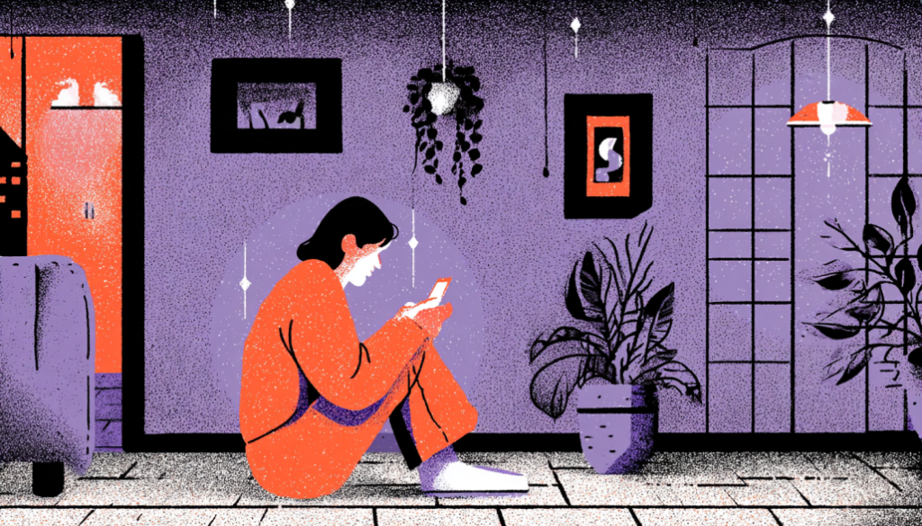
Healthcare Isn’t a Productivity App
Here’s a truth that most enterprise software design ignores entirely: people interacting with patient portals are often scared, confused, grieving, or in pain. They’re not in a neutral headspace trying to complete a task efficiently. They may have just received a cancer diagnosis through a MyChart notification before their doctor had a chance to call them, which is a real and documented problem that made headlines in 2021 when EHR systems began releasing test results to patients immediately. The UX of delivering emotionally charged information matters enormously, and almost no portal is designed with this scenario in mind.
Emotional design in healthcare isn’t about making things look pretty or adding cute illustrations (though visual design matters too). It’s about anticipating the emotional context of your user at every touchpoint and designing the experience accordingly. It means thinking about what happens right after a patient reads a distressing result: Is there a clear next step? Is there a way to promptly message their care team? A link to educational resources that are calming and informative rather than alarming? Or does the portal just show the result and leave the patient in a void? Anxiety fills voids. Good UX fills them with reassurance and direction.
Micro-interactions and tone matter here more than most product teams realize. The difference between “No upcoming appointments” and “You don’t have any upcoming appointments scheduled. Want to book one?” is enormous when you’re a patient who’s supposed to be following up on a chronic condition. The first message is a dead end. The second is a gentle nudge that respects the user’s autonomy while moving the healthcare relationship forward. Companies like Calm and Headspace have mastered the art of emotional UX — healthcare products need to learn from consumer apps that have deeply studied how to meet users in their emotional state and guide them forward with warmth. The clinical context is different, but the human need for reassurance and clarity is exactly the same.
Reduce EHR Cognitive Load for Clinicians Before It Costs Lives
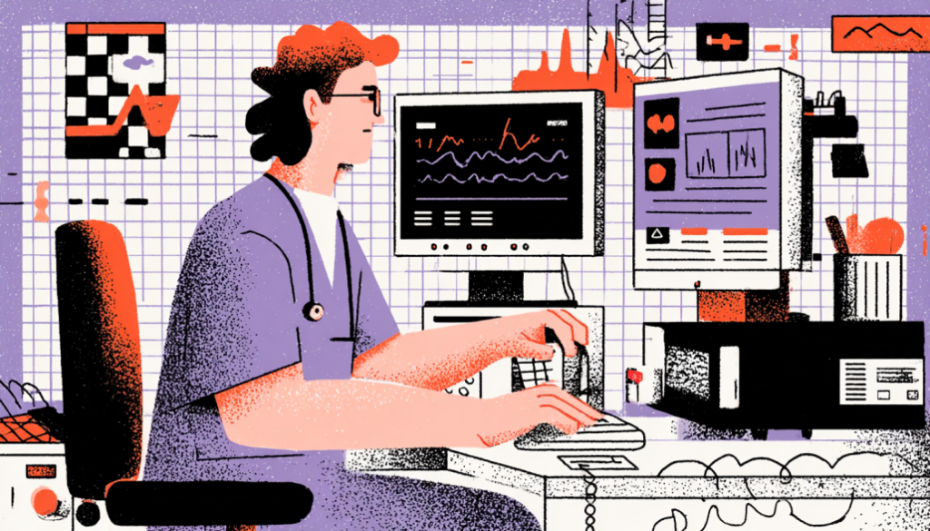
When Bad UX Becomes a Patient Safety Issue
Physician burnout is one of the most urgent crises in modern healthcare, and EHR design is one of the leading contributors. The American Medical Association has explicitly identified “EHR usability” as a key driver of physician burnout, and the evidence is damning. In a study published in the Annals of Internal Medicine, physicians spent an average of 4.5 hours per day on EHR tasks during an 11-hour workday. That’s not just time stolen from patients — it’s a cognitive tax that accumulates fatigue, increases error rates, and drives talented clinicians out of medicine entirely. Bad UX, in this context, is a public health problem.
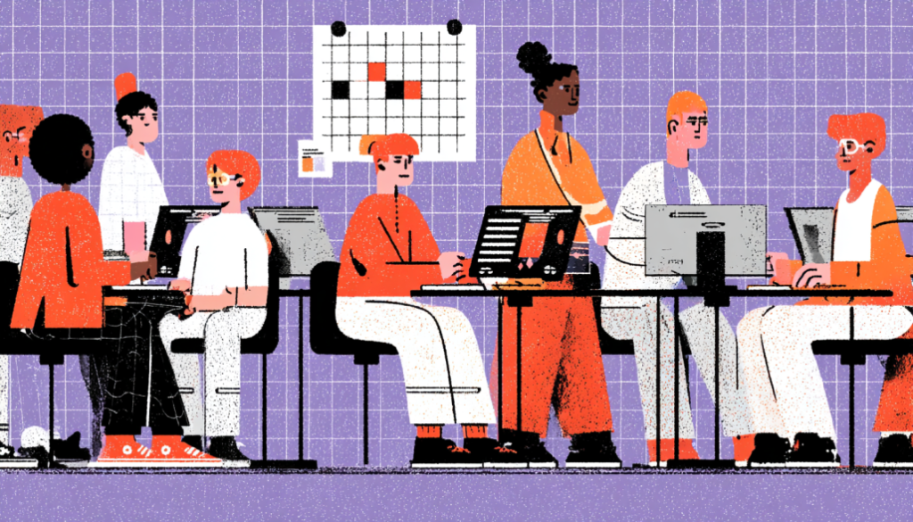
The core issue is cognitive load. EHR systems like Epic, Cerner, and Meditech were built over decades, with features layered on top of features, and the result is interfaces of staggering complexity. Clinicians face alert fatigue, a well-documented phenomenon where the sheer volume of pop-up notifications and warnings causes users to start ignoring them entirely, including the critical ones. A 2019 study in JAMA Network Open found that physicians overrode 69% of drug-drug interaction alerts in one large health system. When everything is urgent, nothing is. This is a design failure with potentially fatal consequences.
The solutions here draw from established UX principles that are standard in other high-stakes industries. Aviation and air traffic control industries, where cognitive overload can be equally catastrophic, have developed rigorous interface standards around information prioritization, alert hierarchization, and minimizing unnecessary decision points during high-pressure moments. Healthcare UX can and should borrow from these playbooks. Concretely, this means smarter alert systems that surface only the most critical warnings during active patient care, better data visualization for patient histories (timelines instead of endless scrollable lists), one-click documentation shortcuts, and AI-assisted note drafting tools like Nuance DAX that reduce documentation burden without sacrificing accuracy. This isn’t futurism—it’s available now, and the design teams who embrace it are already seeing measurable reductions in clinician fatigue and error rates.
The patient portal and EHR space are one of the most consequential frontiers in UX design today—and also one of the most neglected. We’ve spent decades perfecting the checkout flow on e-commerce sites and the onboarding experience for productivity apps, while the software that manages human health and clinical decisions has lagged decades behind. But that gap is closing, and it’s closing because designers, product managers, and healthcare organizations are finally recognizing that UX isn’t a luxury in healthcare—it’s infrastructure. Every improvement you make to navigation clarity, content language, emotional design, and clinician workflow directly translates into better health outcomes, safer care, and a more human experience for patients at their most vulnerable moments. The work is hard, the regulatory environment is complex, and the legacy systems are daunting. But the users on the other side of these interfaces are counting on you to get it right.