


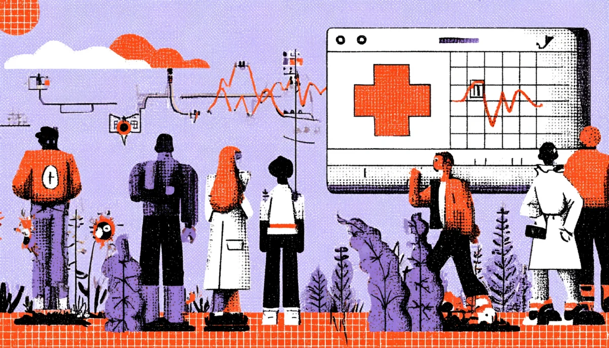
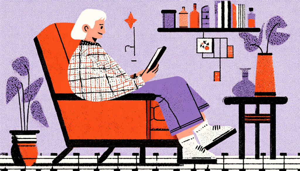
There’s a moment every designer dreads. You’ve built a patient portal that looks clean, functions beautifully, and passed every internal review with flying colors. Then you watch a real patient use it for the first time, someone who reads at a sixth-grade level, maybe, or whose first language isn’t English, and you realize they can’t find their own test results. Designing for low-literacy patients isn’t an edge case; it’s the core challenge of healthcare UX. They’re clicking in circles. They look embarrassed. They give up. That moment? That’s a design failure, not a user failure.
The numbers behind this problem are genuinely staggering. According to the National Assessment of Adult Literacy, approximately 36% of American adults have basic or below-basic health literacy, meaning they struggle to read a prescription label, understand a discharge summary, or interpret a blood test result. Globally, the World Health Organization estimates that low health literacy costs the US healthcare system between $106 and $238 billion annually. These aren’t fringe edge cases. They are the majority of your users.
And here’s the thing that makes the situation particularly frustrating: the healthcare industry is notorious for producing some of the most literacy-demanding documents on earth. Informed consent forms written at a 16th-grade reading level. Patient portals that bury critical information under dropdown menus and medical jargon. Medication instructions that assume users know what “contraindicated” means. We design for the doctor, not the patient, and then we wonder why health outcomes don’t improve.
This article is a deep dive into what genuinely good UX for low-literacy patients looks like—not the watered-down, condescending version, but the thoughtful, research-backed approach that respects users while meeting them where they are. Whether you’re designing a telehealth app, a hospital patient portal, or a medication management tool, these principles will change how you think about every single design decision.
Understanding Your Actual Users: The Literacy Spectrum Is Wider Than You Think
Why “Average User” Is a Myth That Hurts Real People
Let’s kill a comfortable myth right now. There is no average patient. When UX teams build personas around a fictional 40-something professional with a college degree and reliable broadband, they’re designing for a demographic that represents a fraction of people actually seeking medical care. The patients who interact most frequently with healthcare systems, elderly adults, people managing chronic illnesses, and individuals from lower socioeconomic backgrounds are statistically more likely to have lower literacy levels and less digital fluency. You’re designing for exactly the wrong person.
The literacy spectrum in healthcare is nuanced and layered in ways that pure reading-level metrics don’t capture. You might have a highly intelligent 68-year-old retired mechanic who reads perfectly well but has never used a touchscreen interface in a clinical setting. You might have a 35-year-old college graduate who reads fluently in Spanish but struggles with English medical interfaces. You might have a 22-year-old with dyslexia who navigates TikTok effortlessly but falls apart when confronted with a dense wall of paragraph text in a patient portal. Literacy in healthcare isn’t just about reading words; it’s about processing complex, emotionally charged information under stress.
This is why proper user research is non-negotiable. Not a quick survey with leading questions. Real contextual inquiry. Watch people in actual clinical settings. Recruit participants who represent the true population of your users, including older adults, people with limited English proficiency, and those with cognitive or learning disabilities. Organizations like the Nielsen Norman Group have repeatedly shown that testing with just five users will expose the majority of usability issues, but only if those five users actually represent your real audience diversity. If you’ve never done a usability test with a low-literacy participant, your design is guessing.
Reading the Room: Environmental and Emotional Literacy Barriers
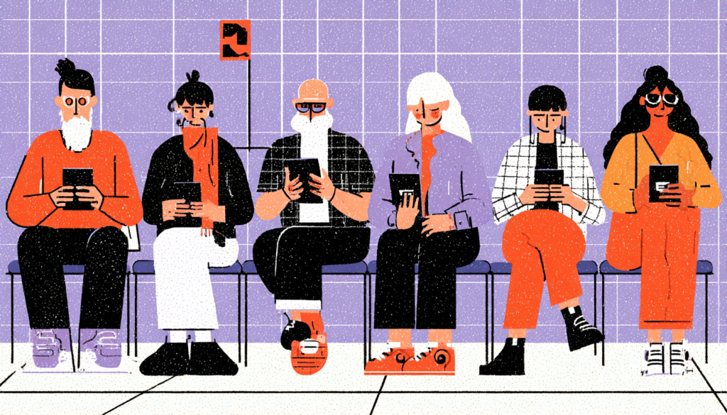
Here’s something most UX teams miss entirely: the context in which patients interact with medical information is fundamentally different from virtually any other digital experience. Someone using your patient portal isn’t doing it from a comfortable couch with a cup of coffee and plenty of time. They’re likely in a waiting room, anxious, possibly in pain, and may have just received difficult news. Or they’re at home at 11pm panicking about a symptom. Cognitive load isn’t just about reading level; it’s about emotional state, and fear is one of the most powerful cognitive load amplifiers there is.
Research from the fields of health psychology consistently shows that anxiety dramatically reduces working memory capacity. A patient who reads at an eighth-grade level may effectively function at a fourth-grade level when told they need a biopsy. This isn’t a literacy problem anymore; it’s a design problem. Your interface needs to perform for users whose cognitive resources are under siege. That means radical simplicity. It means one clear action per screen. It means error messages that never make someone feel stupid. It means progress indicators so the user never feels lost.
Environmental barriers compound these challenges further. Many low-income patients access healthcare apps on older smartphones with cracked screens, limited data plans, and unreliable connections. Dark mode designed for an OLED iPhone looks terrible on a three-year-old Android with a scratched screen protector. Forms that auto-submit or time out are catastrophic for users who type slowly. Designing for the best-case hardware environment is the digital equivalent of putting your clinic’s entrance at the top of a long flight of stairs and calling it accessible.
Plain Language Is Not Dumbing Down — It’s Precision Engineering
The Science and Craft of Writing for Everyone
Plain language has a PR problem. Mention it in a meeting and someone inevitably says, “But we don’t want to talk down to our users.” This misunderstands what plain language actually is. Plain language isn’t simple language; it’s precise language. It’s the difference between “Take this medication orally once daily in the morning with food” and “Take one pill by mouth every day in the morning; eat something first.” The second version isn’t less accurate. It’s more accurate because more people can act on it correctly.
The Plain Language Action and Information Network (PLAIN) and the Centers for Disease Control both offer evidence-based guidelines for health communication. The core principles are well-established: use active voice, favor short sentences, lead with the most important information, define any technical terms immediately, and use the second person (“you”) to make instructions feel direct and personal. A landmark study published in the Journal of General Internal Medicine found that simplifying patient instructions from a 10th-grade reading level to a 6th-grade reading level improved patient comprehension by over 40%—without any reduction in information completeness.
Think of it like this: a surgeon doesn’t use crude tools because they’re simple. They use precise instruments because precision produces better outcomes. Plain language is your precision instrument. Medical writers at places like the Mayo Clinic and Kaiser Permanente now invest heavily in plain language editorial processes, often running every patient-facing document through readability scoring tools like the Flesch-Kincaid grade level test and the SMOG Index before publication. If those organizations, with their deep institutional resources and medical authority, see the value in plain language, there’s no excuse for a digital health startup to ship jargon-stuffed interfaces.
Microcopy That Does Heavy Lifting
In healthcare UX, microcopy isn’t just a nice-to-have. It’s a patient safety issue. The tiny labels on form fields, the placeholder text inside input boxes, and the tooltip that explains what “HbA1c” means—these small pieces of copy do enormous work when it comes to helping low-literacy users navigate successfully. And they’re often the last thing to get UX attention and the first thing to get cut by developers under deadline pressure.
Great medical microcopy answers the questions users are too embarrassed to ask. When someone sees a field labeled “Primary Care Physician,” they may not know what that means. A simple addition of helper text, “This is the main doctor you usually see for checkups,” removes a barrier without changing the clinical meaning. When a user hits an error state, the message should never just say “Invalid input.” It should say, “We need your date of birth in this format: MM/DD/YYYY. For example: 04/15/1982.” Specific. Actionable. Non-judgmental.
Apps like Noom and Calm have become case studies in excellent microcopy precisely because they write for real humans in real emotional states. Healthcare apps can and should adopt the same approach. One practical technique: run every piece of interface copy through what content strategist Kate Kiefer Lee called the “grandmother test.” If your grandmother couldn’t understand it immediately, rewrite it. Not because your users are grandmothers, but because clarity should be your baseline, not your ceiling.
Visual Communication as a Primary Language
Icons, Illustrations, and the Visual Grammar of Health
Humans processed visual information for approximately 50,000 years before we invented written language. Our brains are extraordinarily good at reading images, patterns, and spatial relationships, far better, in fact, than at parsing dense text. In healthcare UX for low-literacy populations, this biological fact is your greatest ally. Thoughtfully designed visual communication doesn’t just supplement text, for many users, it is the primary communication channel.
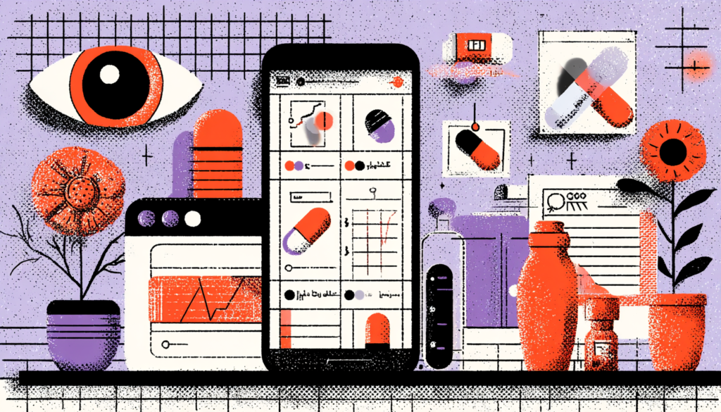
Consider how the WHO designed the pictogram program for international medication safety. These simple, standardized icons communicate dosing instructions, “take with food,” “do not operate machinery,” and “avoid sunlight,” without a single word of text. They’re used in 100+ countries across language barriers, literacy barriers, and cultural differences. The design lesson here is profound: when you strip communication down to its essential visual logic, you often discover that the information is actually simpler than all the words suggested. Icons and illustrations force you to clarify your thinking.
That said, visual communication in healthcare has its pitfalls. Icons are not universally understood; research by the Nielsen Norman Group has shown that most icons are ambiguous without a text label, and healthcare iconography is particularly fraught because misinterpretation has consequences. A stylized heart icon could mean “favorites,” “cardiovascular health,” or “I like this icon.” Always pair icons with text labels for critical functions. Use illustrations that reflect the diversity of your actual user population; a 70-year-old woman with diabetes should see herself in your onboarding illustrations, not a generic twenty-something. Representation in visual design is not a political statement. It’s a trust signal.
Color, Contrast, and the Physiological Realities of Your Users
Color is communication. In healthcare interfaces, it’s also a potential accessibility minefield. Approximately 8% of men and 0.5% of women have some form of color vision deficiency. Many elderly users experience significant contrast sensitivity loss. Users accessing apps in bright outdoor environments, like a construction worker checking their medication schedule on a break, for example, need dramatically higher contrast ratios than the WCAG 2.1 minimum of 4.5:1 might suggest.
Red and green are the most commonly misused color pair in healthcare design. Designers reach for green to mean “healthy” and red to mean “danger” instinctively, but this pairing is precisely the color combination that red-green colorblind users, the most common form of color deficiency, cannot reliably distinguish. The solution isn’t to abandon color as a communication tool; it’s to never use color as the only communication tool. When showing a patient that their blood pressure is in a dangerous range, use red text, a warning icon, AND clear language. Redundant coding isn’t a bad design—it’s a universal design.
Typography deserves its own conversation. For low-literacy and cognitively diverse users, type choices have measurable impacts on comprehension. Research from the British Dyslexia Association and studies on fonts specifically designed for dyslexic readers (like OpenDyslexic and Lexie Readable) consistently support wider letter spacing, larger x-heights, and avoiding fonts where similar letters are easily confused (like lowercase b, d, p, and q). Body text in healthcare apps should be a minimum of 16px, and that minimum should be 18 px for any interface primarily used by users over 55. Your beautiful 13 px italic caption text is invisible to a significant portion of your audience.
Interaction Design That Removes Barriers, Not Just Friction
Designing Flows That Assume Nothing and Forgive Everything
The best healthcare UX for low-literacy users follows a principle that progressive disclosure has popularized: reveal information progressively, at the moment it’s needed, rather than front-loading everything. Think about how the Apple Watch walks you through setup. You don’t see all 47 steps at once. You see one. Then the next. Then the next. This isn’t a limitation — it’s a profoundly respectful design choice that says, “We trust you to handle information when it matters.”
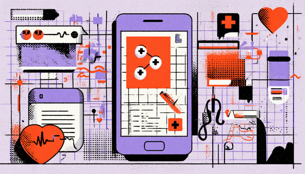
Patient portals like Epic’s MyChart have historically struggled with this. They present patients with dashboards that simultaneously show lab results, upcoming appointments, care team messages, billing information, prescription renewals, and health education content all at once. For a health-literate, digitally fluent user, this is a content hub. For a low-literacy user in an anxious state, it’s an overwhelming wall of noise that sends them straight to the phone to call the clinic. The design failure isn’t just UX; it results in millions of unnecessary calls to overwhelmed clinical staff.
Progressive disclosure, chunking, and task-based navigation are your tools here. Instead of “Here is your full health summary,” try “What would you like to do today?” with three clear options: See my test results, message my doctor, or manage my medications. Each path takes the user on a focused, linear journey to complete one task. Error prevention is critical: use smart defaults, clear validation, and never let a user reach an error state without knowing exactly how to fix it. And build in forgiveness, every destructive action should be reversible, and every submission should have a clear confirmation step.
Voice, Video, and the Power of Multi-Modal Design
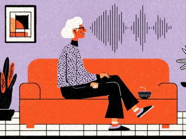
Text is not the only channel through which your interface can communicate. In fact, for many low-literacy users, it shouldn’t be the primary channel at all. The explosion of voice interfaces, driven by devices like Amazon Echo and Google Home, has introduced millions of low-literacy and elderly users to a modality that completely bypasses written text. In healthcare specifically, voice interaction is becoming transformative.
Apps like Amazon Alexa’s medication reminder skill or Babylon Health’s voice-enabled symptom checker show what’s possible when we stop assuming that all users want to read and type their way through medical information. Audio instructions for medication dosing are significantly better understood by low-literacy patients than written instructions, a finding supported by research published in Patient Education and Counseling. Consider building audio alternatives into every critical information moment in your interface. A short, professionally recorded audio clip explaining what a colonoscopy involves is worth ten paragraphs of text for many users.
Short-form video is equally powerful. YouTube’s healthcare channels, telehealth platforms that use video explainers for procedure prep, and tools like Loom-embedded patient education all leverage the fact that video engages multiple cognitive channels simultaneously: auditory, visual, narrative, and emotional. When Kaiser Permanente piloted video-based post-discharge instructions, medication adherence improved measurably compared to text-based discharge summaries. The technology to embed short explanatory videos into patient portals and health apps exists right now. The barrier is mostly organizational inertia, not technical capability.
Clarity Is the Standard, Not a Concession
Designing for low-literacy patients is not a niche accommodation. It is the core work of healthcare UX, the discipline in its most honest, highest-stakes form. When you design with radical clarity, when you test with real users who reflect the actual diversity of people seeking care, when you use visual communication with intention, and when you build interactions that assume nothing and forgive everything, you don’t create an experience that works for “less capable” users and a worse experience for everyone else. You create a better experience for everyone. The patient portal uses plain language, clear icons, and a focused flow to guide low-literacy users through their lab results, and it is also the same portal that a busy, stressed cardiologist can use in thirty seconds between appointments. Clarity is not a concession; it’s the goal. The healthcare system already creates enough barriers for vulnerable patients, your interface shouldn’t be one of them.