


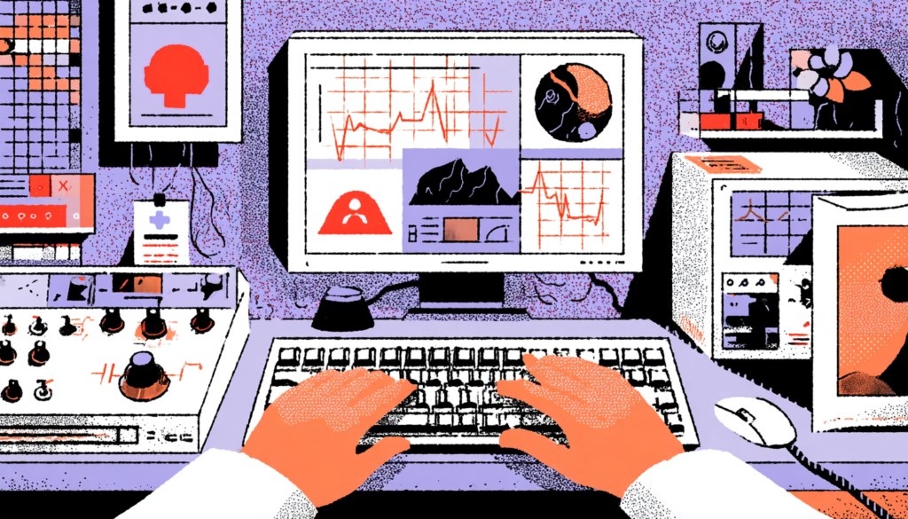
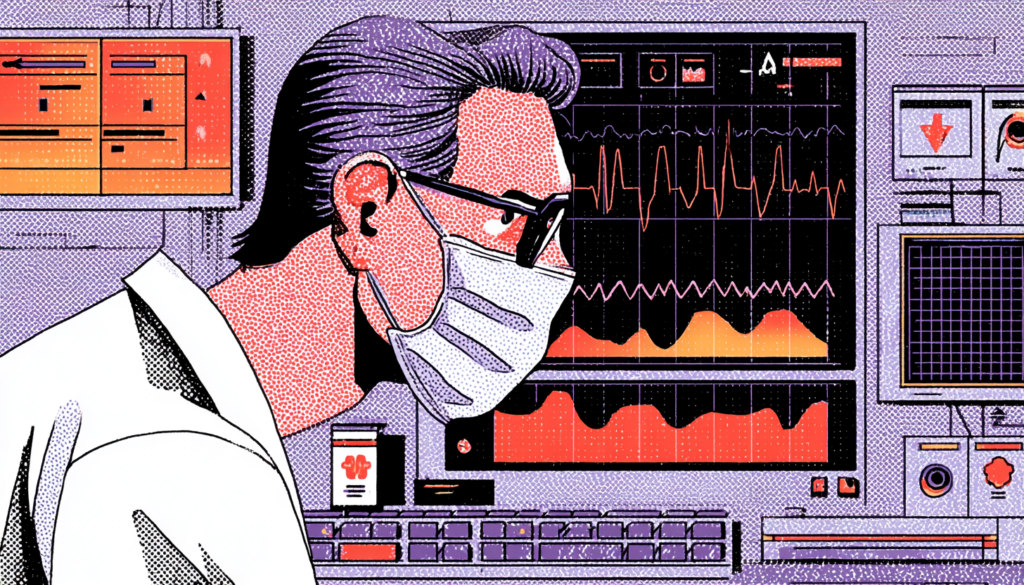
There’s a moment every nurse knows well. It’s 2 AM, the ward is understaffed, and three patients need attention simultaneously. You’re staring at an EHR screen packed with dropdown menus, color-coded alerts, and a medication list that scrolls for what feels like a mile. Your brain is already running at full capacity — and the software is asking it to do more. That moment isn’t just frustrating. It’s dangerous. This is cognitive overload, and in healthcare, it kills.
Cognitive overload in clinical settings is one of the most underreported contributors to medical error. A landmark study published in the Journal of the American Medical Informatics Association found that physicians spend nearly 50% of their working time interacting with electronic health record systems — and much of that time is characterized by friction, confusion, and alert fatigue. In many cases, the software that helps clinicians actively works against them.
The Hidden Cost of Poor EHR Design
In fact, here’s the uncomfortable truth the healthcare technology industry has been slow to confront: most medical software was built by engineers optimizing for data completeness, not by designers optimizing for human cognition. The result is interfaces that treat doctors and nurses like data entry clerks rather than high-stakes decision-makers operating under enormous pressure. Every unnecessary click, every ambiguous icon, every poorly timed notification reduces the mental bandwidth clinicians desperately need.
The good news? This is a design problem. And design problems have design solutions. Let’s dig into exactly how thoughtful UX can reduce cognitive overload for the clinicians who use these systems every day and why getting this right isn’t just a usability win; it’s a patient safety imperative.
Understanding Cognitive Overload in Clinical Environments

The Three Types of Load That Are Silently Breaking Your Clinicians
Cognitive load theory, originally developed by educational psychologist John Sweller in the late 1980s, breaks mental effort into three categories: intrinsic load (the inherent complexity of a task), extraneous load (the mental effort created by poor design), and germane load (the effort used to build understanding and expertise). In medical settings, all three are constantly firing at once.
For example, intrinsic load for a doctor is enormous by default. Diagnosing a patient, recalling drug interactions, reading lab values, and communicating with families—these tasks demand deep, focused cognition. That’s unavoidable. But when a poorly designed EHR forces a physician to click through seven screens to find a single lab result, or when a medication order form uses inconsistent terminology across different modules, you’re stacking extraneous load on top of an already maxed-out brain. That’s where errors happen. That’s where critical information gets missed.
Consider what happens in a real ICU. Nurses routinely manage twelve or more simultaneous data streams: ventilator readings, medication drip rates, vital sign trends, lab results, physician orders, and nursing notes. Research from the Critical Care Medicine journal shows that ICU nurses interrupt their work on average once every two minutes. Every interruption costs you mental context. Every time a nurse has to reorient themselves to a screen because the interface isn’t intuitive, that’s precious cognitive capital burned, capital that could have gone toward noticing a dangerous medication dosage or catching a deteriorating patient trend. Ultimately, good UX design doesn’t just make life easier. It literally frees up the mental space that saves lives.
Information Architecture: The Foundation of a Clinician-Friendly Interface
Designing for Scanning, Not Reading—Because Clinicians Never Have Time to Read
To understand this principle, consider how a doctor actually uses a patient chart. They do not sit down with a cup of coffee and read it from cover to cover. They scan. They’re looking for the one piece of information they need right now, in the next thirty seconds, before they walk into a room. If your interface requires reading rather than scanning, you’ve already lost the battle.
Consequently, this moment is where information architecture becomes a life-or-death design discipline. The hierarchy of information on a clinical screen should mirror the hierarchy of clinical urgency. Critical alerts need to surface at the top of a visual hierarchy, not buried in a sidebar, not nestled inside a tab that requires a click to open. Active medications that could cause adverse interactions should be visually proximate to the prescribing interface. Lab values trending in dangerous directions should carry visual weight proportional to their clinical significance. Epic, one of the most widely used EHR platforms in the US, has gradually improved its dashboard to surface “patient storyboards,” a summary view designed for rapid scanning. It’s not perfect, but it’s directionally right.
As a result, card-based layouts and progressive disclosure are two of the most powerful tools in a medical UX designer’s toolkit. Progressive disclosure means showing only the information a user needs at a given decision point and hiding the rest until it’s needed. This directly reduces extraneous cognitive load. Instead of presenting a clinician with a 40-field form for medication ordering, you surface the six fields most commonly used, with an option to expand for edge cases.
This isn’t dumbing things down; it’s respecting the reality of clinical decision-making under time pressure. Chunking related information into clearly bounded cards, using consistent visual grammar, and establishing strong spatial memory cues (so users always know where to look) are design fundamentals that medical software developers have been painfully slow to adopt.
Alert Design and the Epidemic of Alarm Fatigue
When Everything Is Urgent, Nothing Is Urgent
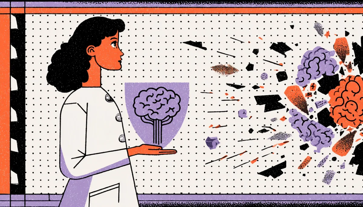
Here’s a number that should stop you cold: studies have found that clinicians override or dismiss up to 96% of clinical decision support alerts without reading them. Ninety-six percent. The alerts are there. The warnings are firing. And they’re being ignored, not because clinicians are reckless, but because the signal-to-noise ratio has collapsed completely. When a system cries wolf forty times a day, the fortieth wolf goes unnoticed.
Furthermore, alert fatigue is one of the most studied and least solved problems in health IT. The Joint Commission has flagged alarm fatigue as a national patient safety goal since 2014. And yet, open almost any major EHR today and you’ll discover alert systems designed around legal defensibility rather than clinical usability. The logic goes: if we alert for everything, we can’t be blamed for missing anything. The result is a system that prioritizes institutional liability over human cognition, and patients pay the price. A famous case at Boston’s Brigham and Women’s Hospital saw a patient die from a medication overdose despite multiple EHR alerts firing because the alerts had been so consistently overridden that the prescribing physician’s alert response had become reflexive and automatic.
The UX fix here is not subtle; it requires fundamental rethinking of alert philosophy. Tiered alert systems that distinguish between “this patient may die in the next hour” and “this is a minor drug interaction with negligible clinical significance” are not just nice to have. They’re non-negotiable. Color, iconography, placement, and interruptive versus passive presentation should all vary dramatically based on clinical severity. Best-in-class implementations, like the alert stratification work done at Vanderbilt University Medical Center’s biomedical informatics department, have demonstrated that removing low-value alerts and redesigning high-value ones can dramatically increase the rate at which critical alerts are actually acted upon. Less noise. More signal. Better outcomes.
Workflow-Centered Design: Building Software Around How Clinicians Actually Work
Stop Designing for the System. Start Designing for the Human in the System.
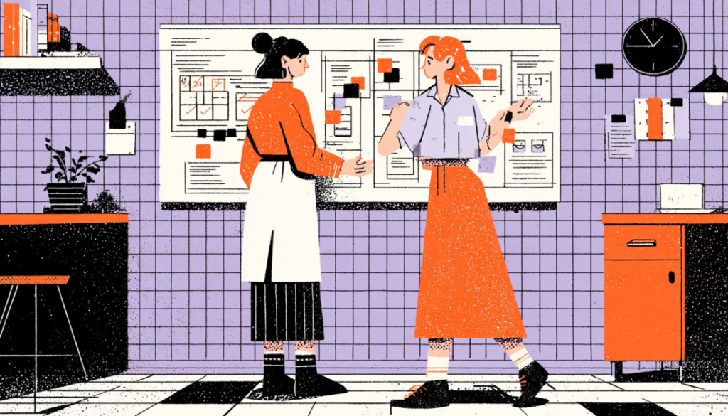
Therefore, here’s a question worth sitting with: When was the last time the software you’re designing, or the software you’re using, was observed in actual clinical use by someone who could change it? Real workflow-centered design begins with deep ethnographic research. Not surveys. Not focus groups. Actual shadowing of nurses during night shifts, watching how surgeons access information between cases, and understanding how an ED physician’s interaction patterns change from the beginning to the end of a twelve-hour shift.
In contrast, contextual inquiry in clinical environments consistently shows a gap between how systems are designed to be used and how they’re actually used. People normalize workarounds. Sticky notes appear on monitors. Nurses develop personal shorthand systems to compensate for interface deficiencies. These workarounds aren’t inefficiencies that we should eliminate; they’re data. They’re your users screaming at you, in the politest possible way, that the design isn’t meeting their needs. When Cerner researchers actually followed nurses through medication administration workflows, they discovered that nurses were routinely switching between three separate screens to complete a task that could, and eventually was, be redesigned into a single unified view. That redesign cut medication administration time and lowered documented errors.
Additionally, designing for workflow means respecting temporal context. A physician using software during a calm morning review session has different cognitive needs than the same physician using the same software in the middle of a code. Adaptive interfaces that adjust information density based on contextual triggers, time of day, patient acuity, and alert volume are a frontier that medical UX is just beginning to explore. Mobile-first design for bedside nurses who are often working from tablets or phones introduces its set of workflow considerations: thumb-reachable interaction zones, glanceable data displays, and one-handed operation modes. The point isn’t to have a single perfect interface; it’s to have interfaces that flex intelligently around the messy, unpredictable reality of clinical work.
Typography, Color, and Visual Hierarchy in High-Stakes Environments
The Pixels You Ignore Are the Details That Matter Most
Therefore, typography in medical software isn’t merely an aesthetic consideration; it’s a functional safety requirement. Studies in applied vision research have shown that under conditions of stress and fatigue, visual acuity decreases and sensitivity to contrast drops. A font that’s perfectly readable during a rested morning becomes genuinely difficult to parse at hour ten of a night shift. And yet, the majority of EHR interfaces use font sizes and weights that would be considered unacceptably small in consumer product design, deployed in environments that are far more demanding than any consumer context.
The work of designing readable interfaces for clinicians draws on a rich body of research from aviation HCI, another domain where interface failures can be catastrophic. Cockpit design principles like the “big and bold” rule for critical information, the use of high-contrast color coding reserved exclusively for status indicators, and the deliberate separation of navigational elements from data displays have direct analogs in medical UX. Color, in particular, requires disciplined restraint. When red means “critical alert” in one module and “completed task” in another, you’ve created a cognitive translation tax that every user pays on every interaction. A consistent, purposeful color language, applied system-wide, documented in a design system, and enforced rigorously, is one of the highest-leverage improvements any medical software team can make.
Moreover, visual hierarchy goes beyond font size and color. It includes white space, grouping, alignment, and the deliberate use of visual weight to guide the eye. A well-structured patient summary screen places vitals, medications, and active problems in distinct visual zones. This layout leverages the brain’s natural tendency toward pattern recognition and spatial memory. When a nurse can develop muscle memory for where information lives, the extraneous cognitive load of navigation drops dramatically. This is why design systems in healthcare aren’t optional; they’re the infrastructure that creates safe, consistent, and learnable interfaces at scale.
The Stakes of Getting Healthcare UX Right
The clinicians using medical software aren’t asking for beautiful interfaces or award-winning interactions. They’re asking for tools that don’t make their already impossibly challenging jobs harder. Every time a UX designer reduces cognitive overload and unnecessary friction in an EHR, every time an alert system is rationalized to surface what actually matters, and every time a workflow is redesigned to match how humans actually think and move and make decisions under pressure, someone, somewhere, gets better care.
Those are the actual stakes of medical UX. We should consider more than just usability scores or NPS metrics. Lives. The field of healthcare technology has the tools, the research, and the talent to do this work well. What it needs now is the will to put human cognition at the center of every design decision and to never let institutional inertia or technical debt be an excuse for interfaces that cost people their health, their safety, or their lives.