


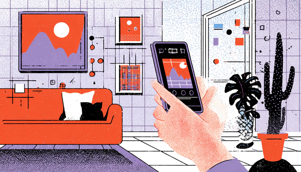
Augmented reality in UX design is transforming how we interact with the world. Imagine pointing your phone at a flat-pack furniture box and watching a fully assembled bookshelf materialize in your living room before you’ve touched a single allen key. Or walking down a street in a foreign city and seeing restaurant reviews, opening hours, and menu prices floating gently above each doorway like digital name tags. This isn’t science fiction anymore. And for UX designers, it represents either the most exciting frontier in the history of the discipline or a minefield of catastrophic user experience failures waiting to happen.
The numbers are hard to ignore. The global AR market is projected to surpass $97 billion by 2028, according to Statista. Apple’s ARKit, Google’s ARCore, and Snap’s Lens Studio have collectively put AR creation tools in the hands of millions of developers. Meta has poured tens of billions into mixed reality experiences. And yet, despite all that investment and all those tools, most AR experiences still feel clunky, disorienting, or just plain unnecessary. The gap between what AR can do and what it should do is enormous, and that gap lives squarely in the domain of UX design.
Here’s the uncomfortable truth: AR design is not just mobile UX with a camera turned on. The rules change. The stakes change. The cognitive load on users changes in ways that can make or break an experience in under three seconds. When you blend the digital and physical worlds, you’re not adding a layer to reality; you’re making a promise to the user that their world just got more useful, more legible, and more delightful. Breaking that promise doesn’t just frustrate people. It makes them distrust the technology entirely.
So whether you’re designing your first AR feature, trying to convince a skeptical product team that spatial UX deserves a seat at the table, or just trying to understand why that “revolutionary” AR launch flopped, this article is for you. We’re going to dig into the principles, the pitfalls, the patterns, and the genuine magic that separates transformative AR experiences from expensive gimmicks.
Understanding the Spatial Contract: What Augmented Reality in UX Demands From Users
The Cognitive Cost Nobody Talks About
Every interface asks users to make a mental investment. A web form asks you to read and type. A dashboard asks you to interpret data. AR asks you to do something far more demanding; it asks you to simultaneously process the physical environment you’re standing in and a new digital layer your brain has never evolved to expect. That dual-channel cognitive processing is exhausting in ways that users can’t always articulate but absolutely feel.
Researchers at the University of Cambridge have studied how augmented overlays affect attentional resources, and the findings are consistently humbling: users in AR environments make more navigation errors, take longer to complete tasks, and report higher fatigue than users in equivalent 2D interfaces, unless the AR experience is designed with exceptional spatial clarity. The cognitive load isn’t a bug in AR. It’s a fundamental feature of the medium that every designer must acknowledge before writing a single line of interaction logic.
This means the spatial contract—the implicit agreement between your design and your user about what they’ll experience— must be established faster, more clearly, and more gracefully than in any other medium. Think about how Pokémon GO handled these issues when it launched in 2016. The AR feature was actually one of the least-used parts of the game because it made the core experience harder. Players turned it off. Later iterations introduced AR+ with depth sensing and creature behavior that responded to real-world surfaces, making the digital creatures feel genuinely grounded in physical space. The spatial contract finally delivered on its promise.
Anchoring: The Foundation of Believable AR
Anchoring is the design principle of tethering digital objects convincingly to physical surfaces and spaces. When an IKEA chair in the IKEA Place app wobbles unrealistically or floats two centimeters above your floor, the spell breaks instantly. Your brain knows that chairs don’t float. It knows that shadows fall at certain angles. It knows occlusion, the way objects hide behind other objects. When AR violates these physical laws, users feel it as wrongness even if they can’t name it.
Good anchoring requires close collaboration between UX designers and AR engineers. The designer’s job is to establish what level of physical fidelity the experience needs to maintain trust. A simple marker-based AR experience, like scanning a product box to see a 3D demo, can afford slightly less realism because users understand they’re in a bounded, game-like context. But what about a medical AR application that overlays vein locations onto a patient’s arm for IV insertion? That needs to be terrifyingly accurate, or it causes real harm. The stakes define the fidelity requirement.
Interaction Design in Three Dimensions: Gestures, Gaze, and Grounding
Why Your 2D Interaction Patterns Won’t Save You
Here’s a humbling realization for any designer coming from mobile or web: tap, swipe, and scroll are vocabularies built for flat surfaces. They work because screens are rectangles and thumbs understand rectangles. The moment you step into AR, the interaction surface expands into three-dimensional space, and suddenly none of your hard-won pattern library applies cleanly. You need new grammar.
Apple’s Vision Pro introduced eye tracking as a primary input modality; you look at something to select it and pinch to activate it. This sounds intuitive until you realize that humans constantly glance at things without intending to select them. The challenge of differentiating intentional gaze from casual peripheral attention is a profound UX problem. Apple’s solution, requiring a deliberate pinch gesture to confirm a gaze-based selection, creates a two-step interaction model that adds friction but prevents accidental activations. It’s a careful, considered trade-off. And it shows exactly how designing for AR forces you to think about human biology, not just human behavior.
Microsoft’s HoloLens took a different approach for enterprise use cases, combining air-tap gestures, bloom gestures to open menus, and voice commands. The mixed input model was powerful but required significant effort to learn. Enterprise clients using HoloLens for warehouse logistics or surgical navigation reported that onboarding took significantly longer than traditional software training. This isn’t necessarily a failure; it reflects the truth that we are still discovering AR interaction paradigms in real time. As a designer, your job is to shepherd users through that discovery with patience, clarity, and progressively disclosed complexity.
Designing for Peripheral Attention and Environmental Noise
One of the most underappreciated challenges in AR UX is that your interface is competing with everything in the physical world. A notification might pop up while a user is trying to measure their kitchen for new cabinets. A passing pedestrian might walk directly into a user’s camera frame during a face-filter experience. Wind might shake the phone, breaking the AR tracking. Real environments are chaotic, and your design must be resilient to that chaos.
The concept of graceful degradation, borrowed from web design, applies beautifully to AR. If the tracking fails, what does the user see? If ambient light is too low for the camera to read the environment accurately, does your app communicate that clearly, or does it just show a broken, floating mess? Snapchat handles the situation with characteristic elegance: when lighting conditions are poor for face tracking, lenses simply don’t activate, and a gentle prompt invites the user to find better light. No broken experience. No unexplained failure. Just clear, human communication.
Designing for peripheral attention also means thinking carefully about visual hierarchy in three-dimensional space. Always position important information, safety warnings, navigation cues, and task completion confirmations in the user’s primary line of sight. Decorative or secondary information can float in the periphery. Think of it like a stage production: the lead actor stands in the spotlight, and the ensemble fills the background. Reversing that hierarchy in AR doesn’t just confuse users; it creates real-world safety risks, especially in applications tied to physical navigation or hazardous environments.
Emotional Design in AR: Building Delight Without Losing Utility
The Delight Trap and How to Avoid It
AR has a delightful problem. It is not a deficit of delight, but an excess of it. When teams first discover AR capabilities, there’s an almost irresistible temptation to pile on effects, animations, 3D objects, and interactive moments because it all looks incredible in demos. The problem is that delight without purpose creates only noise, and in AR, the sensory richness of the medium amplifies that noise.
L’Oréal’s ModiFace AR try-on platform is a masterclass in purposeful delight. The technology lets users virtually apply makeup, foundation, lipstick, and eyeshadow, using their phone camera with remarkable accuracy. It’s genuinely magical to use. But notice what ModiFace doesn’t do: it doesn’t add confetti explosions when you pick a lipstick shade. It doesn’t play sound effects when you change foundation coverage. It does not enhance the beauty exploration experience through gamification beyond its core utility. The delight comes entirely from the accuracy and fluidity of the core function. The emotion is a byproduct of usefulness, not a veneer over uselessness.
Contrast that with the graveyard of AR apps that launched with fanfare and died quietly: apps that let you point your camera at the sky to see constellation overlays but had GPS errors that made them wildly inaccurate; apps that promised to let you try on glasses but tracked facial features so poorly that frames warped and swam across the screen; apps that launched beautiful AR activations at live events but crashed when hundreds of users tried them simultaneously in the same venue. In every case, the delight promise exceeded the delivery capability, and users felt not just disappointed but foolish for having believed.
Trust as the Core Currency of AR Experiences
Trust is the foundation of every good UX. In AR, the stakes on trust are dramatically higher because you’re asking users to lower their defenses about the physical world. When Measure, Apple’s built-in AR measuring app, gives you an accurate room dimension, you trust it, and that trust has real consequences if you use it to order custom furniture. When it gives you an inaccurate reading, you don’t just close the app frustrated; you potentially order the wrong thing, waste money, and associate that failure with AR as a whole.
Building trust in AR means being relentlessly honest about capability limits. IKEA Place, for all its brilliance, includes visual indicators showing when the floor-detection algorithm is confident versus uncertain. The AR experience communicates its confidence level to the user. That’s sophisticated emotional design treating the user as a partner in the experience rather than a passive recipient of magic. It says: “We’re doing something genuinely hard here, and we want you to understand when it’s working well and when it needs a bit more help.” That honesty builds more lasting trust than any amount of polished animation.
Designing for Inclusion and Ethics in Augmented Spaces
Accessibility in a Spatially Complex Medium
Accessibility in AR is not an afterthought. It’s an ethical obligation, and frankly, it’s one the industry has been depressingly slow to meet. Most AR applications assume binocular vision, functioning motor control for gesture inputs, adequate cognitive processing speed for moving interfaces, and environments that are well-lit and physically navigable. That’s an enormous number of assumptions that exclude a significant portion of potential users before they’ve even opened the app.
Consider users with low vision. Many AR experiences rely on small visual indicators, subtle depth cues, or color differentiation to convey information. For users with color blindness, deuteranopia specifically affects the ability to distinguish red from green, two colors that are almost universally used in AR interfaces for “place here” and “error” states. For users with motor impairments, gesture-heavy AR interfaces can be completely inaccessible without alternative input methods. Apple’s ARKit does now support voice control as an alternative to gesture inputs, but most third-party AR applications haven’t integrated those accessibility pathways. That’s a design failure, not a platform limitation.
The solution starts with inclusive design research. When was the last time you saw an AR user testing session that deliberately recruited participants with visual impairments, motor disabilities, or cognitive differences? Probably never — because most AR projects operate on budgets and timelines that treat accessibility research as a luxury. But here’s the practical argument beyond the ethical one: the global disability market represents over $13 trillion in spending power, according to the Return on Disability Group. Designing accessible AR isn’t just right. It’s strategically intelligent.
The Privacy and Surveillance Dimensions of AR Design
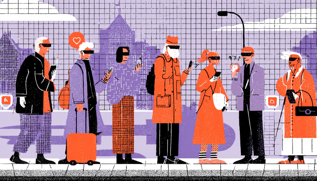
AR applications that use cameras and environmental scanning are, by definition, surveillance technologies. They read physical spaces, identify objects, analyze faces, and increasingly map the interiors of private homes. The casual user pointing their phone at their living room to try out a virtual sofa isn’t thinking about the fact that the app may be sending detailed environmental data to a server. But as a UX designer, you must think about it, because how you design the data communication around your AR feature is as much a user experience decision as how you design the interaction patterns.
Transparency in AR data collection is both an ethical imperative and an emerging legal requirement. GDPR and CCPA have begun addressing location and biometric data. The EU’s AI Act has specific provisions relevant to real-time facial recognition in public spaces, which is essentially what face-tracking AR features do. Designing permission flows, data explanations, and opt-out pathways into AR experiences isn’t just legal compliance. It’s fundamental respect for the users you’re designing for. When Snap introduced a feature allowing users to see exactly which lens effects accessed camera data and for how long, it was a small addition that had an outsized effect on user trust.
The more profound question that every AR UX designer should be asking themselves is this: whose world are we augmenting, and for whose benefit? AR in retail augments consumer decision-making, but it also collects behavioral data about which products attract visual attention. AR in enterprise augments worker efficiency, but it also enables surveillance of employee behavior at a granular level that would have been unimaginable ten years ago. These aren’t questions with simple answers. But they are questions that responsible designers must bring to product planning conversations, not leave to lawyers and compliance teams to figure out after launch.
The blending of digital and physical worlds is not a trend that peaks and recedes. It’s a structural shift in how human beings interact with information, the environment, and each other, and UX designers are the architects of how that shift feels, whether it empowers or alienates, and whether it includes or excludes. The medium is genuinely extraordinary. A well-designed AR experience can reduce surgical error rates, help a first-generation college student visualize a campus they’ve never visited, or simply let someone finally buy furniture they’re actually confident will fit in their home. That’s not a small thing. But getting there requires resisting the gravitational pull of novelty, taking cognitive load seriously, designing trust into every interaction, and refusing to treat inclusion and ethics as optional modules. The physical world has been here for 4.5 billion years. You’re adding a layer to it. Design like it matters.