


Why empathy, accessibility, and simplicity matter more than ever in digital health design.
Why This Matters (Now More Than Ever)
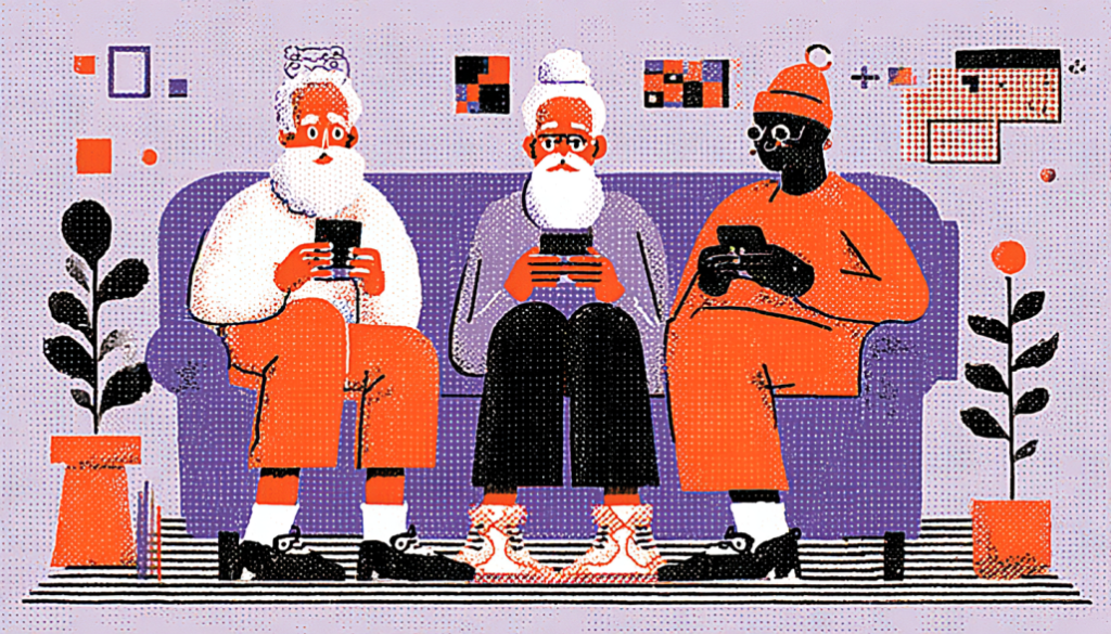
Let’s be honest—most digital health platforms aren’t built with older adults in mind. They’re designed for tech-savvy millennials or busy Gen Xers, leaving seniors struggling with small fonts, confusing layouts, and endless forms.
But here’s the thing: by 2030, one in six people in the world will be over 60. That’s over 1.4 billion individuals. And that’s not all. Many of them are managing chronic conditions, juggling medications, or navigating post-op recovery—often alone. They need tools that support them, not frustrate them.
How can we design digital health platforms that truly meet the needs of our aging population?
It’s not just about bigger buttons (though yes, please, make them bigger). It’s about empathy-driven design, simplified user flows, cognitive support, and building trust at every tap.
Are you prepared to create an impactful design? Let’s dive in.

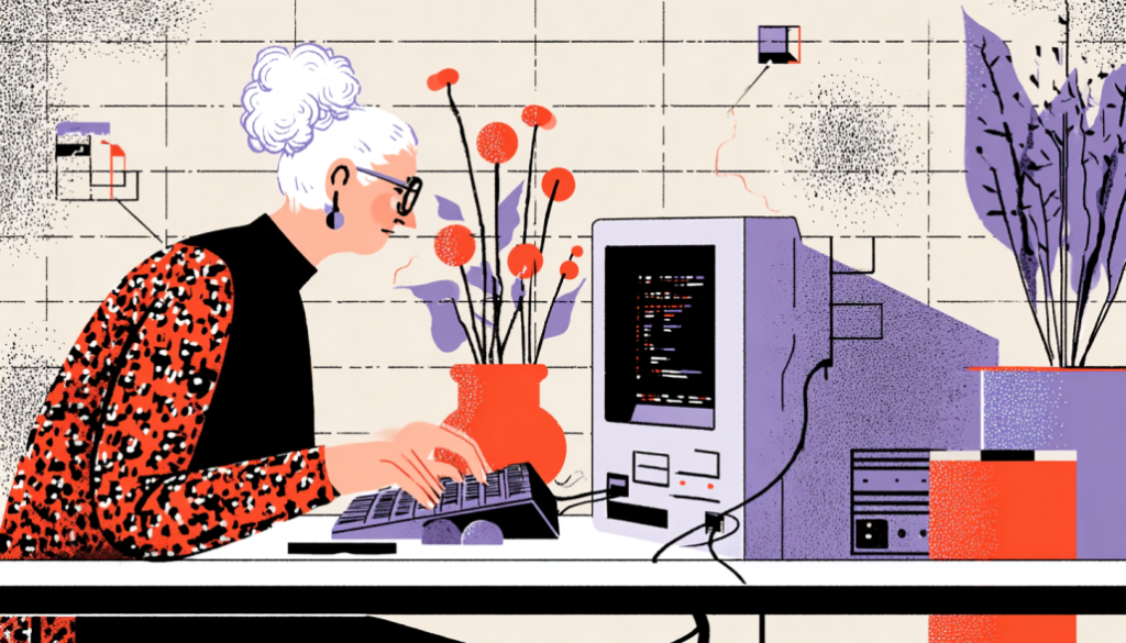
Know Thy User
Understanding Older Adults and Their Digital Realities
Before discussing wireframes or color palettes, it is important to focus on understanding people.
The needs and preferences of older adults vary widely. Some are retired engineers who’ve used computers for decades. Others are picking up a tablet for the first time. But across the board, they tend to share a few key traits when it comes to tech:
- Vision declines. Reading small fonts or low-contrast interfaces can feel like deciphering a puzzle in the dark.
- Motor skills change. Arthritis, tremors, or reduced dexterity can make navigating tiny tap targets challenging.
- Cognitive load matters. Complex navigation or too many decisions at once can lead to overwhelm.
- Skepticism is common. Many seniors are wary of scams, data breaches, or technology in general.
Designing for older users requires putting ourselves in their shoes and understanding their needs.
Imagine you’re 78, recovering from surgery, and your doctor tells you to track your vitals through an app. You open it, and it looks like a dashboard from NASA. Now what?
That’s why usability testing with real older users is non-negotiable. Don’t assume. Ask. Watch. Learn.
Designing Clear Interfaces for Digital Health Platforms
Make It So Simple, They Don’t Need a Grandchild to Help
Let’s talk UI. Most seniors aren’t looking for cutting-edge animations or clever microinteractions. They’re looking for clarity. Here’s how to deliver it:
1. Prioritize visual hierarchy
Use large, legible fonts (at least 16 pt), high-contrast colors, and clear section breaks. Use whitespace to your advantage.
2. Limit choices
Avoid menus with 8+ options or endless filter dropdowns. Offer only what’s necessary—and nothing more.
3. Use plain language
Skip the jargon. Say “doctor’s appointment” instead of “telehealth synchronous consultation.” Keep it human.
4. Make buttons look like buttons
Avoid using ghost buttons. Avoid using text links that resemble body copy. Give each action visual weight.
5. Confirm actions clearly
“Are you sure you want to cancel this medication reminder?” goes a long way. So does a simple “Done” message after submission.
6. Use icons wisely
Avoid trendy or ambiguous icons. A calendar should look like… well, a calendar. Supplement with labels wherever possible.
Think of the UI like a gentle guide—not a puzzle to be solved.
Good design should reduce cognitive friction. For older users, every little reduction counts.

Build Trust at Every Step
Because Trust is the True User Interface
Users won’t use a clean UI if they don’t trust it.
Older adults often hesitate when it comes to digital tools—especially when their health is involved. The potential consequences are significant. One mistake might mean a missed dose or incorrect symptom tracking.
So how do we build digital trust?
Show credentials and sources
List who developed the app. Show affiliations with hospitals or health authorities. Add badges or recognizable logos. It matters.
Avoid dark patterns
Don’t hide cancel buttons, auto-enroll users, or pre-check consent boxes. Seniors already fear being tricked. Let’s not give them a reason.
Respect their data
Be transparent about what’s being collected—and why. Make opt-in choices clear. Keep privacy policies digestible.
Design for slow decision-making
Offer gentle reminders rather than sudden pop-ups. Let users review entries before submitting. Confirm. Clarify. Confirm again.
Use human tone in microcopy
Don’t say, “Form submitted.” Say, “Thanks, we’ve saved your blood pressure reading for today.”
Trust isn’t just built by branding—it’s built through consistent, considerate moments.
Think of your product as a digital nurse. It should feel competent, kind, and calm—not rushed, robotic, or risky.

Accessible Health Tech for Elderly Users: A Must-Have in Digital Health Design
WCAG, Meet Grandma. It’s Time to Be Inclusive by Default.
Accessibility isn’t just for legal compliance—it’s for human dignity. Additionally, accessibility can significantly impact the usability of your platform for older adults.
Visual impairments
Use scalable fonts. Avoid relying solely on color for meaning. Add alt text to every image. Support screen readers.
Hearing loss
Include captions on all videos and auditory instructions. Don’t rely on sound cues alone.
Dexterity challenges
Make touch targets at least 44×44 pixels. Avoid gestures like swiping or pinching unless absolutely necessary.
Cognitive issues
Keep the layout consistent. Avoid flashing content. Chunk long forms into smaller steps.
Bonus: Offline accessibility
Can users print summaries or appointment details? Can they save instructions as PDFs to share with caregivers?
Imagine a design so accessible, it feels invisible.
That’s the goal. When accessibility is baked in from the beginning, everyone benefits.
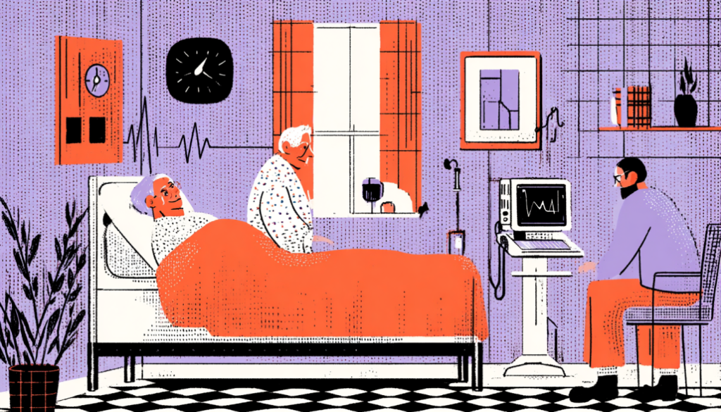
Designing Healthcare Apps for Seniors and Their Care Networks
Design for the Circle of Care
Older adults rarely manage healthcare alone. Spouses, adult children, nurses, and aides all play a role.
Why are so many digital health tools designed for single users only?
Let’s shift that paradigm. Here’s how:
Add caregiver access
Allow trusted family members to view logs, manage meds, or attend telehealth appointments virtually.
Support shared notifications
If Mom misses her pill reminder, Dad or a nurse should be notified too. Design for team-based health.
Provide print-friendly materials
Yes, it’s a digital platform—but caregivers may need to hand something to a doctor. Give them that option.
Use calendar integrations
Help caregivers coordinate transportation, pharmacy pickups, or checkups without switching platforms.
Healthcare does not occur in isolation. Neither should your design.
By designing for the extended care network, you create resilience—and peace of mind.
UX Design for Older Adults: Why Real-World Testing Matters Most
Real Feedback From Real Older Adults = Better Products
Here’s a hard truth: internal testing doesn’t cut it.
If your product team primarily consists of individuals in their 20s and 30s, there may be an unintended bias in your design decisions.
Recruit older test users
Include a mix of tech comfort levels, languages, and health conditions. This isn’t a checkbox—it’s your roadmap to relevance.
Test in real-world settings
Don’t just test on a desktop in an office. Test on an iPad in a cluttered kitchen. Alternatively, try testing on an outdated Android device under the harsh light from a window.
Watch their faces
Do they squint? Get frustrated? Hand the phone to someone else? Those are UX goldmines.
Record their journey
Where do they get stuck? Which screens confuse them? Where do they express joy or relief?
Iterate and repeat
Every feedback loop brings you closer to something usable, lovable, and truly helpful.
Designing for older users isn’t an afterthought—it’s an empathy-driven, iterative practice.
Aging Isn’t a Bug—It’s a Feature
Let’s face it. We’re all headed in the same direction. Designing for older adults isn’t just about “them”—it’s future-proofing for all of us.
When we slow down our design thinking, simplify our flows, and build with clarity, we don’t just make better tools for aging populations. We make better products, period.
Good design does not discriminate.
It uplifts.
It empowers.
And it remembers that the people using your product aren’t just “users.” They’re parents. Grandparents. Neighbors. Patients. Humans.
Let’s build like it.