


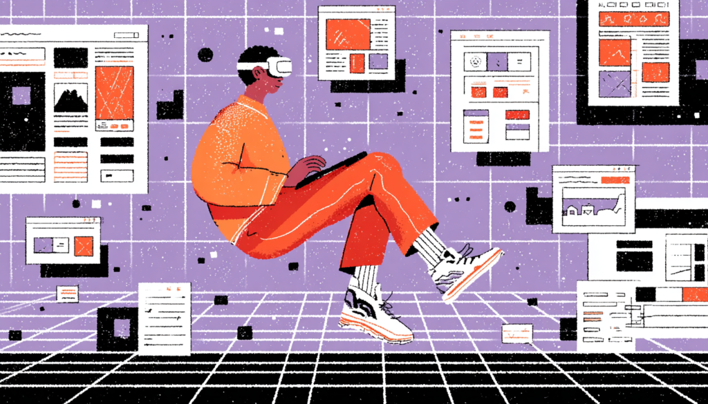
Imagine handing a user a pair of headset goggles and watching their jaw drop the moment they step inside your product. No cursor, no scroll bar, no tap target to miss. Just pure, embodied presence inside an experience you designed from the ground up. That moment, that intake of breath is what UX designers have been chasing since the first pixel was pushed onto a monitor. Virtual reality isn’t just a new canvas. It’s an entirely different dimension of design.
Here’s a number that should make you sit up straight: the global VR market is projected to hit $87 billion by 2030, according to Grand View Research. And yet, most UX designers are still treating VR like a novelty, something the gaming team handles, something for the “future roadmap.” The truth is, VR is already reshaping digital health, retail, real estate, education, and enterprise training right now, today, and the designers who understand its UX principles are becoming the most valuable people in the room.
The challenge is real, though. Designing for virtual reality isn’t just about transplanting your Figma skills into a three-dimensional space. The rules you’ve spent years mastering, visual hierarchy, affordances, tap targets, and color contrast—all of them need to be rebuilt from scratch. In this new paradigm, depth replaces flatness. Spatial audio replaces notification chimes. Consequently, presence replaces engagement as your north star metric. And motion sickness, unfortunately, replaces a bad bounce rate as your worst failure mode.
This article explores what it means to create immersive VR experiences from a UX design perspective, and if you’re also looking into augmented reality UX design, many of these principles apply there too. We’ll cover spatial UI design, the psychology of presence, accessibility in volumetric space, and how to prototype and test when your deliverable is literally a world. Whether you’re a veteran UX designer curious about the next frontier or a product manager trying to greenlight a VR project, get ready. Things are about to get three-dimensional.
Spatial UI Design: Building Interfaces in Three Dimensions
From Flat to Volumetric: The Paradigm Shift Nobody Warned You About
When you design a mobile app, you’re working in a two-dimensional plane. Everything has an X and a Y. You know the screen dimensions, you know the resolution, and you know that the user’s eyes are roughly 12 inches from the glass. Virtual reality blows all of that up. Suddenly you have X, Y, and Z. You have a user whose head can rotate 360 degrees. You have content that floats, wraps, hovers, and exists behind the user if you’re not careful. Welcome to spatial UI design, the most mind-bending discipline in digital product work.
The Comfortable Viewing Zone: Where UI Must Live in VR
The first thing you need to understand is the concept of the “comfortable viewing zone.” In VR, this is the arc of space directly in front of the user, roughly 1.5 to 3 meters away and within about 30 to 35 degrees of their central gaze. Think of it like a curved cinema screen placed right in front of them. Anything outside this zone, such as text placed too high, navigation menus floating to the far left, or action buttons buried below the natural horizon line, will cause neck strain, eye fatigue, and that creeping sense of frustration that makes users pull the headset off. Apple’s visionOS Human Interface Guidelines for spatial computing explicitly warn against placing critical UI elements outside this comfortable arc for exactly this reason.
The Danger Zone: Common Spatial UI Mistakes to Avoid
Depth is your new best friend, but it can also betray you fast. Layering UI panels at different Z-axis distances can create stunning, intuitive hierarchies. Imagine an information card that floats close to you while a background menu recedes softly behind it. This is something apps like Meta’s Horizon Worlds and Microsoft’s Mesh have started exploring, using depth to separate primary actions from secondary settings. But use too many layers or place interactive elements too close to the user’s face (inside 0.5 meters is generally considered the “danger zone”), and you’ll trigger a vergence-accommodation conflict; basically, your eyes strain because the focal distance and the convergence distance don’t match. It’s the optical equivalent of reading a book six inches from your nose.
Anchoring, Drifting, and World-Locked UI
One of the most crucial spatial UI decisions you’ll make is whether your interface elements are “head-locked,” “world-locked,” or “body-locked.” A head-locked UI follows the user’s gaze everywhere, like a HUD in a fighter pilot’s helmet. Sounds useful, right? In practice, however, it’s exhausting and deeply uncomfortable for extended use. As a result, it eliminates any sense of depth, flattens the experience, and breaks the feeling of actually being inside a space. Reserve headlocked elements only for critical, momentary alerts; think low battery warnings in the Meta Quest system UI.
In contrast, a world-locked UI is anchored to the virtual environment itself. A menu panel attached to a virtual desk stays there when you look away and come back to it. This is far more natural and mirrors how we interact with physical objects. It respects the user’s spatial memory: you put your keys on the table, and they’re still there when you return. Design your primary interfaces to be world-locked wherever possible. It builds trust, reduces cognitive load, and makes your VR product feel like a real place rather than a projected slide deck.
Body-Locked UI: The Toolbelt Approach
Finally, a body-locked UI sits somewhere in between; it moves with the user’s general position but not their head rotation. It’s particularly useful for things like toolbars or contextual menus that need to stay accessible without being intrusive. Think of it like a tool belt. It moves with your hips as you walk around a job site, but it doesn’t jump into your face when you turn your head to look.
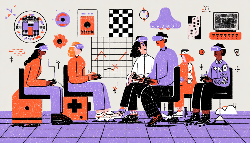
The Psychology of Presence: Designing for Immersion, Not Just Interaction
What “Presence” Actually Means and Why It’s Your Core Design Metric
In traditional UX, we obsess over engagement metrics, time on screen, click-through rate, and retention. In VR design, there’s a more fundamental metric that underlies all of those: presence. Presence is the psychological sensation of actually being somewhere. It’s the moment the user stops thinking, “I’m wearing a headset in my living room,” and starts thinking, “I am in this place.” Mel Slater, one of the foremost researchers in VR psychology at the University of Barcelona, describes presence as the sense of “being there,” and it’s the single most powerful lever you have as a VR designer.
Presence is not just about visual fidelity. This is a mistake many first-time VR designers make. They throw rendering budgets at photorealistic textures and wonder why users still feel disconnected. Presence is actually built from a constellation of sensory and interaction cues working together.
Spatial audio is enormously powerful here. When a sound comes from your left in a well-designed VR environment, and your brain actually perceives it as coming from your left due to binaural audio processing, presence skyrockets. Apps like Beat Saber understand this phenomenon intuitively: the music isn’t just playing; it’s surrounding you, and the blocks appear to fly out of a three-dimensional space. Remove the spatial audio, and the experience deflates almost immediately.
How Interactivity and Agency Deepen Presence
Interactivity and agency are the other twin pillars of presence. When the virtual environment responds to your actions—such as a door opening when you reach for the handle, a virtual plant swaying as your controller passes through it, or a character turning to acknowledge your gaze—the brain updates its working model of reality. You feel real agency. Valve’s Half-Life: Alyx is one of the best-designed VR experiences ever made precisely because of these factors: every single interaction, from reloading a pistol to opening a drawer, was designed to reward physical engagement. Nothing is a button press. Everything is a gesture, a reach, a physical commitment.
Breaking Presence: The UX Failures That Snap Users Back to Reality
Understanding what destroys presence is just as important as understanding what builds it. And the number one presence-killer in poorly designed VR? Inconsistency. When the virtual world behaves in ways that contradict physical expectations—a virtual button that your hand passes through without response, a wall that you can accidentally walk into and clip through, or a menu that pops up with a jarring 2D flat panel in the middle of an otherwise immersive 3D environment—your brain’s reality-checking system flags the discrepancy immediately. In that instant, presence collapses entirely, and suddenly, the headset is just a headset again.
Latency is the other silent assassin. Google’s research into VR comfort has shown that motion-to-photon latency (the time between you moving your head and the display updating) must remain below 20 milliseconds to maintain presence and avoid motion sickness. Above that threshold, the visual and vestibular systems start disagreeing about what’s happening, and the result ranges from mild discomfort to full nausea. This is largely a hardware and rendering engineering problem. That said, as a designer, it should inform every interaction you design. Avoid heavy computational loads that spike latency. Design graceful degradation for lower-performance hardware. Know your rendering budget.
Why Latency and Coherence Matter as Much as Inconsistency
Beyond latency and interactivity, narrative and environmental coherence matter more than most designers expect. A VR environment that maintains a consistent aesthetic logic, lighting, material language, spatial scale, and sound design fosters implicit trust in the user’s brain. It says, “This place makes sense.” Even stylized, non-photorealistic environments like the geometric worlds in Google’s Tilt Brush maintain extraordinary presence because everything within them follows the same visual rules. It’s not realism that creates presence. It’s coherence.
Accessibility and Inclusion in Volumetric Space
Why Accessibility in VR Is More Complex, and More Critical Than You Think
Accessibility in traditional UX is already a nuanced discipline. WCAG guidelines, screen reader compatibility, and color contrast ratios—these are hard-won standards that took decades of advocacy to establish. In VR, the accessibility problem is dramatically more complex because the entire interaction model is physical and spatial. When your UI is designed around reaching, rotating, gazing, and physically moving, you’ve immediately created barriers for users with motor impairments, vestibular disorders, visual impairments, and a wide range of physical differences that don’t map neatly onto controller input.
Meta has begun addressing these issues with the accessibility features in Meta Quest’s system software, options for single-handed controller use, eye-tracking navigation, and adjustable movement speeds. But these are system-level patches. The real accessibility work has to happen at the design level, in the products and experiences built for the platform. If your VR app requires the user to physically reach up and grab an item overhead, you’ve excluded every wheelchair user and anyone with limited arm mobility. If your navigation relies entirely on walking or teleporting through a space, users with vestibular disorders, who already represent a significant VR motion sickness risk group, are left behind.
Designing Inclusive Interaction Modes From the Start
Therefore, the solution is designing layered interaction modes from the very beginning, not bolting them on at the end. Consider designing every core interaction with at least two input methods: a physical/spatial method and a gaze-plus-dwell or controller-button alternative. Think about the color contrast of floating UI elements against varied environmental backgrounds; this is harder than screen contrast because the background is dynamic and three-dimensional. Think about the font size of any text in your VR environment and test it at the actual distances users will encounter it, using a range of simulated visual acuity levels.
Designing for Vestibular Safety and Motion Sickness Prevention
Motion sickness in VR, clinically referred to as “cybersickness,” is a real barrier to inclusion that affects a significant portion of users, disproportionately women, according to research published in the journal Experimental Brain Research. The underlying cause is the mismatch between visual motion (what your eyes see) and vestibular motion (what your inner ear feels). If your VR experience moves the user’s virtual position without corresponding physical movement, through “smooth locomotion,” camera shakes, or artificial acceleration, you’re creating the conditions for cybersickness.
In contrast, teleportation locomotion, while less immersive, has emerged as the gold standard for accessible movement in VR. Instead of smoothly gliding your viewpoint through space, the user points to a destination and blinks there instantly. No visual flow. No vestibular mismatch. Beat Saber, which is almost entirely stationary, has a dramatically lower motion sickness profile than games requiring locomotion, and it’s among the most widely played VR experiences in the world. Stationary design isn’t a constraint; it’s a smart, inclusive choice.
Comfort Settings: First-Class Citizens, Not an Afterthought
Furthermore, comfort settings should be a first-class citizen in your VR product, not an afterthought buried in a settings menu. Vignetting during movement (darkening the peripheral vision when the virtual camera accelerates) has been shown to significantly reduce cybersickness. Height adjustment options matter enormously; the default standing height in many VR experiences excludes shorter users and wheelchair users entirely. These aren’t edge cases. These are your users.
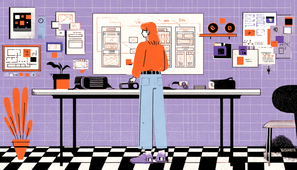
Prototyping and Testing VR Experiences Without Building an Entire World
The VR Prototyping Toolchain: From Paper to Presence
Here’s the dirty secret of VR design: most teams jump straight into building the full experience in Unity or Unreal Engine because it feels like there’s no other way to test something that’s inherently spatial and immersive. This is a mistake that burns weeks of development time and leads to expensive pivots when user testing reveals fundamental navigation problems. The answer is rapid, low-fidelity prototyping, and yes, that includes paper. Seriously.
For instance, storyboarding VR experiences as 360-degree panel sequences, literally drawing out what the user sees at each interaction decision point, from every angle, is a surprisingly effective way to identify spatial layout problems, information hierarchy issues, and interaction dead-ends before a single line of code is written. Microsoft’s Mixed Reality Design Lab has published extensively on this approach, and their teams use physical props, role-playing exercises, and annotated sketches to pressure-test spatial interaction concepts long before entering an engine. It forces the design team to think in three dimensions without the technical overhead.
Medium-Fidelity VR Prototyping: ShapesXR and Beyond
Moving up the fidelity ladder, tools like Mozilla Hubs, Gravity Sketch, and ShapesXR are genuinely game-changing. ShapesXR in particular allows designers to build 3D prototype environments directly inside a VR headset using intuitive gesture-based tools, no engineering required. You can place UI panels in space, define interaction zones, and run walkthrough tests with real users in a matter of hours. The fidelity is rough, but it’s good enough to surface the spatial and interaction problems that matter most. Adobe’s investment in VR design tooling suggests this category is only going to get more sophisticated.
User Testing in VR: Observation, Gaze Data, and the Problem of Being a Fly on the Wall
Testing a VR experience presents a fundamental UX research challenge: you can’t look over the user’s shoulder. When someone is testing a mobile app, you can see everything they see. In VR, they’re in their own world, and you’re standing outside it holding a notepad. This changes everything about how you structure observation sessions and what data you collect.
Fortunately, gaze-tracking data has become one of the most valuable VR research tools available. Modern headsets like Meta Quest Pro and PlayStation VR2 include built-in eye-tracking, which means you can record exactly where users are looking, what UI elements they fixate on, what they miss, and how long their gaze dwells on specific zones. This is far richer than traditional click-tracking and heatmaps; you’re capturing attention itself, not just the downstream behavior that attention produces. Run heatmap analyses on your spatial UI layout using gaze data, and you’ll often discover that your carefully designed navigation menu is getting zero attention because it’s just slightly outside the natural gaze zone.
Think-Aloud Protocols and Post-Session Spatial Memory Testing
Beyond gaze data, verbal think-aloud protocols remain valuable in VR testing, but they need adaptation. Ask users to narrate their experience continuously, because you can’t see what they’re seeing. Recording sessions with a mirrored screen output — casting the headset view to a monitor — lets observers track user gaze direction and catch moments of confusion in real time.
Post-session interviews should always ask users to locate specific interactions: “Where was the main menu?” “How did you go back to the previous screen?” Spatial memory recall tests your information architecture in ways that no survey can replicate. If users can’t remember where things lived in your VR space, your spatial hierarchy has failed them.
Virtual reality isn’t coming — it’s already here, already being used to train surgeons, sell apartments, treat PTSD, and build the next generation of enterprise collaboration tools. The UX designers who understand how to design for presence, who can navigate the spatial UI paradigm shift, who build inclusivity into the volumetric experience from day one, and who have the prototyping and research vocabulary to iterate confidently in three-dimensional space — those are the professionals who will define the next decade of digital product design. The screen was never the destination. It was always just a waypoint. Now we get to build the worlds beyond it.