


Predictive AI interfaces are changing how we experience digital products, and the shift is already here. Imagine opening an app and finding exactly what you need before you’ve even typed a word. No searching, no scrolling, no friction, just the right option waiting for you like a well-trained assistant who’s been paying close attention. Sounds like science fiction? Not anymore. This phenomenon is already happening in products you use every day, and it’s about to get a whole lot more sophisticated.
Here’s a number that might surprise you: according to a McKinsey Global Institute report, AI-driven personalization can reduce customer acquisition costs by up to 50% and increase revenue by 5 to 15%. No small UX tweak, this represents a fundamental shift in how interfaces behave, from static tools we operate to dynamic systems that anticipate us. The gap between those two paradigms is exactly where predictive UI lives.
For years, UX design has been about removing friction. We’ve obsessed over button placement, microcopy, information architecture, and loading times. All of that work matters enormously. But predictive user interfaces completely change the whole model. Instead of designing pathways for users to walk down, we’re designing systems that learn which pathway each user is most likely to want and then quietly clear the way before they even start walking.
This isn’t a trend you can afford to watch from the sidelines. Whether you’re a UX designer, product manager, or digital health strategist, the AI layer now weaves into the fabric of every serious product roadmap. Understanding how predictive UI systems work, where they excel, where they fail, and how to design them responsibly isn’t just intellectually compelling; it’s professionally essential.
What Actually Makes a User Interface “Predictive”?
The Difference Between Reactive and Anticipatory Design
Most interfaces we interact with are reactive. You tap, it responds. You type, it searches. You scroll, it loads. The entire design logic responds to explicit user intent, a stimulus-response loop that works fine but puts all the cognitive burden on the user. You must know what you want, how to ask for it, and how to navigate to find it. That’s three layers of friction before anything useful happens.
Predictive interfaces operate on a fundamentally different logic. They use machine learning models trained on behavioral data, things like what you’ve clicked on before, what time of day you typically do certain tasks, how long you linger on specific content types, and contextual signals like your location or calendar state. These signals let the system surface relevant options proactively. Rather than waiting for you to say what you want, the UI builds a probabilistic model of your next likely action and arranges itself accordingly.
Think about how Spotify’s home screen works on a Monday morning versus a Friday night. Same app, same account, but the content layout shifts based on learned listening patterns. Or consider how Gmail’s Smart Compose finishes your sentences, not because it read your mind but because it identified the pattern across thousands of similar emails. These are early, consumer-facing examples of predictive AI interfaces in action. The same core principles apply whether you’re designing a music streaming app or a complex enterprise tool used by healthcare professionals.
The Data Signals That Feed Prediction Engines
So what’s actually powering these systems? At the core of any predictive interface is a feedback loop between user behavior and a model that interprets this behavior. The richest signal is historical interaction data, the sequences of actions a user has taken over time. Clicking on article A, then B, then C creates a pattern. Do that enough times across enough users, and you can start predicting that someone who just clicked A and B is very likely to want C next.
Modern prediction engines go far beyond click history. Temporal data matters enormously; you probably check your bank balance at different times than you browse for flights. Contextual signals like device type, network speed, geolocation, and ambient noise add another predictive layer. Collaborative filtering, the technique powering Netflix recommendations, looks across users with similar behavioral profiles to make predictions for individuals. The model doesn’t need to have seen you do something before; it just needs to have seen similar people do it.
What this means from a design perspective is profound. The interface is no longer a fixed artifact. It’s a living document that reshapes itself based on a continuously updated model of who you are and what you need right now. And that raises as many design challenges as it solves, because when the interface changes beneath your feet, you’d better make sure it’s doing so in a way that feels helpful rather than eerie.
AI Techniques That Are Actively Reshaping Interface Behavior
From Recommendation Engines to Contextual AI Layers
Recommendation engines were the first commercially successful form of predictive UI. Amazon’s “customers who bought this also bought” feature is reportedly responsible for 35% of the company’s total revenue. That’s a staggering return on what is essentially an interface decision, showing you things you didn’t ask for in a place where you’re already primed to act. The engine isn’t adding a feature. It’s restructuring the entire decision-making context around your next likely action.
We’ve moved well beyond basic collaborative filtering. Modern AI techniques like reinforcement learning, the same approach that taught AlphaGo to beat world champions, now apply to interface personalization. Rather than a static model predicting preferences from past behavior, reinforcement learning systems continuously optimize interface layout, content sequencing, and feature prominence based on real-time signals. The interface, in effect, teaches itself to serve each individual user better over time.
Large language models, yes, the same family of models behind ChatGPT, are now being embedded directly into UI layers as contextual assistants. Microsoft’s Copilot integration across Office 365 is the highest-profile example. But we’re seeing the same pattern in tools like Notion AI, Figma’s AI prototyping features, and dozens of enterprise software platforms. These aren’t chatbots bolted onto the side of an interface. They’re AI layers woven into the interaction model itself, capable of interpreting natural language intent, surfacing relevant tools and content, and completing complex multi-step tasks on a user’s behalf.
Natural Language Processing and Intent Recognition
One of the most exciting frontiers in predictive UI is the collapse of the command syntax barrier. Historically, interacting with software meant learning the system’s language, its menu structures, its terminology, and its logic. NLP-powered interfaces are inverting this paradigm. The system learns your language instead. You describe what you want in plain speech or text, and the interface maps that to its own internal structure.
Google’s search has been doing a version of this for years, interpreting semantically ambiguous queries and returning contextually relevant results rather than just keyword matches. But in-product NLP is now making the same leap. Salesforce Einstein, for example, lets sales reps query their CRM data in natural language. “Show me all deals over $50k that haven’t had activity in 30 days” returns an instant filtered view without the user touching a single filter control. The interface has learned to connect human intent with system capability.
For UX designers, this creates a fascinating challenge. How do you design affordances for an interface behavior the user doesn’t fully understand yet? What’s the best way to communicate that the search bar accepts plain English when users have been trained their whole lives to use keyword syntax? The answer, increasingly, is through progressive disclosure and intelligent placeholders, showing examples of natural language queries in the input field itself or surfacing suggestions as the user begins to type, and demonstrating capabilities through interaction rather than instruction.
Where Predictive UIs Are Making the Biggest Impact Right Now
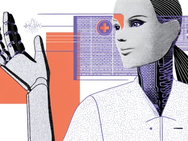
Digital Health: Where Prediction Has Life-Changing Stakes
Nowhere is the potential of predictive AI interfaces more significant, or more carefully scrutinized, than in digital health. The FDA has already cleared several AI-powered clinical decision support tools that surface predictive alerts directly within clinical workflows. Epic’s EHR platform, for example, uses predictive models to flag patients at elevated risk for sepsis, readmission, or deterioration, surfacing alerts to clinicians the moment they review a patient record. That’s predictive UI operating at the highest possible stakes.
Consumer-facing health apps are moving fast in this direction too. Apple’s Health app combines motion sensors, heart rate variability data, and sleep tracking to surface personalized insights users didn’t explicitly request. Whoop, the fitness wearable platform, uses recovery and strain prediction algorithms to proactively recommend whether you should train hard or rest. That recommendation appears the moment you open the app in the morning, before you’ve asked any question at all. The interface already knows what you’re about to ask.
The UX design implications here are enormous. Predictive health interfaces must balance being helpfully proactive with being alarmingly presumptuous. Surface a high-risk flag incorrectly? You’ve potentially caused unnecessary anxiety or unwarranted clinical action. Is it appropriate to bury a genuine warning in an overly conservative interface? The consequences can be worse. Designing the right alert hierarchy, confidence thresholds, and explainability layers isn’t just exemplary UX practice in this context; it’s an ethical imperative.
E-Commerce, Productivity, and Beyond
Outside healthcare, the commercial applications of predictive UI are multiplying rapidly. In e-commerce, dynamic storefronts that reorganize product categories, pricing emphasis, and promotional content based on individual user profiles are moving from a luxury feature to a competitive baseline. Shopify merchants using AI-powered personalization tools report conversion rate improvements of 20 to 30 percent. The interface is essentially becoming a different store for each visitor.
In productivity software, the stakes are different, but the principles are the same. Notion’s AI autofill, Linear’s smart issue prioritization, and Slack’s message prioritization algorithm all apply predictive logic to help knowledge workers cut through information overload. These tools make a constant series of low-level editorial decisions on your behalf: what to surface, what to suppress, and in what order to present options. Get it right, and you feel inexplicably productive. Get it wrong, and you feel mysteriously frustrated without being able to articulate exactly why.
The Design and Ethical Risks You Can’t Ignore
When Prediction Becomes Presumption
There’s a moment in every user’s experience with predictive AI interfaces when the magic turns into something uncomfortable. You’ve felt it, that slight unease when an ad appears for something you only discussed out loud or when a recommendation feels so accurate it’s invasive. Researchers call this the “creepiness threshold,” and it’s a real, measurable UX phenomenon. A study in the Journal of Consumer Psychology found that personalization boosts engagement right up until it signals that the system knows how it knows something. At that point, trust drops sharply.
For designers, this means the explainability of predictive suggestions isn’t just a valuable transparency feature; it’s a trust mechanism that protects long-term engagement. “Because you saved this article” or “Based on your morning routine” are small strings of text that carry enormous psychological weight. They transform a potentially eerie coincidence into a comprehensible service logic. Spotify shows you “Daily Mix based on your listening” not because it’s legally required to, but because that framing converts a potentially unsettling behavior into a delightful one.
There’s also the filter bubble problem. Predictive interfaces, by definition, surface more of what you’ve already engaged with. That’s useful for task completion, but it can create closed information loops that reinforce existing habits rather than expanding them. The UX challenge is designing in just enough serendipity, surfacing occasionally surprising content or features that the model predicts you might like even though you haven’t demonstrated that preference yet. Spotify calls these “Discovery” features. The design intent is explicit: break the loop on purpose.
Bias, Fairness, and the Responsibility of the Training Set
The uncomfortable truth about every predictive system is that it is only as fair as the data it was trained on. When historical user data overrepresents certain demographics, the model optimizes for those behavior patterns. Users who don’t fit the training profile get predictions that consistently miss the mark. This creates a two-tier experience: some users feel the interface was made for them, while others feel like they’re using a product designed for someone else entirely.
This is not a hypothetical problem. Research from MIT Media Lab has documented significant performance disparities in commercial AI systems across gender and skin tone variables. Healthcare AI tools underperform for Black patients when training data skews toward white patient populations. These are systematic failures that scale with the product, and because they’re embedded in the interface logic rather than in any single design decision, they’re far harder to audit than a straightforward accessibility failure.
The practical response for design teams is to treat model auditing as a UX discipline, not just a data science task. Build user testing protocols that specifically test prediction quality across diverse user groups. Create feedback mechanisms that let users signal when predictions are wrong, and then feed that signal back into model retraining. Finally, be willing to cap prediction confidence when the model hasn’t seen enough data for a particular user profile, defaulting to neutral rather than biased.
How to Design Predictive UI Systems That Users Actually Trust
Building the Explainability Layer Into Your Design System
If predictive behavior is going to be a first-class feature of your product, explainability needs to be a first-class design component, not an afterthought bolted on for compliance reasons. That means creating a systematic way to surface the “why” behind predictions at the moment they appear. The design pattern is consistent: a prediction or suggestion appears, and immediately adjacent to it is a short, plain-language reason. Designing AI-driven interfaces that users trust requires this kind of transparency. “You have a 9 AM meeting,” explains a calendar prompt. “You usually check this on Tuesday mornings,” explains a dashboard widget’s prominent placement.
This pattern does several things simultaneously. It demonstrates that the system has a rational basis for its behavior, which builds trust. It provides users a mental model for how the prediction engine works, which reduces the creepiness threshold. And it creates a natural correction mechanism; if the stated reason is wrong, the user knows what data point to challenge. This is significantly better UX than a magical prediction that appears with no context because magic that fails looks like a malfunction, while a reasoned suggestion that misses looks like a reasonable attempt.
Designing for User Control Without Destroying the Experience
The tension at the heart of predictive UI design is the control paradox. Predictions work best when the system has rich behavioral data and acts on it confidently. But users trust interfaces more when they feel in control. Give users too many override controls and you introduce friction that undermines the core value proposition. Give them too few and you risk the “I’m being managed by an algorithm” alienation that drives churn.
The solution most leading products are converging on is layered control. Lightweight in-context feedback, thumbs up, thumbs down, and “don’t show this” options handle the moment-to-moment corrections with minimal friction. A dedicated preferences or personalization settings screen handles deeper overrides for users who want them. And periodic prompts, “Does this still match how you use this feature?” handle long-term drift as user needs change. This three-tier model keeps the day-to-day experience clean while providing genuine recourse for users who want it.
The Non-Negotiable: Always Provide an Off-Ramp
What you absolutely cannot do, and this is a hill worth dying on, is design a predictive system with no off-ramp. Users need to be able to reset, opt down, or override predictions when those predictions are wrong or unwanted. Locking users into an interface that has made incorrect inferences with no way to correct them is one of the fastest paths to deep product distrust. These are the kinds of complaints that get written up in Reddit threads and linger in X (Twitter) complaints for years.
The future of UX design isn’t about adding more features or refining microcopy. It’s about building systems that continuously learn, anticipate, and adapt, bridging the gap between what users want and what they must do to get it. Predictive AI interfaces are already reshaping the competitive landscape across every product category, from consumer apps to clinical decision support tools. The designers who will get this right aren’t the ones who simply bolt an AI layer onto an existing interface and call it predictive. They’re the ones who understand that prediction is a relationship, built on data, sustained by transparency, and governed by genuine respect for the humans on the other side of the screen. Get that relationship right, and you’re not just building a better interface. You’re building something users feel understood by. And that’s the most powerful thing a product can do.