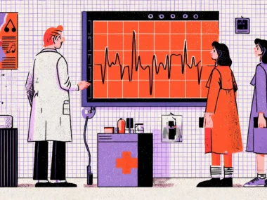


There’s a moment that happens to almost every smartwatch user. You’re mid-conversation, your wrist buzzes, and suddenly you’re glancing down to see a notification that your heart rate is “elevated.” Is it the coffee? The argument you just had? Or something worth calling your doctor about? You stare at the screen for three seconds, confused, slightly anxious, and ultimately more stressed than before the alert fired. That moment—tiny pockets of friction and uncertainty—is a UX failure. And in health tech, UX failures aren’t just annoying. They can be genuinely dangerous.
The wearable health tech market is exploding. By 2028, it’s projected to surpass $186 billion globally, with smartwatches and biosensors moving from fitness novelties to legitimate clinical tools. The Apple Watch now detects atrial fibrillation with enough clinical validity to earn FDA clearance. Millions of diabetics rely daily on continuous glucose monitors from companies like Dexcom and Abbott, which they strap to their arms. Whoop, Garmin, and Fitbit are generating longitudinal health data that researchers couldn’t have dreamed of a decade ago. These devices are extraordinary. But they’re only as powerful as the experience wrapped around them.
Here’s the uncomfortable truth: most wearable health UX is still designed like it belongs on a desktop from 2009. Walls of data. Confusing metric labels. Alerts that cry wolf. Onboarding flows that would make a compliance officer weep. The hardware has lapped the software experience, and users are paying the price with confusion, alert fatigue, and ultimately abandoned devices gathering dust in junk drawers. Studies suggest that up to 30% of wearable device owners stop using their devices within six months of purchase.
So what does genuinely great wearable UX look like? What separates a device that becomes part of someone’s daily health identity from one that gets abandoned? That’s exactly what we’re going to dig into. Buckle up, because this is where hardware ambition meets human-centered design.
Designing for a Three-Second Window
Why the Wrist Is the Most Demanding Screen You’ll Ever Design For
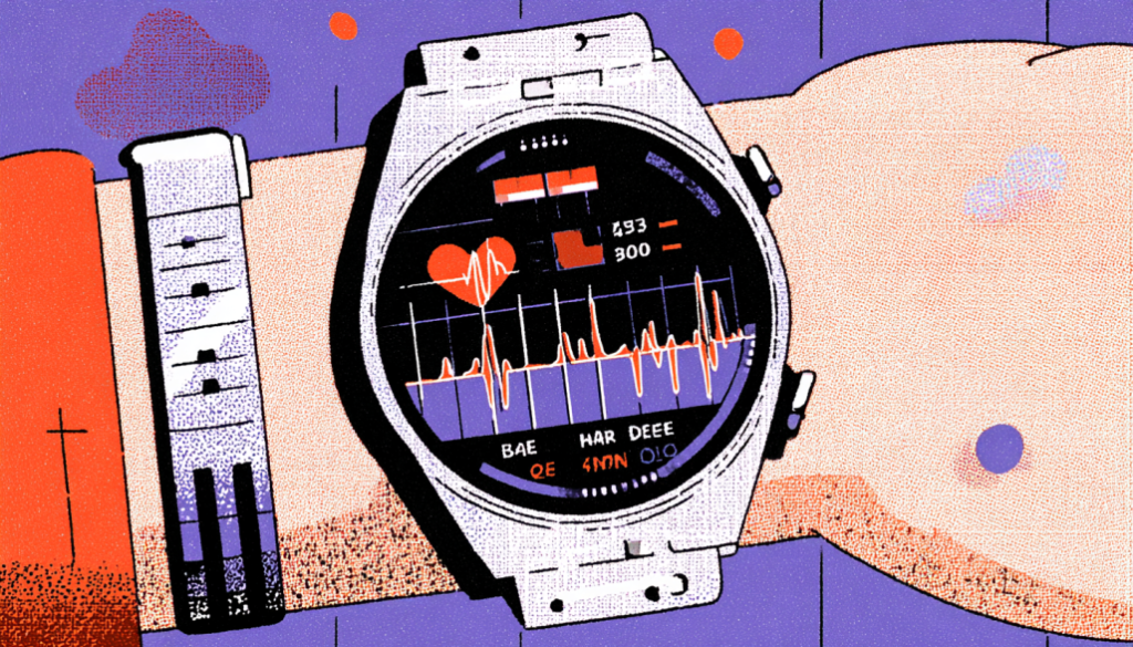
The wrist is not a phone. It’s not a tablet. It’s not even a tiny phone. It’s a completely different interaction paradigm that most designers don’t fully respect until they’ve spent serious time in the constraint. When someone raises their wrist to check their device, they have an average of two to four seconds before the social pressure of the interaction they’re in — or simply the awkwardness of the pose — pulls their attention away. Two to four seconds. That’s your entire canvas.
Glanceability is the art of communicating the most meaningful information in the least amount of cognitive effort. Think about how the best analog watch faces work. You absorb the time without “reading” anything. Your brain pattern-matches the hand positions almost subconsciously. Great wearable health UX should aspire to the same level of instant comprehension. If a user has to read, parse, and interpret a health metric while glancing, you’ve already lost them. The goal is immediate recognition, not effortful analysis.
Apple’s Activity Rings are a masterclass in this principle. Three colored circles, each representing Move, Exercise, and Stand goals. You don’t need a legend after the first week. You don’t need to read numbers. You see the rings, you see how complete they are, and you know everything you need to know in under a second. Contrast that with some third-party health apps that stack six or seven metrics in a watch face, each requiring you to squint at tiny labels and decimal points. One respects the three-second window. The other ignores it entirely.
When designing for glanceability, think in layers. The first layer is the immediate visual: shape, color, and size relationships that communicate at a glance. The second layer is the confirmatory glance: actual numbers or short labels for users who want specificity. The third layer lives in the app or a deeper tap interaction—trends, history, and context. Most wearable UX mistakes happen when designers try to collapse all three layers into the first one. Respect the hierarchy. Your users’ wrists — and their patience — will thank you.
Contextual Alerts and the War Against Notification Fatigue
Teaching Your Device to Know When to Speak — and When to Shut Up
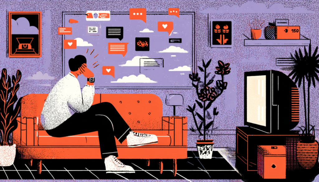
Alert fatigue is one of the most well-documented problems in clinical healthcare. Nurses in ICUs tune out monitor alarms because the alarm-to-actionable-event ratio is so skewed toward false positives that the brain starts filtering the sound as background noise. This isn’t negligence. It’s human neuroscience. And if it happens to trained medical professionals in life-or-death environments, imagine what happens to a regular person wearing a consumer smartwatch that buzzes 40 times a day.
The Whoop band took a philosophically interesting stance here. It deliberately has no screen and sends no real-time alerts during the day. Instead, it gives you a daily “recovery score” each morning — a single, synthesized number that tells you how ready your body is to perform. This is a radical act of UX restraint. By refusing to interrupt you throughout the day, Whoop forces you into a once-daily ritual of checking in with your body data. The result? Users actually read and internalize the data rather than dismissing it as another ping. It’s a design lesson masquerading as a product philosophy.
Not every wearable can or should take Whoop’s no-screen approach. But every wearable designer needs to develop a rigorous alert taxonomy. Think of it this way: alerts should be tiered like emergency services. A “911 call” alert—atrial fibrillation detected, fall detected, or blood oxygen dangerously low—should be immediate, bold, and demand attention. A “non-urgent advisory”—you’ve been sitting for 45 minutes, and your resting heart rate is slightly elevated today—should be gentle, dismissible, and ideally delivered at a naturally appropriate moment, not during your morning commute. And a “nice to know” insight—your sleep quality improved this week—should live in the app, not buzz your wrist at 7am.
Timing is everything. Research from the University of California Berkeley showed that interruption timing dramatically affects both the perceived importance of a notification and the user’s emotional response to it. An alert that fires during a period of stillness is processed very differently than one that fires mid-task. Smart wearables should be using motion data, calendar context, and behavioral patterns to choose alert timing deliberately. If you know the user is in a workout, hold the non-critical notifications. If you know it’s Sunday morning and their heart rate is relaxed, that’s a great moment for a weekly summary. Context awareness isn’t a nice-to-have. In health wearables, it’s the whole game.
Onboarding and Health Literacy: Meeting Users Where They Actually Are
The Gap Between What Your Data Says and What Your User Understands
Here’s a question worth sitting with: what percentage of your users actually know what HRV stands for, let alone what a “healthy” HRV range is for their age, fitness level, and genetics? Heart rate variability is one of the most clinically interesting metrics modern wearables track. It’s also one of the most misunderstood, miscontextualized, and anxiety-inducing numbers you can show someone without proper scaffolding. Drop a raw HRV number on a 52-year-old with health anxiety, and you’ve potentially ruined their day—or sent them to urgent care unnecessarily.
Health literacy is the invisible elephant in every wearable UX room. According to the National Assessment of Adult Literacy, only 12% of American adults have proficient health literacy. That means the vast majority of your users cannot reliably interpret clinical health information without support. Your onboarding can’t assume a baseline of medical knowledge. It needs to build comprehension progressively, contextually, and gently. The Dexcom CGM app does this reasonably well with its glucose trend arrows — instead of just showing you a number, it shows you the direction and rate of change with simple iconography that new users can learn in minutes. Directional information is cognitively easier than absolute numbers for non-experts.
Progressive disclosure is your best friend in health tech onboarding. Start with what the device does for the user emotionally and behaviorally. “This approach will help you understand your sleep patterns” before diving into the biometric mechanics. Introduce one or two metrics at a time, each with clear plain-language explanations and relatable benchmarks. Netflix-style tooltips that appear contextually when a user first encounters a metric—rather than a mandatory 20-slide onboarding carousel they’ll swipe through in 30 seconds—create genuine learning moments. And never, ever show a health metric without telling the user what to do with the information. Data without guidance isn’t empowering. It’s just noise with a nice chart.
Personalization in onboarding matters enormously in health contexts. A 25-year-old marathon runner and a 68-year-old cardiac rehabilitation patient should have fundamentally different first experiences with a heart rate monitor. Both might be using the same hardware, but the metrics that matter, the alert thresholds that are appropriate, and the language that resonates are wildly different. The best wearable health platforms — think Garmin’s nuanced athlete profiles versus Apple’s more general wellness framing — understand that health context shapes everything about how data should be presented.
Designing for Chronic Conditions: When Wearables Become Medical Lifelines
When “User Experience” Becomes “Patient Experience”
Designing for someone tracking fitness goals is a lovely design challenge. Designing for someone managing Type 1 diabetes, congestive heart failure, or epilepsy is an entirely different moral weight class. When a wearable becomes a medical lifeline—something a person depends on to make real-time decisions about insulin, medication, or whether to call emergency services—the UX stakes are no longer about engagement metrics or daily active users. They’re about safety, trust, and dignity.
The Dexcom G7 and Abbott Libre 3 continuous glucose monitors are instructive case studies. Both display glucose data continuously, alert users to dangerous highs and lows, and integrate with insulin pump systems in closed-loop configurations. The UX decisions in these systems have direct clinical consequences. An alert that’s too sensitive creates alarm fatigue and causes users to dismiss even critical warnings. An alert that’s not sensitive enough misses a dangerous hypoglycemic event. Finding the right calibration—and crucially, allowing users to personalize alert thresholds within clinically safe bounds—requires extraordinary collaboration between UX designers, clinical advisors, and the patients themselves.
Involving patients as co-designers—not just usability testers—is non-negotiable in this space. The #WeAreNotWaiting movement in the diabetes community produced OpenAPS, a DIY closed-loop insulin delivery system built by patients who were frustrated with the pace of commercial device development. Thousands of people built their own artificial pancreas systems from off-the-shelf components because the commercial products weren’t meeting their lived needs. That’s not just a fascinating story. It’s a thunderous signal that people with chronic conditions are expert users with deep, sophisticated requirements that generic wearable UX often completely misses. Co-design isn’t charitable here. It’s essential.
Emotional design matters profoundly when health data is chronic and inescapable. Someone with Type 1 diabetes sees their glucose number dozens of times a day, every day, for the rest of their life. A poorly designed display that makes every slightly elevated reading look alarming—red colors, flashing borders, aggressive typography—creates a sustained psychological toll. Researchers at Stanford have documented “diabetes device burnout,” where patients disengage from monitoring technology because the emotional weight of constant data feedback becomes overwhelming. Designing for chronic conditions means designing for the emotional long game: calm color systems, positive reinforcement for time-in-range, and visual languages that communicate “here’s information” rather than “here’s something to panic about.”
Privacy, Trust, and the Ethics of Intimate Data
The Invisible Contract Between Device and Body
Your smartwatch knows things about you that your closest friends don’t. It knows when you had a restless night. It knows your resting heart rate spiked the morning of a difficult conversation. It may know when your menstrual cycle is approaching, when your stress response is elevated, and—with emerging sensors—potentially markers of metabolic health. This is extraordinary data. And it demands an extraordinary level of trust-building in the design of the systems that collect, store, and use it.
Privacy UX in health wearables is still shockingly immature. Most devices bury their data sharing practices in 40-page terms of service documents that nobody reads, uses dark patterns to nudge users toward more permissive sharing settings, and provides almost no meaningful control once the data is collected. The Fitbit-Google acquisition sent ripples of unease through the health tech community precisely because users suddenly weren’t sure whose hands their intimate health data had landed in. That uncertainty—the erosion of trust—is a direct UX failure. Users should never have to wonder what happens to their body data.
Trust is built through transparency and control, not privacy policies. Practically, this means designing clear, visual data maps that show users exactly what data is collected, where it goes, and who can access it. It means building meaningful opt-in flows — not pre-checked boxes — for data sharing, research participation, and third-party integrations. It means providing one-tap data deletion with clear confirmation of what deletion by default actually means. Withings does a notably excellent job of making their data practices visible within the app itself, rather than relegating them to a settings submenu. When designers highlight privacy as a feature rather than conceal it as a liability, it becomes a genuine differentiator.
UX designers bear the responsibility of understanding the systemic concerns that extend beyond individual users in the realm of wearable health data ethics. Health data can reveal pregnancy. It can reveal mental health patterns. This data can be weaponized in jurisdictions where rights are contested or fragile. Designing privacy controls for the median user isn’t enough. Your design must protect the most vulnerable user in your audience. That means thinking about intimate partner surveillance—can someone else monitor this device’s data? It means thinking about employer or insurer access. It means building privacy architecture that treats user data as if the user’s safety depends on it. Because, for some of your users, it genuinely does.
The wearable health tech space is one of the most thrilling and consequential design frontiers of our generation. We have sensors that can detect atrial fibrillation, continuous glucose monitors that are replacing painful finger pricks, and sleep trackers that are surfacing insights that reshape how people understand their bodies. But technology without thoughtful UX is just hardware waiting to fail someone. The designers, product managers, and health professionals who approach this space with genuine human-centeredness, who obsess over the three-second glance, who rage against notification fatigue, who co-design with patients rather than for them, and who treat privacy as sacred—are the ones building products that actually change lives. That’s the standard this medium demands. And honestly? It’s the most exciting design challenge we’ve ever been handed.