


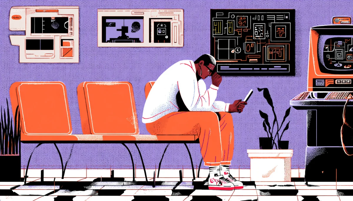
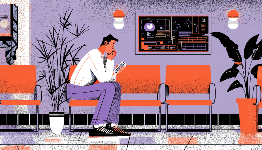
There’s a moment most of us know well. You’re sitting in a waiting room, staring at a check-in tablet, and the screen is cluttered with fourteen form fields, a confusing navigation menu, and a privacy policy modal that just popped up uninvited. Your heart rate ticks up a little. Maybe your palms get slightly damp. And you’re not even sick yet; you’re just trying to register. Now imagine you’re a cancer patient trying to access your test results through a poorly designed patient portal. Or an elderly woman navigating a telehealth app alone for the first time. Patient anxiety in digital health settings isn’t a fringe issue; it’s the default. The stakes of bad UX in healthcare aren’t just annoying. They’re genuinely harmful.
Research from the Pew Research Center shows that 80% of internet users have searched for health information online, and a significant portion reports feeling more anxious after the experience, not less. That’s a damning indictment of how digital health tools are currently designed. When we build healthcare apps, portals, and interfaces without intentional empathy, we’re not just creating friction. We’re amplifying fear at the exact moment people need reassurance.
The good news? UX designers have enormous power here. The choices you make, the color of a button, the phrasing of an error message, and the order of steps in a flow can either spike a patient’s cortisol or genuinely calm their nervous system. This isn’t hyperbole. Cognitive load theory, trauma-informed design principles, and years of behavioral research all confirm that how an interface feels directly affects how a user feels. That’s a profound responsibility.
This article digs into the practical, evidence-backed strategies you can use right now to design digital health experiences that reduce patient anxiety, build trust, and treat patients like humans, not form fields waiting to be completed.
Understanding the Anxiety-UX Loop in Healthcare Contexts
Why Healthcare Users Are Already Primed for Stress
Before a patient ever touches your interface, they’re already operating under elevated stress. This is a fundamental truth that separates healthcare UX from virtually every other design domain. When someone opens a food delivery app, they’re hungry and mildly impatient. When someone opens a patient portal to review a biopsy result, they may be terrified. The emotional baseline is entirely different, and designing without acknowledging that difference is a critical failure of empathy.
Psychologists describe this state as “anticipatory anxiety,” the dread that builds while waiting for a potentially threatening outcome. In healthcare contexts, this anxiety hijacks cognitive function. Working memory shrinks. Decision fatigue sets in faster. Users become more prone to errors, more likely to abandon tasks, and more likely to catastrophize ambiguous information.
The work of Dr. Theresa Nguyen and others in digital mental health has shown that the concept of “psychological safety” applies just as much to digital interfaces as it does to physical spaces. A user needs to feel that the system is on their side, that it won’t judge them, won’t surprise them with something frightening without warning, and won’t abandon them in the middle of a critical task. Every UX decision, microcopy, animation timing, and piece of information architecture either contributes to or erodes that psychological safety. Understanding this loop isn’t just academically compelling. It’s the foundation on which every design decision in this space should be built.
The Compounding Effect of Cognitive Overload
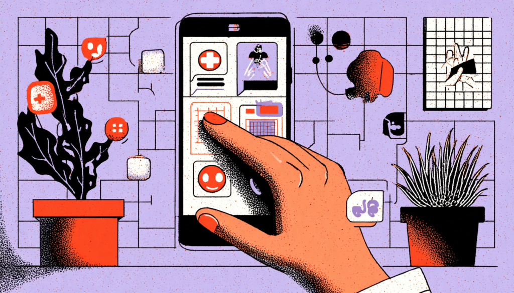
Cognitive overload is the enemy of calm. When an interface demands too much of a user’s mental bandwidth, through jargon, excessive choices, unclear navigation, or visual noise, it doesn’t just frustrate them. It triggers a stress response. Think of cognitive load as a glass of water. For a calm user, the glass might be half full. In a healthcare user, it often arrives nearly overflowing before the session even begins. Any additional complexity you add risks spilling it entirely.
Apps like MyChart, which is one of the most widely used patient portal platforms in the United States, have historically struggled with these issues. The interface often presents lab results as raw clinical data, INR levels, creatinine values, and reference ranges without contextual explanation. For a medically literate user, the task is manageable. For the majority of patients, it’s terrifying. A number sitting outside a reference range, displayed in bold red, with no plain-language explanation, is a design decision that can send someone into a panic spiral at 11pm when their doctor’s office is closed and Google is the only resource available.
The solution isn’t to hide information or dumb it down. It’s to scaffold it intelligently. Progressive disclosure, the technique of revealing information in digestible layers, is one of the most powerful tools in the anxious-user design toolkit. Show the plain-language summary first. Let the user choose to see the clinical details. This respects both patient intelligence and patient emotional capacity, without forcing them to process everything simultaneously.
The Visual Language of Calm: Color, Typography, and Space
Choosing Colors That Heal Rather Than Alarm
Color is not decoration in healthcare UX. It’s communication. And when your users are already anxious, color communicates at a visceral, precognitive level—before any text is read, before any button is found. The brain processes color in milliseconds, and the emotional associations it triggers are deeply conditioned. This means your palatte is one of your most powerful calming tools, or one of your most powerful anxiety amplifiers.
Research in environmental psychology consistently shows that soft blues and greens activate the parasympathetic nervous system, the “rest and digest” counterpart to the “fight or flight” response. It’s no accident that hospital environments increasingly incorporate these tones in their physical design. Apps like Calm and Headspace have built entire visual identities around muted teals, soft lavenders, and warm neutrals precisely because these palettes physiologically signal safety. For digital health experiences, borrowing from this language is not just aesthetically pleasing; it’s clinically informed.
What you should actively avoid is the aggressive use of red (learn more about color contrast in healthcare UI) for anything other than genuine emergencies. Red is physiologically alerting. It raises heart rate. In many healthcare apps, red is used liberally for out-of-range lab values, for overdue tasks, and for error states, creating an interface that, at a glance, reads as a series of alarms. That visual cacophony is profoundly counterproductive. Consider orange or amber for warnings that are important but not critical, and reserve true red for genuinely urgent scenarios. Even then, pair it with calm, reassuring microcopy so the color communicates urgency without triggering panic.
Typography and Spacing as Emotional Architecture
Typography is how your interface breathes. Dense, small, tightly kerned text feels like a terms-and-conditions document. It signals effort, creates cognitive friction, and subconsciously communicates that people should avoid rather than engage with this information. Generous line spacing, appropriately large body text (minimum 16px for body copy in healthcare contexts, given the higher proportion of older users), and clear typographic hierarchy all contribute to an experience that feels manageable rather than overwhelming.
The choice of typeface carries emotional weight, too. Sharp, angular serif fonts can feel clinical and cold, appropriate perhaps for a research paper, but jarring in a patient-facing interface where warmth matters. Rounded sans-serifs like Inter, Nunito, or even the custom typefaces used by apps like Hims & Hers communicate approachability. They say, subtly but unmistakably, “We’re on your side. This isn’t intimidating.” That subconscious reassurance is genuinely valuable when your user is scared.
White space, or negative space, is perhaps the most underappreciated tool for calming design. Crowded interfaces feel urgent and chaotic, which is the last thing you want a patient to feel. Generous padding around elements, clear visual separation between sections, and a restrained approach to information density all work together to say, “Take your time. There’s no rush. You’re in control.” That sense of control is central to anxiety reduction. Research from the American Psychological Association consistently links perceived control to reduced anxiety, and a spacious, unhurried layout design is one of the most direct ways to communicate that control through a screen.
Microcopy and Tone: The Words That Either Soothe or Terrify
Writing Error Messages That Don’t Feel Like Punishment
Error messages are the pop quizzes of UX writing; nobody likes them, and they reveal a lot about how a designer really thinks about their users. In most apps, errors are written as passive-aggressive accusations: “Invalid input.” “Password does not meet requirements.” “You have been logged out due to inactivity.” Each of these messages, however technically accurate, lands as a small social rejection. For an anxious healthcare user, these microfailures accumulate. They chip away at the user’s sense of competence and safety until the whole experience feels hostile.
Good error copy in healthcare does three things simultaneously: it explains what happened without blame, it tells the user exactly what to do next, and it maintains a warm, human tone throughout. Compare “Invalid date of birth” to “We didn’t recognize that date format; try entering it as MM/DD/YYYY.” The second version takes fractionally more space but delivers something the first entirely lacks: respect. It assumes good faith. It treats the user as a reasonable person who simply needs clarification, not as someone who made a mistake that requires correcting.
Woebot, the AI-powered mental health chatbot, is a masterclass in this kind of microcopy. Even when users input something unexpected or when the system can’t process a response, the copy maintains a consistent warmth and humility that preserves the user’s sense of safety. “I didn’t quite catch that; can you tell me more?” is infinitely less clinical than “Unrecognized input.” The emotional architecture of healthcare apps should model that same ethos throughout every interaction, especially at points of friction.
The Power of Reassuring Confirmations and Progress Signals
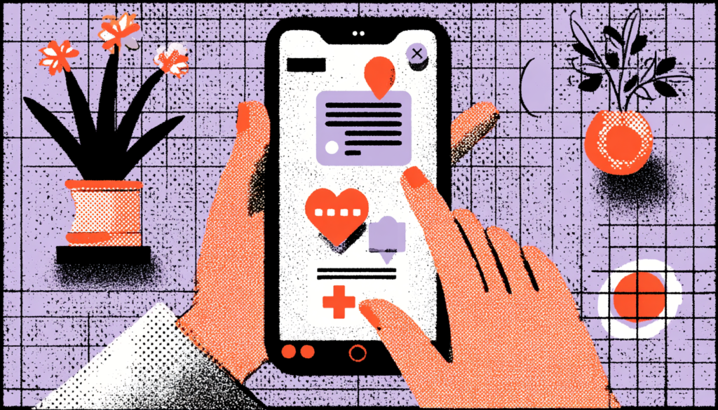
If error messages are the moments where things go wrong, confirmation messages are the moments where you can actively build trust. Most healthcare apps treat confirmation messages as administrative necessities: “Form submitted.” “Appointment booked.” Done. But these are valuable chances to genuinely calm and reassure a user who may have just done something nerve-wracking, submitted a sensitive health history, scheduled a mental health consultation, or ordered a medication refill.
Consider the difference between “Appointment confirmed” and “You’re all set. Dr. Chen will see you on Thursday at 2pm. We’ll send you a reminder the day before.” The second version anticipates the user’s next anxiety (Will I forget? What happens next?) and proactively addresses it. That’s not just good UX writing; it’s anxiety-informed design that treats the patient’s whole emotional experience as part of the product’s job. Amazon does this type of communication extraordinarily well with order confirmations, and there’s no reason healthcare apps can’t apply the same logic.
Progress indicators deserve a special mention here. Multi-step healthcare forms, insurance verification, symptom intake questionnaires, and onboarding flows are notorious anxiety generators because they feel endless. A clearly visible progress bar does something psychologically remarkable: it transforms an unknown ordeal into a known finite task. Step 3 of 6 gives the user a cognitive anchor. It says, “You know where you are. You can see the end. You’ve got this.” That small piece of information can measurably reduce abandonment rates and significantly improve the user’s emotional state throughout the flow.
Interaction Design and Flow: Creating Moments of Agency and Control
Designing for Perceived Control in High-Stakes Moments
Agency is the antidote to anxiety. When users feel they have meaningful control over what’s happening, when they can move forward, pause, go back, ask a question, or skip something, their anxiety levels measurably decrease. This is well-established in behavioral psychology, and it translates directly into interaction design principles for healthcare apps. The goal isn’t to remove all difficult content. It’s to make sure the user always feels like the driver, not the passenger.
One of the most effective techniques is the use of optional depth. Let users choose how much information they see at any given time. Rather than front-loading an entire medical history form on page one, ask one meaningful question at a time, a pattern popularized by Typeform and now widely adopted in product design for good reason. Single-question flows feel conversational rather than interrogative. They reduce the visual overwhelm of seeing thirty fields simultaneously, and they allow users to pause and reflect between inputs without feeling lost in a sea of unanswered questions.
Another critical moment of agency is the ability to save progress and return later. This sounds obvious, but it’s shockingly rare in healthcare form design. When a patient is filling out a complex prior authorization form or a detailed symptom history questionnaire and needs to stop because their baby is crying or they’re suddenly too emotional to continue, finding that their progress has been lost is a devastating experience. It erodes trust instantly. Auto-save functionality, with a clear “continue where you left off” feature, sends a powerful message: “We understand your life is complicated. This can wait. We’ve got you.”
Transitions, Animations, and the Rhythm of Calm
The pace of an interface has a physiological effect. Abrupt transitions, instant page loads that slam new content onto the screen, and jarring modal appearances all create a kind of visual startle response, small but cumulative. When every interaction feels slightly jarring, the overall experience feels relentless. Contrast these effects with the gentle, easing transitions in apps like Headspace or Apple Health, where elements slide and fade in with deliberate, slow curves. The interface breathes. It invites the user to breathe with it.
Animation timing in healthcare UX should lean toward the slower end of what feels natural, not so slow as to feel broken, but slow enough to feel unhurried. The Material Design guidelines suggest 300ms for most standard transitions, but in healthcare contexts, easing functions that slow down gradually (ease-out rather than linear) feel more natural and less mechanical. These are subtle details, but they stack. When every micro-interaction in your app communicates patience and calm, the cumulative emotional effect is genuinely significant.
Loading states deserve particular attention. In healthcare apps, when something is processing, lab results are loading, a teleconsult is connecting, or a prescription is being sent, the waiting period is psychologically loaded. An indeterminate spinner communicates uncertainty and lack of control. A progress bar, even an estimated one, communicates process and predictability. Better still, consider using loading states as micro-moments of reassurance; a calm message like “Securely connecting to your provider…” does double duty, both filling the wait and reinforcing the security and human care that underlies the process.
Accessibility and Inclusive Design as Anxiety Reduction
Designing for the Users Most Likely to Feel Anxious
Here’s something the design industry doesn’t say loudly enough: the users most likely to feel anxious about digital health tools are also the users most likely to be excluded by inaccessible design. Our guide to inclusive healthcare UX design covers many of these overlapping challenges. Elderly patients, people with lower digital literacy, users with visual impairments, and people navigating the healthcare system in their second language—these groups experience compounded anxiety when interfaces don’t accommodate their needs. Accessibility isn’t a compliance checkbox. It’s a fundamental act of anxiety reduction.
Consider vision accessibility. WCAG AA contrast ratios aren’t just about technical legibility; they directly reduce cognitive strain. Low-contrast text forces users to squint, to reread, and to work harder to extract information. That effort costs cognitive resources that anxious users don’t have to spare. High-contrast design, clear focus indicators for keyboard navigation, and appropriately sized tap targets (minimum 44x44px per Apple’s HIG) all reduce the friction that turns into stress. For older users in particular, who are among the most frequent healthcare consumers, these choices can be the difference between a usable tool and an abandoned one.
Language accessibility is equally critical. Healthcare is one of the most jargon-dense fields in existence. When a digital intake form asks a patient to describe their “chief complaint” or requests their “primary care physician’s NPI number,” it’s assuming a level of medical literacy that the majority of patients don’t have. Plain language guidelines exist precisely because health literacy strongly correlates with health outcomes, recommending a 6th-to 8th-grade reading level for consumer health content. Plain language is a calm design. Every time you replace a clinical term with a plain-language equivalent, you remove a potential anxiety trigger.
Testing With Real Patients, Not Just Usability Experts
The most sophisticated visual design, the most carefully considered microcopy, and the most technically accessible code in the world mean very little if they haven’t been tested with actual patients, particularly patients who represent the most anxious, most vulnerable, and most digitally excluded users of your product. This is where many healthcare UX teams fall short. User research in digital health too often involves tech-comfortable participants in controlled research lab environments, producing insights that don’t translate to the lived reality of a scared 68-year-old with macular degeneration trying to understand her blood pressure readings at home.
Contextual inquiry reveals anxiety triggers by observing users in their actual environments, whether at home, in a waiting room, or on a mobile device while sitting in a parking lot outside a clinic, which lab testing simply can’t surface. It surfaces the moment of confusion that leads to phone call abandonment. It reveals the interface element that made someone’s hands shake just a little. These insights transform good design into genuinely healing design.
Incorporating patients with lived experience of anxiety disorders, chronic illness, or significant health events into your design process as genuine co-designers—not just research subjects—is one of the most powerful things a digital health team can do. Organizations like IDEO.org have demonstrated repeatedly that participatory design in health contexts produces solutions that are not only more effective but also more trusted by the communities they serve. When patients help build the tools they’ll use, those tools feel like they were made for them. Because they were there.
The intersection of UX design and patient well-being is one of the most meaningful frontiers in the entire field of design. Every color choice, every line of microcopy, every animation curve, and every accessibility decision you make in a healthcare product ripples outward into real human experience, into the moment a patient reads their diagnosis, schedules their first therapy appointment, or tries to understand their child’s test results at midnight. That’s extraordinary power, and it carries extraordinary responsibility. When we design with empathy, with patience, with a profound understanding of the anxious human on the other side of the screen, we aren’t just improving usability metrics. We’re doing something closer to care. And in healthcare, that’s always been the main goal.